Stop writing one-off product photo prompts. Use this structure instead.
Reusable prompt templates for ecom product photos are a six-part structure, not 30 fill-in-the-blank prompts. The actual prompts I run inside Outfit, across the five shot types every ecom catalog needs.
Reusable prompt templates for ecom product photos are a six-part structure (subject, scene, light, camera, feel, avoid) you fill in differently per shot type and product category. Not 30 fill-in-the-blank prompts. One structure, five shot types every ecom catalog needs.
A while back I tried to build my own 30-prompt list.
I had this idea that if I wrote enough variations, I'd cover every product type. Apparel on white. Apparel in scene. Skincare jar. Sneakers on white. Sneakers in scene. By the third week I had 47 of them and used four.
The rest sat in the doc and rotted. Some prompts worked once and never again. Some worked twice and then failed on the third product. Some I'd written so many versions of that I couldn't remember which was the "good" one. Total waste.
What worked instead was much smaller and much less impressive: one paragraph-shaped structure with six parts. I write the structure once, fill it differently for each shot, and that's basically the whole job.
This post is that structure. Plus the five shot types I'd say every ecom catalog needs (white background, lifestyle, hero, flat lay, on-model), plus how the structure bends across four categories I work with most (jewelry, apparel, skincare, footwear), plus the few things I learned not to even try with AI yet.
The actual prompts in this post are real ones from Outfit. You can lift them, you can argue with them, you can write better ones. But once you see the structure I think you'll stop hunting for the perfect listicle.
Why don't "30 prompt templates" lists actually help?
Honest answer: I think they help if you're brand new. The first time you read one, you get a feel for what an AI image prompt looks like. Useful.
But the second month in, three things bite.
You don't reuse 30 templates. You reuse five or six. The other 24 sit in a doc and rot. I had 47 in mine at the peak. I think I actually used four of them on real shots.
The format is wrong now. Most lists are still written as comma-tag salads, like studio, white background, soft lighting, 50mm, --ar 1:1. That came from the early Midjourney era. Modern image models like Flux, Imagen, and Nanobanana (the latest one for product photography work) read descriptive prose much better than tag salads. So a "30 prompts" post written in 2023 syntax is still being copied today, and it's silently leaving quality on the table.
They treat all products the same. This was the one that hurt the most when I started. The "minimalist white background" prompt I wrote for a sneaker was almost useless on a serum bottle. Product physics are different. Reflectivity is different. Scale is different. A generic prompt produces a generic photo for any single product, and an actively wrong photo for the next product in line.
So I stopped writing more prompts and went back the other way: one shape that I had to fill in for each job.
What does a reusable product photo prompt actually look like?
The shape I ended up with is six parts. I'll get to the parts in a second, but first the thing that took me longest to learn: a reusable prompt is a paragraph, not a tag list. Full sentences. The model walks through the shot one decision at a time, the way you'd brief a real photographer over the phone.
I tried tag lists first. I tried three-line structured prompts second. Neither worked. The paragraph version did.
Here are the six parts:
1. Subject. What the product is. Material, color, distinctive details. Specific. 2. Scene. Where it sits. Background and surrounding context (or the explicit absence of one). 3. Light. Direction, hardness, mood. Where the key comes from. What the fill is doing. Where the shadows land. 4. Camera. Angle, distance, framing. Eye-level or overhead. Tight crop or breathing room. 5. Feel. Color palette and emotional register. Dominant tones, accent notes, mood. 6. Avoid. What to keep out. Negative space, banned objects, things the model tends to add that you don't want.
Six. That's the whole template. I started with four (Subject, Scene, Light, Camera) and got nonsense for jewelry because there was nowhere to specify reflectivity language. Added Feel. Got cleaner outputs but kept getting random props the model invented. Added Avoid. That's when it locked.
One thing I should flag. This lines up almost exactly with how Outfit's product thinks about presets internally. I didn't reverse-engineer the structure from the product. I arrived at it from writing prompts on my own, and was surprised to find it matched what the engineering team had already built. Take that as a credibility note, not a teaching one.
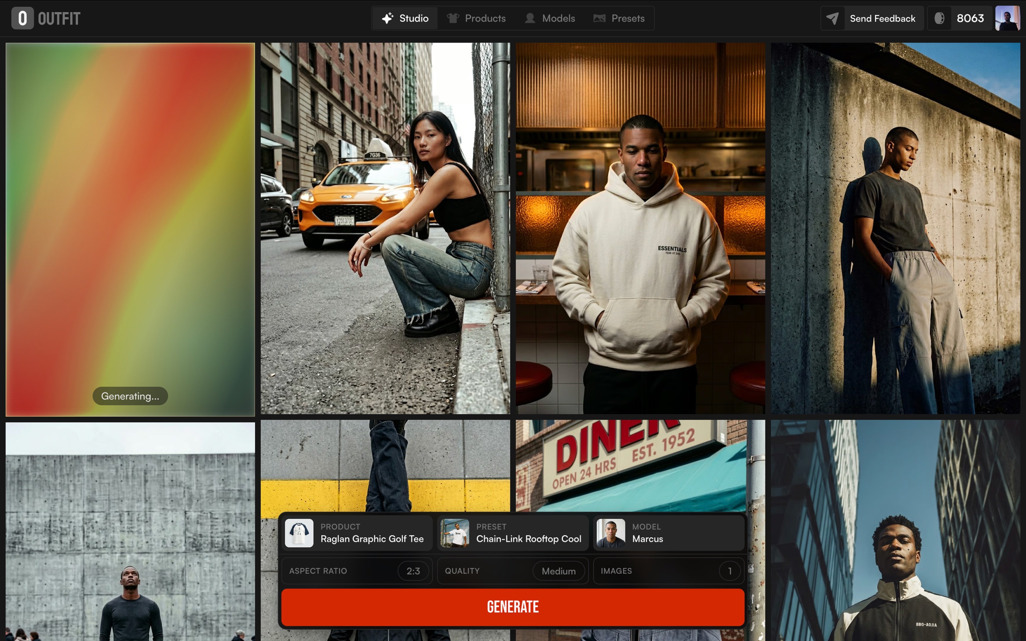
Now the five shot types every ecom catalog needs, with the exact prompts I run.
Shot 1: The white-background workhorse
The clean studio shot. White seamless, no scene, product centered. The boring one. The one you can't skip.
It does a single job: render the product clearly enough to be a PDP hero. Nothing competing for attention. Nothing about mood. Just the thing.
Here's the prompt I run for ghost-mannequin apparel on white seamless (the "Ghost Flat Catalog" preset):
A camel-tan oversized short-sleeve t-shirt floats centered in the frame in a ghost-mannequin presentation, shown front-on at eye level with shoulders squared, sleeves relaxed outward, and the hem hanging straight, the neckline holding its round shape as if worn. Behind the garment a pure white seamless backdrop carries no horizon, no surface, no environmental context. Soft diffused overhead key with broad even fill from both sides gently models the shoulder seams, sleeve hems, and subtle chest drape, leaving a faint low-contrast shadow tucked beneath the hem. Dominant warm sand-tan garment tone against clean white ground, ribbed collar reading slightly darker as a quiet detail note. The shirt anchors dead center with generous symmetric negative space on all sides, composed catalog neutrality.

When I first wrote this, I left the Scene part as "pure white seamless backdrop." Looked at the outputs. The model kept adding a faint horizon line. Sometimes a soft floor seam. Sometimes a tiny gradient at the bottom that suggested a surface. I had no idea where it was coming from.
What I'd missed was that on a white-background shot, the Avoid part has to do as much work as the Scene part. So I went back and wrote: "no horizon, no surface, no environmental context." That's three negative clauses for a Scene that has basically one positive thing in it. Felt wrong while writing it. Worked.
On clean studio shots, telling the model what not to add is the actual job. Most lists skip this part. Mine had too.
When this shot fails: the AI invents a horizon you didn't want, drops a shadow you didn't ask for, or, for products with brand text, garbles the logo. More on that one in a bit.
Shot 2: Lifestyle, in context
Lifestyle is the shot I wrote badly for the longest. My early lifestyle prompts were basically white-background prompts with the word "gym" or "beach" added. The outputs looked like white-background shots with a faint gym or beach wallpaper behind the product. They were terrible.
The thing I had to learn: a lifestyle shot is a scene, and scenes have to be built deliberately. You can't bolt them on.
Here's the prompt I run for activewear in a styled gym set ("Locker Room Cream"):
A full-body shot of a blonde model in a cream long-sleeve crop top and matching flared leggings stands in front of a wall of beige gym lockers, one hand raised to rest on an open locker door, the other gripping the strap of a soft pink duffel bag slung across her body, framed straight on at a slight low angle so her sneakers anchor the bottom edge. Behind her the locker bank fills the frame, an open central cubby revealing neatly folded towels, a clear water bottle, and pastel resistance bands with green and pink handles. Soft diffused front key wraps her evenly with gentle shadow falloff onto the lockers, no hard edges. Dominant warm cream and beige palette across walls, lockers, and apparel, the pink duffel and blush sneakers as the single chromatic accent. Body forms a relaxed contrapposto column centered in the frame, locker grid as graphic backdrop, composed athletic poise.
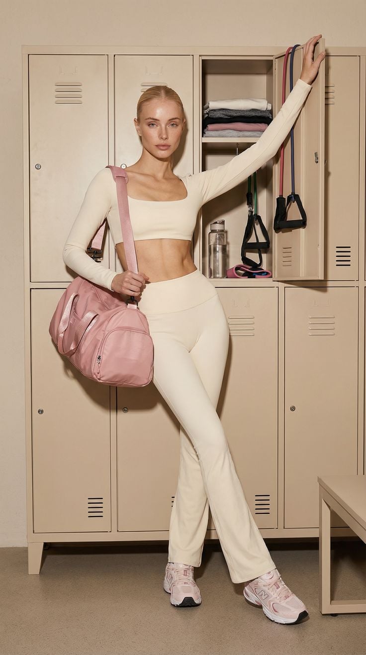
Look at the Scene part again. It isn't "in a gym." It's "a wall of beige gym lockers, an open central cubby revealing neatly folded towels, a clear water bottle, pastel resistance bands with green and pink handles." That detail isn't decoration. It's what stops the model from generating "generic gym," which looks like every other generic gym a thousand other ecom photos have used.
The rule I landed on after a lot of bad scenes: if you can describe the spot in three sentences someone could picture without a photo, you're done. If you can't, the model can't either.
The other thing. Every lifestyle scene I've made work has exactly one chromatic accent. "Cream and beige palette, the pink duffel and blush sneakers as the single chromatic accent." When I had two or three accents, the eye couldn't land anywhere. The shot felt busy without anything actually happening.
Shot 3: The hero brand shot
This is the shot I'm still learning. The one that goes on the homepage or the ad. No model. The product has to carry mood by itself, which means Scene and Feel are doing almost all the work.
The prompt I currently run for a leather bag in a found-moment European hero ("Old World Doorway"):
A glossy black patent leather shoulder bag hangs by its strap from an ornate brass door handle mounted on a heavy carved wooden door, a rolled magazine tucked inside and rising from the open top, framed straight on at eye level with the bag centered in the lower two-thirds. Behind the bag a paneled walnut-brown door fills the frame, its rectangular relief panels and verdigris-patinated round bosses creating a symmetric architectural grid, no environmental context beyond the door face. Soft warm daylight rakes from the upper left, gentle highlights gliding across the patent leather, warm reflections on the brass handle and oxidized green metal studs, shadows soft and grounded. Dominant rich walnut and umber wood tones, deep black leather as the central anchor, aged brass and verdigris green as accent notes, off-white magazine paper bringing a quiet highlight. The bag hangs as a vertical centerpiece against the symmetric door panels, found-moment European travel mood, lived-in and softly editorial.
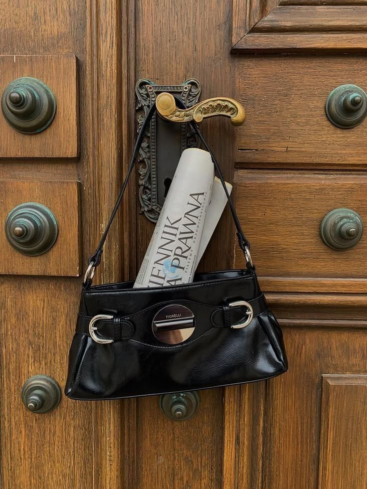
A hero shot lives or dies on Feel. Look at how long the Feel part runs: "Dominant rich walnut and umber wood tones, deep black leather as the central anchor, aged brass and verdigris green as accent notes, off-white magazine paper bringing a quiet highlight." That's painterly. It's the kind of sentence you'd write into a brief for a real photographer.
When I wrote my first hero shot, I treated Feel like a one-line afterthought. Output looked technically correct and emotionally flat. The next round I made Feel a full paragraph and it landed. That's the only adjustment I'd say I'm sure about for hero work. Everything else is still trial and error.
Practical tip if you're trying this for the first time: write the photo essay caption first, then back-fill the six parts. Sounds backwards. Works.
Shot 4: The overhead flat lay
The flat lay is overhead, period. The camera looks straight down.
The moment you nail that, every other slot changes meaning. Light direction is no longer "from the side." It's "rakes across the surface." Composition is no longer about background versus subject. It's about the relationship between objects on a plane.
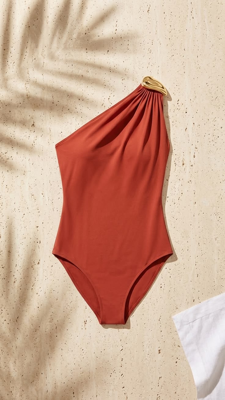
Here's the prompt I run for a sunlit resort flat lay ("Palm Shadow Travertine"):
A terracotta one-shoulder swimsuit with a gold sculptural hardware detail lies flat and slightly diagonal across a pale travertine surface, shot from directly overhead in full view so the asymmetric strap and gathered drape read cleanly. The backdrop is porous sand-toned stone with natural pitting and warm cream variation, a corner of crisp white linen tucked into the lower-right edge for textural contrast. Hard directional sunlight rakes from the upper-left, casting a soft-edged palm frond shadow across the top-left quadrant and laying a gentle drop shadow beneath the garment to anchor it to the surface. Warm sand and cream dominate the field, the burnt-terracotta swimsuit holds the chromatic center, polished gold hardware adds a single luxe specular note. Composition runs on a soft diagonal with generous negative space, evoking quiet resort luxury and late-morning Mediterranean light.
Two flat-lay-specific things I had to learn the hard way.
First, the Camera line has to be exact. I started by writing "from above." The model gave me a steep three-quarter angle and called it overhead. I rewrote it as "shot from directly overhead in full view" and the angle locked. Be precise on the camera or the model invents one.
Second, shadows aren't a byproduct of light on flat lays. They're a prop. "A soft-edged palm frond shadow across the top-left quadrant" is doing the same work that a styled item would do. I stumbled onto this on a tabletop shot where the model added a leaf shadow I hadn't asked for. It made the composition. I started asking for them on purpose.
Shot 5: Full-length on-model
This one's straightforward because it shares its Scene with the white-background shot you already saw. Model wearing the product, head-to-toe, on a seamless backdrop. The ecom catalog standard.
I'd missed this for a while: your white-seamless setup is a workhorse, not a single-purpose tool. Ghost-mannequin and on-model both live there. Same backdrop, different role.
Here's the prompt ("Ecommerce Standard Lookbook"):
A full-length model stands squared to camera on a seamless off-white studio backdrop, both hands tucked into the front pockets of dark washed denim jeans, wearing an oversized white cotton crewneck t-shirt and black low-top sneakers with pale soles, framed head-to-toe at eye level with the lens centered around the waist. Behind the model a clean seamless paper sweep flows into the floor with no visible horizon, no props, no environmental context. Soft broad diffused frontal key with even wraparound fill, low-contrast shadow pooling gently at the feet, gentle modeling across the t-shirt and denim that preserves weave and indigo wash. Dominant warm off-white ground, the white tee as the bright mid-frame mass, the dark denim and sneakers as the grounding low-tone anchor, a thin silver chain at the neckline as the single specular note. Model centered with symmetric negative space flanking, composed unhurried lookbook calm.
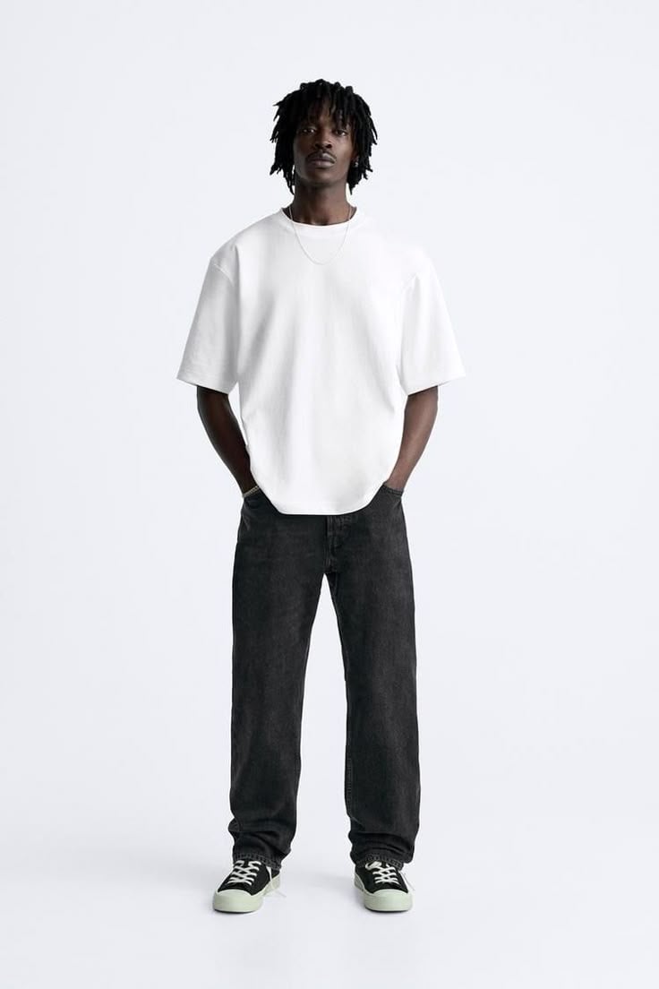
The new slot work on this shot type is around fabric. My first version didn't have any fabric instructions and the model smoothed everything into a kind of plastic. The t-shirt looked molded. The denim looked sprayed-on. I added "gentle modeling across the t-shirt and denim that preserves weave and indigo wash" and the cotton started looking like cotton again.
That phrase technically belongs in the Light slot. I keep it in the prompt because fabric is what the customer is buying. If the weave doesn't read, the photo isn't doing its job.
How does the structure bend per product category?
Same six slots. Different language inside them.
When I started, I had one prompt I'd reused across categories. I thought I was being clever. It produced mediocre photos in every category. Jewelry came back flat. Skincare came back synthetic. The shoes looked like Crocs.
Different physics. Different reflectivity. Different scale. The slot text has to bend or the output doesn't.
Four examples below. Same editorial complexity, different categories. You can see which slots change.
Jewelry ("Burgundy Gold Composure," gold rings, earrings, bracelets on a styled portrait):
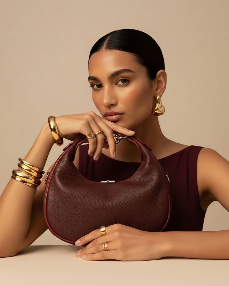
The jewelry-specific work shows up most in Light and Feel. The prompt names "a clean specular roll along chunky gold hoop earrings, stacked gold cuff bracelets, and bold gold signet rings." That phrase, "specular roll," is jewelry language. I didn't know to write it the first time around. Output: the gold looked like painted plastic. Polished surfaces need explicit highlight direction or the model picks a generic one and your jewelry looks fake. This single phrase fixed most of my jewelry shots.
Apparel ("Tangerine Lounge Editorial," silk shirt and trousers, model on velvet chair):
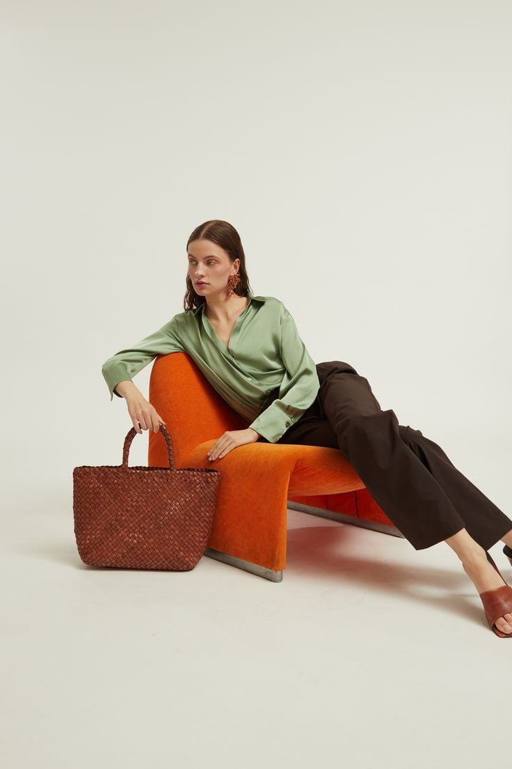
Apparel lives in Subject and Camera. "Sage-green silk shirt and dark chocolate trousers, one arm draped over the chair's curved arm." Notice the verb: "draped." That's how I tell the model the fabric is silk and not stiff cotton. The pose verbs (draped, tucked, slipped) carry as much information as the color adjectives. I learned this after producing about ten "silk shirts" that all looked like cotton with a sheen.
Skincare ("Terracotta Poolside Summer," sunscreen tube on travertine, pool behind):
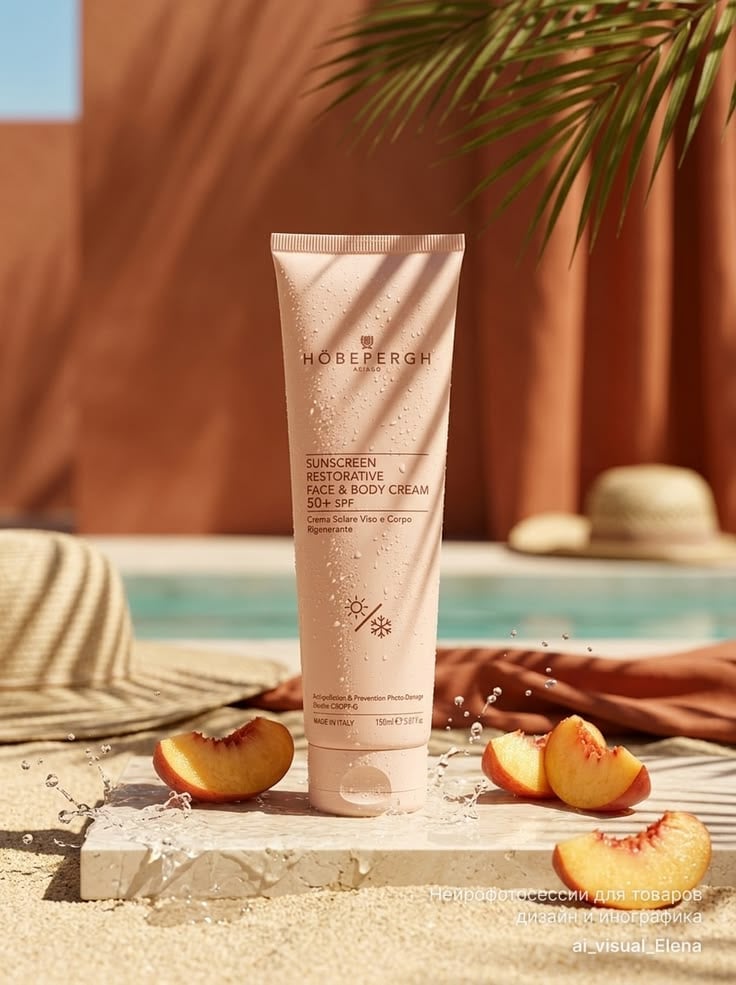
Skincare lives in Subject and Scene. "A tall blush-pink sunscreen tube stands upright at center on a pale travertine stone slab, water droplets clinging to its surface." Water droplets are a skincare tell. They signal hydration, freshness, formula physicality. You wouldn't prompt water droplets onto a sneaker. Each category has these specific tells, and learning yours is most of the work.
Footwear ("Clay Court Reverie," olive suede sneaker on wire basket of tennis balls):
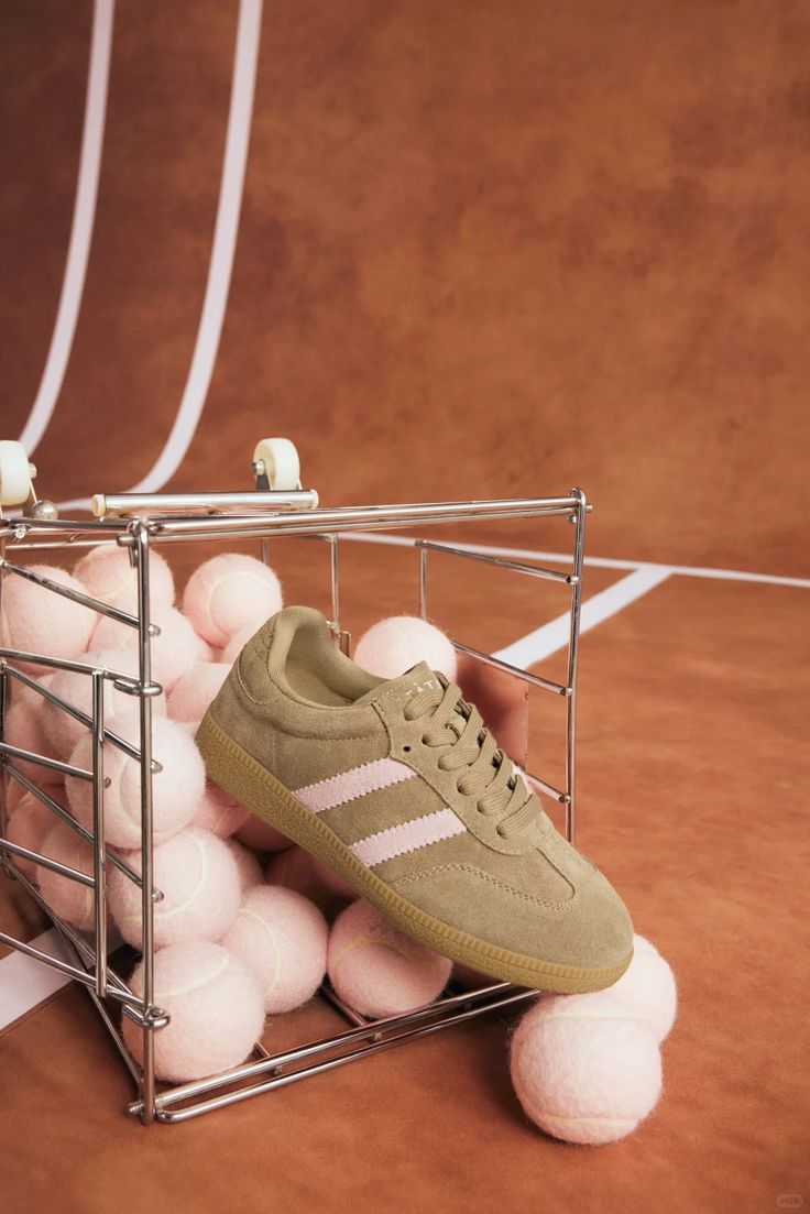
Footwear lives in Subject and Camera. "Framed slightly above eye level so the lacing, side stripes, and gum sole all read clearly." Footwear has structural detail: laces, stitching, sole, eyelets. The camera angle has to expose them. Eye-level kills it (you lose the sole). Slightly above eye-level reveals it. I had eye-level baked into my early shots and produced a lot of "boring sneaker" photos before I figured out it was the angle, not the prompt.
Same structure across all four. Different language. Learning the bending is the bulk of the job.
When does the structure fail?
The structure is a tool. It doesn't make AI good at things AI is bad at.
Here's where I'd tell you to stop and call a real photographer, even in 2026.
Brand text and logos on packaging. Diffusion models still mangle text. The latest-generation models have improved a lot (readable in some shots, garbled in others), but consistency on a brand wordmark is not there yet. If your product photography depends on the logo reading correctly across every output, you've hit a wall. For background on why text rendering is the hardest sub-problem in image generation, see this teardown of model behavior and the broader State of AI Image Generation 2026.
Hands holding products. Better than it was. Not solved. Latest-gen models nail simple hand positions in good light. They still fail on complex grips, foreshortened fingers, and any pose where two hands interact with one object. If a hand is going to feature prominently in the shot, expect to retake until it works or just shoot it for real.
Fabric drape on moving bodies. A static catalog pose holds up. A walking shot, a mid-motion shot, anything with momentum: the cloth physics drift. Drape on still bodies is convincing. Drape mid-motion is one of the categories AI is still measurably behind on.
Multi-source reflections and transparency. Jewelry and skincare both get hit here. A polished metal surface in a single-light scene looks great. The same surface in a scene with two or three light sources, where each reflection has to match the surrounding environment, falls apart. Same story for water surfaces, glass jars, and chrome packaging in busy scenes. They'll look "almost right" and they won't survive a close read.
Dense fine patterns. Houndstooth, fine pinstripe, ribbed knit at scale, repeating logo prints. The model approximates the pattern instead of generating it cleanly. Up close you see the seams.
AI photography is production-ready for most ecom catalog work now. The exceptions cluster in the same handful of places: packaging hero shots, complex interaction shots, fine-pattern garments. Those are where you still pay a photographer. Don't fight it. Plan for it.
Before you ship the prompt
Quick gut check before you hit generate. I run through this almost every time and it's caught more dumb mistakes than I'd like to admit.
All six slots present? Subject, Scene, Light, Camera, Feel, Avoid.
One chromatic accent named, not five?
Light direction specified beyond "studio lighting"?
Camera angle exact ("eye level," "directly overhead") rather than vague ("from above")?
Scene specifies what to leave out, not only what to include?
Category-specific slot language in there? Specular highlights for jewelry, weave for apparel, water droplets for skincare, sole detail for footwear.
Output won't depend on brand text rendering correctly?
If any of these is missing, the prompt isn't done yet.
FAQ
Does this six-part structure work in any AI image tool, or is it tool-specific?
For me it's been tool-agnostic across the major modern models (Flux, Imagen, Nanobanana, the leading proprietary engines). The structure is descriptive prose. Modern models read it as intended. Where it falls down: very old comma-tag-trained models (early Midjourney, SD 1.5-era checkpoints). If you're still on those, switch.
How long does it take to dial in slot language for a new product category?
For me, about half a day of testing per category if I have a real product to shoot. The first round produces a passable prompt. Two or three rounds of iterating, mostly on the Light and Feel slots, gets to reusable.
What's the Avoid slot for, and do I always need it?
Avoid does two things. Tells the model what you don't want in frame (no horizon, no logos, no other products) and tells the model what it tends to add unprompted (a faint floor seam, a generic shadow, a stray accessory). I always include it. On clean studio shots, it does more work than the Scene slot, which still feels backwards to me but is the truth.
One template per SKU, or one per shot type?
One per shot type. Your white-background prompt is one template. Your lifestyle prompt is another. Within each, you swap the Subject part per SKU. If you're writing one template per SKU, you've made the mistake I made: you've turned this back into the 50-prompts trap, just slower.
When should I skip AI and hire a real photographer?
Five cases. Brand-text hero shots where the logo must be perfect. Hands holding products in unusual grips. Mid-motion fabric. Multi-source reflective close-ups (especially fine jewelry). Garments with dense fine patterns. If your shot list is mostly in those categories, AI isn't where you start.
The whole pitch: stop hunting prompts. Write the structure, fill it correctly, bend it per category, and accept that some things still need a camera. Six parts. Five shot types. Four categories. That's the catalog.