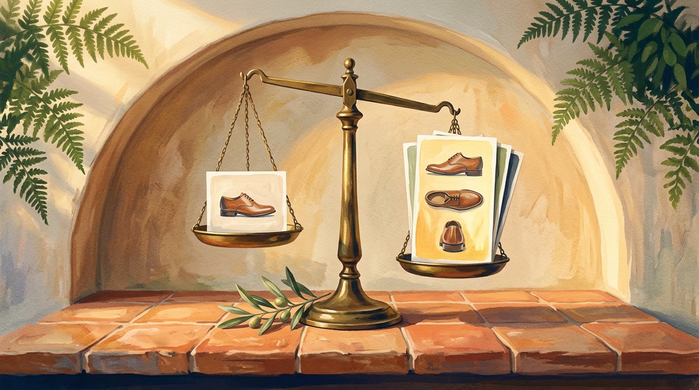
I graded 5 DTC brands' product photos the way an AI shopping agent does
I graded five well-known DTC brands' product photos the way an AI shopping engine does. Three nailed the five-shot set, two didn't, and the gap split cleanly by category.
I ran five well-known DTC brands through the same five-shot test an AI shopping engine effectively applies to product images: a clean hero, real angles, a material close-up, a scale cue, a lifestyle shot. Three passed. Two didn't. And the two that fell short were the beauty and jewelry brands, both missing the exact shots that tell an engine what a product is and what it's made of.
A few weeks back I argued that AI shopping engines read your product images now, not just your text, and that they quietly reward a specific set of five shots. It was a clean argument on paper.
Then I got curious about how real brands actually stack up. Not made-up examples. Names you know.
So I opened five DTC stores, pulled up the product page for a flagship item on each, and graded the image set the way a shopping agent effectively does. One question: does this page give an engine what it needs to recognize the product and match it to what a shopper asked for?
I expected everyone to miss something. That's not what I found. What I found was cleaner, and a little uncomfortable if you sell in certain categories.
How I graded them, and why an agent cares
When someone asks ChatGPT or Google's AI for "a slim leather wallet that still holds cash" or "a tinted brow gel for sparse brows," the engine does two jobs with your photos. It works out what the product is, which is recognition. Then it decides whether it fits the request, which is intent matching.
Five shots cover both jobs:
A clean hero on a plain background. The recognition shot.
Multiple angles. Front, back, side, the parts that matter for the category.
A material close-up. What is this actually made of.
A scale cue. How big is it, on a body or in a hand.
A lifestyle shot. The product in use, which is how an engine reads feel.
One front photo answers one of those questions. A full set answers all five. I wrote the long version of why each shot matters separately, so here I just used it as a scorecard.
The rule I set for myself: no partial credit for "they probably have it somewhere." If the shot isn't on the product page, the agent doesn't see it, so it doesn't count.
The report card
Here's how the five landed, each on one flagship product, graded on the page as it stood the day I looked:
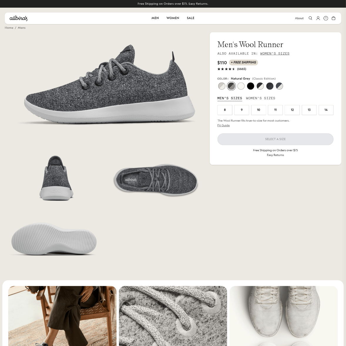
Allbirds, Wool Runner: A. The full set, including the shots most brands skip.
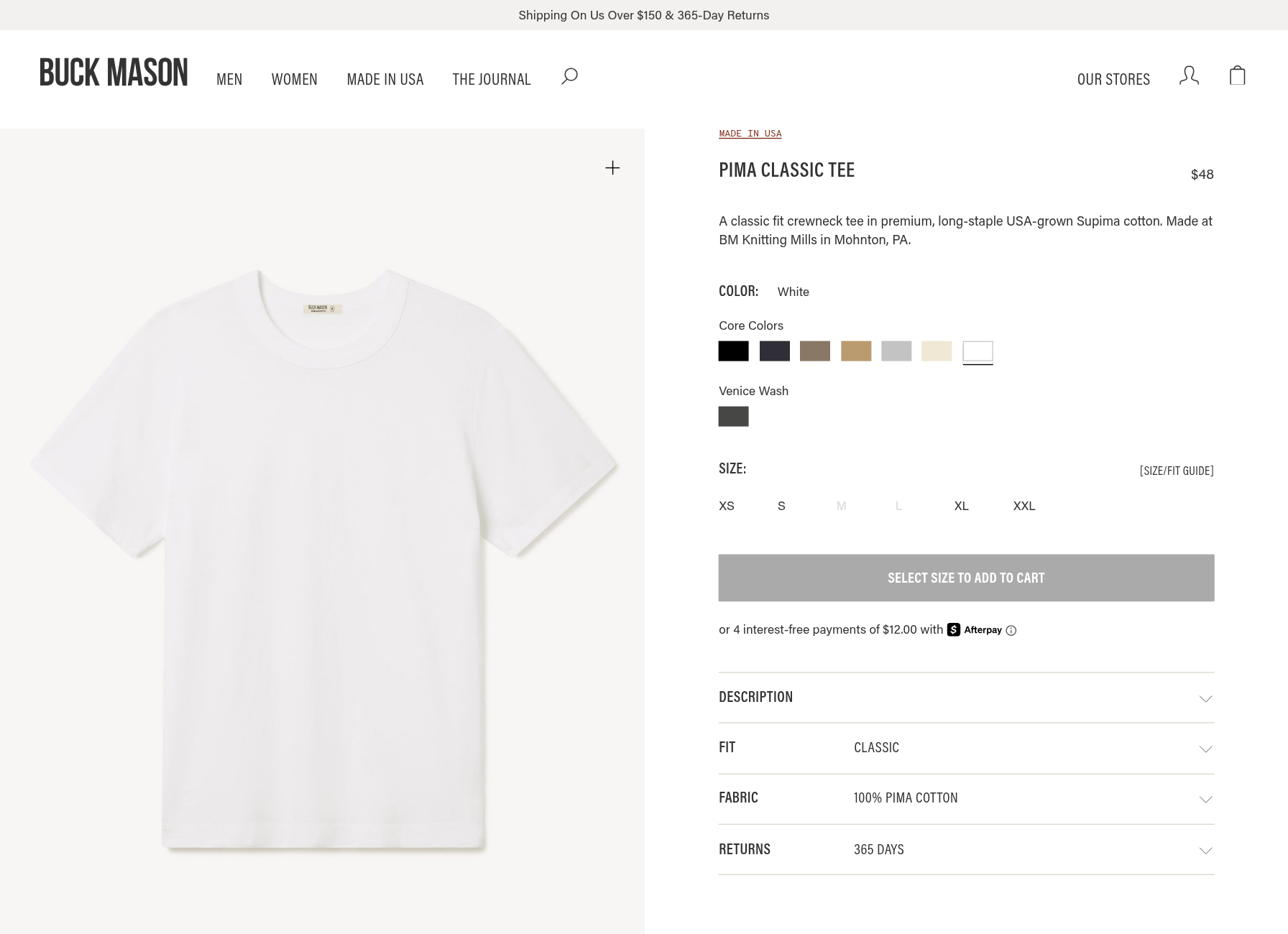
Buck Mason, Pima Classic Tee: A. Clean hero, on-model, and the fabric proof that earns the price.
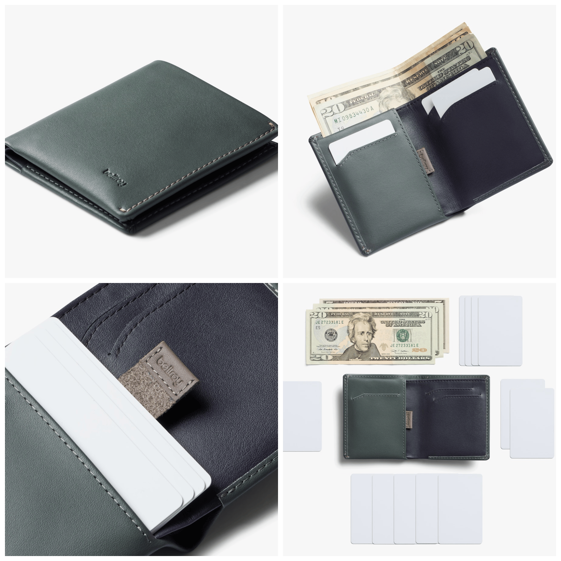
Bellroy, Note Sleeve: A+. Nine images and a video. The most complete of anyone.
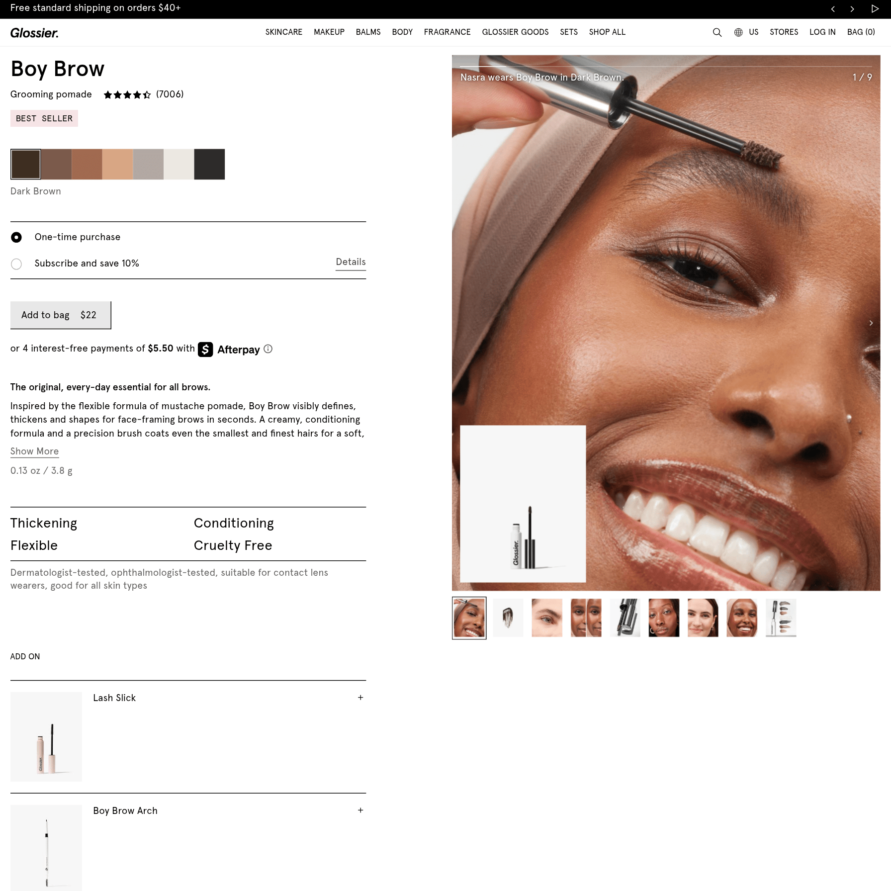
Glossier, Boy Brow: C. Lots of beautiful faces. Thin on product evidence.
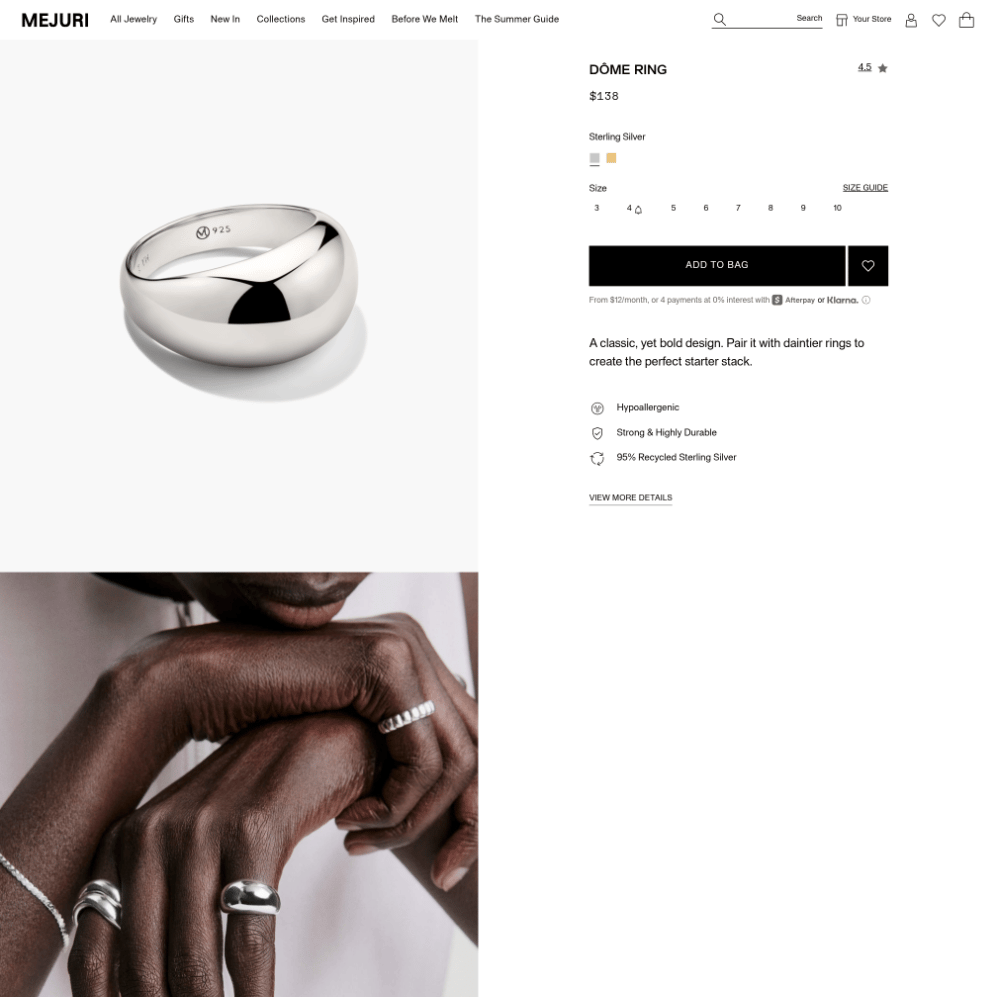
Mejuri, Dôme Ring: C. A gorgeous hero and a smart on-hand shot, but no product angle or detail macro.
Three As and two Cs. Now look at which brands are which. The three with full sets sell shoes, tees, and wallets. The two with gaps sell makeup and jewelry. Hold that thought, because it turned out to be the whole story.
The three an agent can see clearly
Allbirds nails the boring shots. The Wool Runner page has the side profile, the heel, a top-down, and the sole. Then it does the two things most brands never bother with: a macro of the merino knit so tight you can count the fibers, and a shot of someone sitting and walking in them. That last one pulls double duty as both lifestyle and scale. Every question an engine could ask about a shoe is already answered in the gallery.
Buck Mason proves the fabric. The Pima tee has a clean flat hero, an on-model front, a side, a back, and a close-up of the cotton itself. For a $48 white tee, where the entire pitch is "this fabric is better than the $12 one," that material shot is the one doing the selling. An engine reading "premium long-staple supima cotton" gets to see the proof, not just take the words for it.
Bellroy over-delivers. The Note Sleeve has nine images and a video. Closed on white. Opened with cards and cash tucked in. Slim in a jacket pocket. Held in a hand. They are answering the one question every wallet shopper actually has, which is "how much does it really hold, and is it still slim when full," before anyone has to ask it. That is intent matching done entirely in pictures.
The thread connecting all three: none of these are the prettiest single photo on the internet. They're the most complete sets. The brands treat the gallery like a checklist, not a billboard.
The two that would get skipped
This is where it stings, because both brands make genuinely beautiful images. The problem isn't quality. It's coverage.
Glossier: gorgeous, and evidence-light. The Boy Brow page is mostly faces. Real people, soft light, the product mid-application on a brow. It's some of the best-looking content in beauty. But strip back to what an engine can verify, and it thins out fast. There's one clean look at the product and a row of cropped faces. What's missing is a proper angle set of the tube itself and a real macro of the formula's texture. For a person scrolling, the faces win. For an engine trying to confirm what this is and what it does, a wall of faces is surprisingly little to go on. The fix is small: one clean angle set, one texture macro.
Mejuri: a beautiful hero, then only mood. The Dôme Ring gallery is a mirror-finish hero so sharp you can read the "925" stamp, then a couple of shots of the ring on a hand. Credit where it's due, putting it on a hand is smart, because it answers scale, which is the hardest thing to convey for a ring. But that's the whole set: a hero and some lifestyle. No profile, nothing that shows the weight and curve of the band, no detail macro of the finish. A shopper who was just told "this is the bold everyday ring you wanted" gets a gorgeous hero and a few hand shots, then has to take the rest on faith. An engine has even less patience than that shopper.
Why does the gap split so cleanly by category?
The pattern wasn't random, and once I saw it I couldn't unsee it.
Apparel, footwear, and accessories brands grew up inside catalogs, wholesale, and marketplaces that demand multiple angles and detail shots as a baseline. Amazon won't even let you list without certain views. So the muscle is built. The full set is just how those teams already work.
Beauty and jewelry grew up somewhere else: on aspiration. The hero, then mood. The product on a face, the ring on a hand, the feeling of the thing. That approach built some of the most powerful brands of the last decade, and it sells beautifully to a human being.
It also happens to starve an engine of the exact two shots it leans on hardest. The angle set that confirms identity. The macro that confirms material. The aspirational playbook skips both, because a human fills those gaps with imagination and a machine doesn't.
So if you sell anything bought on feeling, makeup, jewelry, fragrance, candles, you are statistically the most exposed here, and probably the least aware of it, because your photos already look great.
How to grade your own catalog in ten minutes
Pick your best seller. Open its product page like you've never seen it. Count:
Is there a clean hero on a plain background?
More than one angle?
A close-up of the material?
Anything that shows scale?
One shot in context or in use?
Tally it. If you came up with five, you're in Allbirds and Bellroy territory and you can stop reading. If you came up with two, you've found why a competitor with an uglier hero and a fuller set is getting recommended instead of you.
The good news is that the fix is almost never a full reshoot. It's one or two missing shots. That's also where AI product photography earns its place, less for making things prettier and more for filling coverage gaps, generating the angle, the material close-up, and the scale cue from a hero you already have, across a whole catalog, without booking studio time per SKU. One honest caveat: keep the recognition hero accurate, and for fine jewelry where the exact finish is the product, a real macro still beats a generated one. Use it for coverage, not for pretending.
FAQ
Do AI shopping engines actually look at product images, or just text? Both, and the image side is growing. Shopping answers in ChatGPT, Perplexity, and Google's AI surfaces pull from product feeds that include your image fields, and the underlying models are multimodal, so the picture is part of what gets evaluated, not decoration.
What are the five shots an engine wants? A clean hero on a plain background, multiple angles, a material close-up, a scale cue, and a lifestyle shot. Each answers a different question the engine has about your product. Five distinct shots beat fifteen near-duplicates.
I sell beauty or jewelry. What's the one shot to add first? A true material or texture macro, then a second clean angle of the product by itself. Those two are what the aspirational, lifestyle-first playbook tends to skip, and they're exactly what the engine uses to confirm what the product is and what it's made of.
Will AI-generated photos hurt me with these engines? Not if they're accurate. The engines reward clear, complete, in-spec images and don't currently penalize images for being AI-made. They do effectively penalize images that misrepresent the product. Use AI to fill coverage, keep the hero honest.
How many product images is enough? Five that each do a job. More is fine but the returns drop fast. The brands winning here aren't the ones with the most photos, they're the ones whose photos answer every question without the shopper or the engine having to guess.
The takeaway
The brands that win the AI shelf aren't the ones with the prettiest single photo. They're the ones whose gallery leaves no question unanswered.
Three of my five already work that way, and they're the categories that were forced to learn it years ago. The two that don't are the ones whose images are, honestly, the most beautiful of the bunch. That's the trap. Beautiful and complete aren't the same test, and only one of them gets you recommended.
Go grade your top ten. If you're in beauty or jewelry, I'd bet you find a stunning hero, a mood shot, and a gap where the evidence should be. Two shots usually closes it.