How to Choose Colors for Your Fashion Brand’s Style and Identity
Your brand color is your first impression. Learn how to choose, build, and use a color palette that makes your fashion brand instantly recognizable.
People forget names, they never forget a color.
Think about it, you don't need to see the logo to know which brand uses that exact shade of red, or who owns that specific black and white. Color is often the first thing your customer notices, and the last thing they forget.
For fashion brands especially, color does more than look good. It sets the tone before anyone reads a single word. It signals who you are, who you're for, and what you stand for, all in a fraction of a second.
The problem is most new brands pick colors based on personal taste and call it a day. Then they wonder why their brand identity feels inconsistent, or why nothing looks quite right across their packaging, their feed, and their website.
This guide fixes that. By the end, you'll know exactly how to choose a color palette that works not just one that looks pretty.
What is a brand color palette?
A brand color palette is the specific set of colors your brand uses consistently across everything. Your website, your packaging, your social media, your labels, your product photography. Everything.
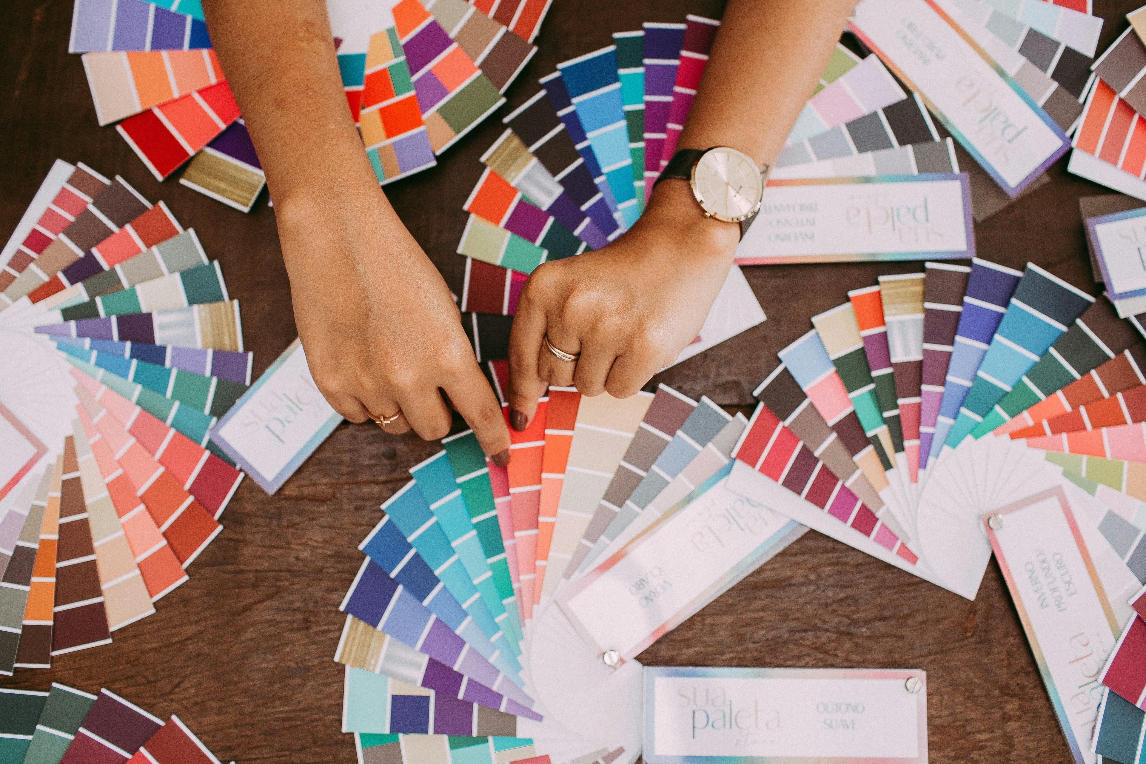
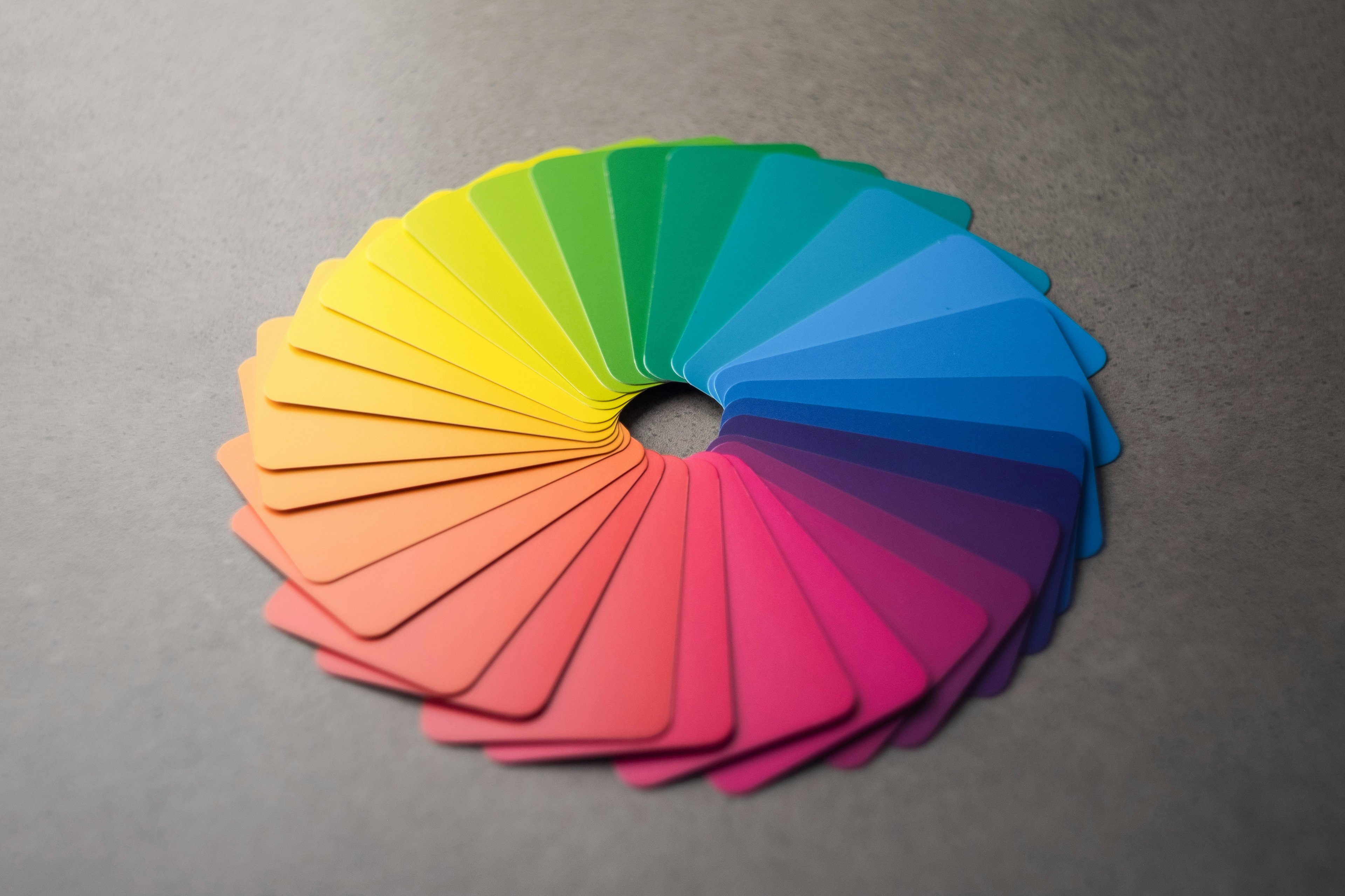
It's not just like green. It's a defined system usually 3 to 5 colors each with an exact code so anyone working on your brand uses the exact same shade every single time.
A typical palette has three layers:
Primary color: the main color most associated with your brand. The one people will start to recognize over time.
Secondary color: supports the primary. Used for backgrounds, sections, or complementary elements.
Accent color: the pop. Used sparingly for buttons, highlights, or details that need to stand out.
Each color has a code usually a HEX code for digital use (like #FFFFFF for white) and a Pantone or CMYK value for print and physical products, without these codes, your red on Instagram will never quite match your red on the label.
That consistency is what turns a color into a brand signal. Brands like Burberry built instant recognition on exactly this one color, used the same way, everywhere.
Color is a decision, not a detail
Color isn't decoration. It's one of the fastest ways the brain processes information before your customer reads your brand name, before they see your logo, they've already formed an impression based on color alone.
Studies show that color increases brand recognition by up to 80%. That's not a small detail, that's your first impression, your packaging, your feed, and your storefront all rolled into one.
In fashion especially, color does a lot of the heavy lifting. It signals price point. It signals who the brand is for. A minimalist black and white palette reads very differently from a bright, saturated one even before you've seen a single product.
Think about how instantly you recognize these:
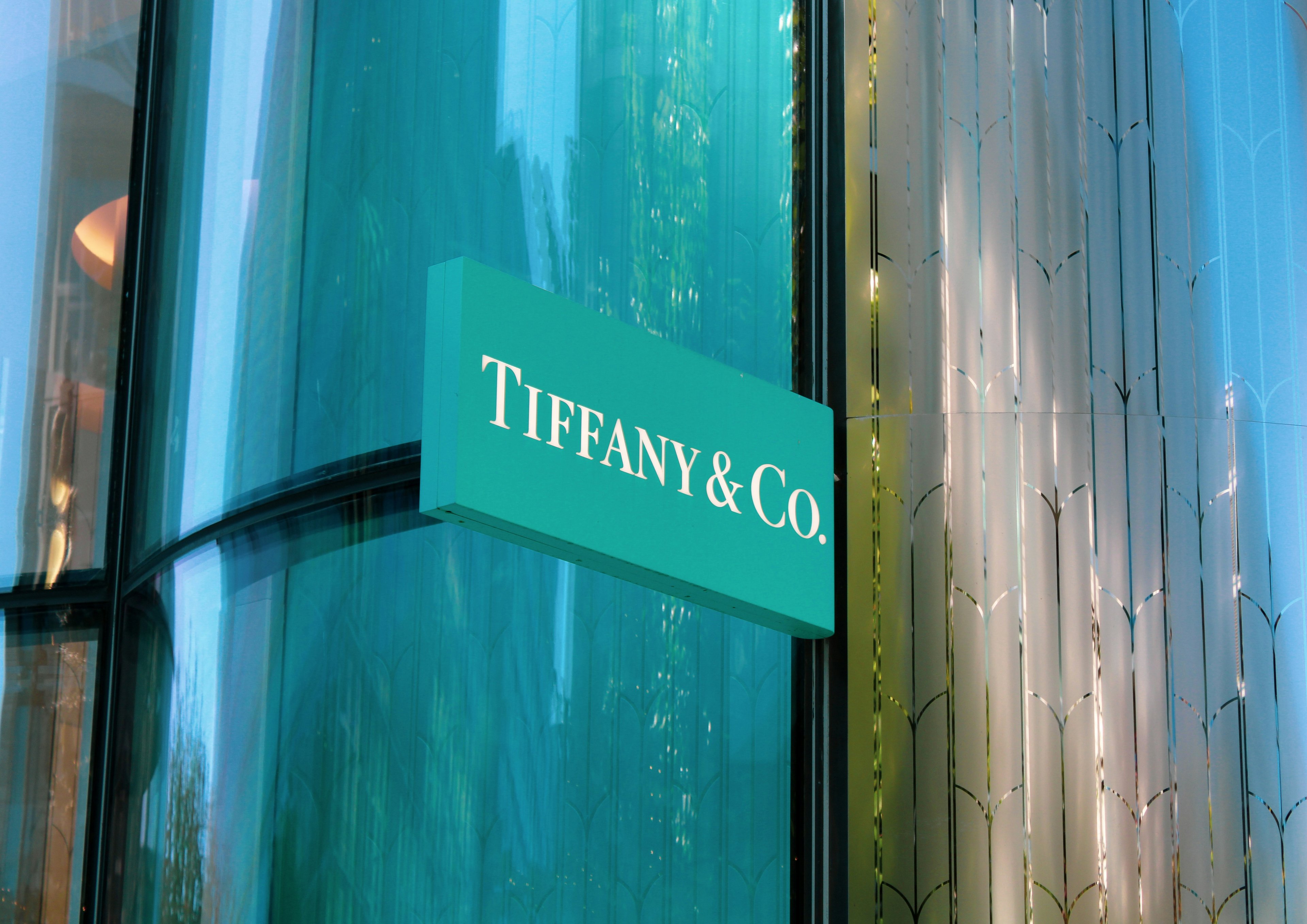
Tiffany & Co.: that specific robin's egg blue says luxury and romance without a single word
Supreme: red and white says streetwear and exclusivity
Bottega Veneta: earthy neutrals say quiet luxury and understated wealth
None of that happened by accident. Every one of those was a deliberate decision made early and protected consistently.
What each color says and who it's for?
This is where most brands make their biggest mistake, they pick a color they like, not a color that works for their audience.
Every color carries a psychological weight. Here's what each one signals in fashion, with real examples:
Black: luxury, power, sophistication. The go-to for high-end fashion brands like Chanel, Saint Laurent, and Balenciaga. It says we don't need to explain ourselves. According to 99designs, black is the most commonly used color in luxury branding.
White: clean, minimal, pure. Brands like Toteme and COS use it to signal simplicity and quiet confidence. Works especially well for brands targeting a minimalist aesthetic.
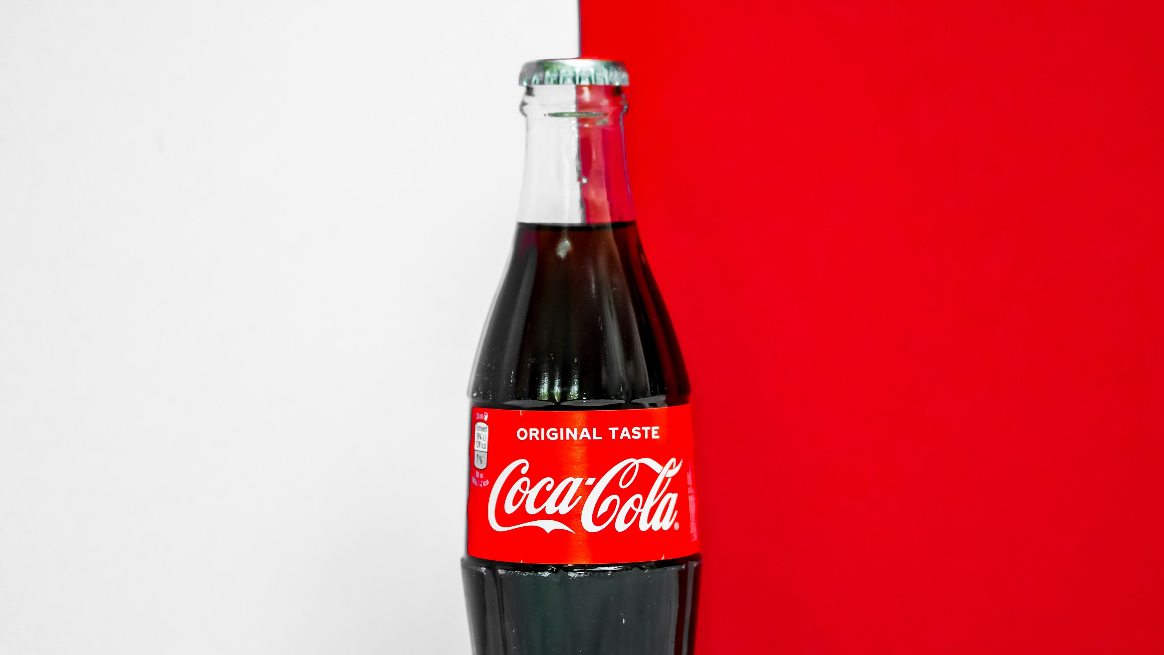
Red: energy, passion, urgency. H&M and Supreme use red to create excitement and immediacy. It grabs attention fast but it's hard to own subtly.
Pink: femininity, playfulness, softness. From millennial pink to hot pink, Jacquemus has used it to build a distinct, joyful identity that feels instantly recognizable on social media.
Green: nature, sustainability, calm. Stella McCartney and Pangaia lean into green to signal ethical values, a growing priority for today's conscious buyer.
Blue: trust, reliability, calm. Less common in fashion than in tech, but works well for brands targeting a classic or professional customer.
Brown / Beige / Earth tones: warmth, authenticity, groundedness. The backbone of the quiet luxury trend think Loro Piana, The Row, Bottega Veneta.
Purple: creativity, mystery, individuality. Works well for brands targeting an artistic or unconventional customer.
Orange: energy, warmth, approachability. Hermès turned orange into one of the most recognizable signature colors in luxury proof that any color can become iconic with enough consistency.
How to pick your palette?
Most people spend too long on this step. Here's a simple process that actually works.

1. Start with your audience, not yourself
The biggest mistake is picking colors you personally love. Your palette needs to resonate with your customer, not you. Ask yourself: who is buying from me, and what do they respond to emotionally? A brand targeting Gen Z streetwear buyers will need a very different palette than one targeting women over 40 looking for classic elegance.
2. Study your competitors
Look at the top 5 brands in your niche and map out their colors. You're not looking for inspiration, you're looking for gaps. If everyone in your space is using black and white, a warm earthy palette will make you instantly stand out. Color differentiation is one of the easiest ways to own a visual space.
3. Choose your primary color first
Don't try to build a full palette all at once. Start with one color that feels right for your brand's personality and audience. Everything else builds around it. Use a tool like Adobe Color or Coolors to generate complementary options once you have your anchor.
4. Test before you commit
Put your colors on a mock product, a social media post, and a simple webpage. See how they look in different contexts, on screen, on fabric, on packaging. Colors behave differently depending on the surface and lighting. What looks great on a phone screen might feel flat on a kraft paper bag. Product mockups are a quick way to test this without spending money on samples.
Brands that got their colors right
The best way to understand color strategy is to see it in action. Here are four brands that made color a core part of their identity and what you can learn from each.
Tiffany & Co. - Robin's Egg Blue Before anyone sees the jewelry, they see the box. That specific shade of blue Pantone 1837 has become so synonymous with the brand that it's legally protected. The lesson: a color can become more valuable than a logo.
Coca-Cola - Red In a world of beverage brands, Coca-Cola owns red. Their consistency across 150+ years of marketing means that the moment you see that specific shade, your brain connects it to the brand before you even read the name. Commitment and repetition is what turns a color into an asset.
Starbucks - Green Green was a deliberate choice to signal nature, calm, and community exactly what Starbucks wanted you to feel walking into their stores. It also helped them stand out in the food and beverage space where red and yellow dominate, a masterclass in color differentiation. Sometimes the best color move is choosing what your competitors aren't using.

Nike - Black and White Nike rarely relies on color, their power comes from contrast and simplicity. Black on white, white on black. It works across every product, every market, every culture. A reminder that sometimes less is more when it comes to building a timeless visual identity.

Now put it everywhere
Choosing your palette is only half the job. The other half is using it consistently across every single place your brand shows up.
Here's where your colors need to live:
Your website: background, buttons, headings, and accents should all pull from your palette. Consistency here builds instant trust. A well-designed product page that uses your brand colors correctly can directly impact whether someone buys or bounces.
Social media: your feed should feel like one cohesive world. Use your palette in your post backgrounds, your story highlights, your Reels covers, and your profile aesthetic. When someone lands on your page, they should feel your brand before they read a single caption.
Packaging: this is where color makes its biggest emotional impact. The moment a customer receives your product, the colors they see set the tone for the entire unboxing experience. Get this wrong and even great products can feel cheap. Get it right and it becomes part of what they share.
Product photography: your backgrounds, props, and styling should all complement your palette. A brand with a warm earthy palette shooting on cold grey backgrounds will always feel off. Consistent photography is what ties your visual world together.
Labels and tags: every physical touchpoint matters. Your hang tags, care labels, and stickers are small but they add up. A customer who sees the same colors from your Instagram post to your packaging to your label feels the brand even if they can't articulate why.
Mistakes that confuse your customer
You can have a beautiful palette and still get color wrong. These are the mistakes that quietly undermine your brand.
Using too many colors
More than 3-4 colors and your brand starts to feel chaotic. Every color you add is another decision your customer's brain has to make. Keep it tight, restraint is a design choice, not a limitation. The brands with the strongest visual identity are almost always the ones with the fewest colors.
Inconsistency across platforms
Your Instagram is warm and earthy, but your website is cold and minimal. Your packaging uses a slightly different shade of green than your logo. These small inconsistencies add up and they signal to your customer that the brand isn't quite put together. Use exact color codes everywhere and audit your visuals regularly.
Choosing based on personal taste alone Your favorite color is purple. But your customer is a 35-year-old man looking for minimalist streetwear. Personal taste is a starting point not a strategy. Always come back to who you're designing for, not what you personally love.
Changing your palette too often
Every time you rebrand or shift your colors, you reset the recognition you've built. Color recognition takes time and repetition. Commit to your palette, stay consistent, and only evolve it when there's a real strategic reason not because you're bored.
Ignoring how colors look on different surfaces
A color that looks perfect on screen can look completely different on fabric, paper, or packaging. Always test your colors in the actual context they'll be used not just on a mood board.
Conclusion
Color is one of the most powerful and most underused tools a fashion brand has.
It doesn't require a big budget or a creative director. It requires a clear decision, made early, and protected consistently. One primary color. Two supporting ones. Exact codes. Used everywhere.
That's it.
The brands that get color right aren't the ones with the most complex palettes, they're the ones that committed to something simple and never wavered.
Pick your three colors today. Get their codes. Put them somewhere your whole team can see. And then use them on everything, every time.
That's how a color becomes a brand.