How to Create a Consistent Visual Language for Your Brand
Learn how to create a consistent visual language for your brand, build recognition, and keep your visuals clear, cohesive, and easy to scale.
If your brand shows up in different places, a website, social media, ads, product photos but each one feels slightly different, you’re not alone. This is one of the most common challenges brands face as they grow.
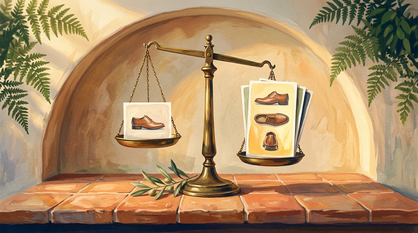
A consistent visual language is what makes everything feel connected. It helps people recognize your brand faster, trust it more, and remember it longer. It’s not about having the perfect design, it’s about creating visuals that feel like they belong to the same story.
Many brands already start with inspiration, moodboards, and references when shaping their look, something we explored in how fashion designers use AI for moodboards. but inspiration alone isn’t enough. Without a clear visual system, those ideas can quickly turn into inconsistent visuals across platforms.
In this article, we’ll break down what a visual language really is, why it matters, and how to build one that stays consistent even as your brand grows and creates more content.
What is a brand’s visual language?
A brand’s visual language is the way your brand speaks visually without saying a single word.
It’s the mix of colors, fonts, imagery, layouts, and overall style that makes someone recognize your brand instantly. When it’s clear and consistent, people don’t need to see your logo to know it’s you. They just feel it.
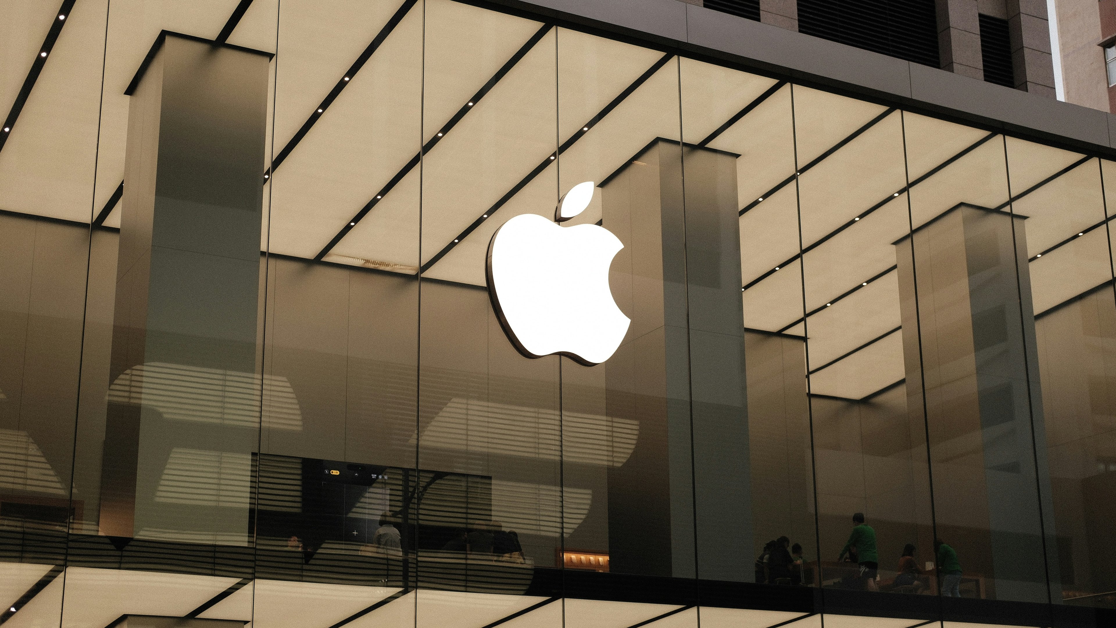
Think about brands like Apple. Even without the logo, their visuals feel clean, minimal, and intentional. Or Starbucks, where warm colors and familiar imagery instantly communicate comfort and familiarity. That recognition comes from a strong visual language not from one great design.
A common mistake brands make is confusing visual language with just a logo or a color palette. In reality, visual language is bigger than that. It’s the system that keeps everything aligned from your website and social posts to ads and product visuals.
When a brand doesn’t have a clear visual language, content can still look nice, but it often feels disconnected. When the language is defined, every new visual builds on the one before it, making the brand stronger over time.
The core elements of a visual language
A strong visual language isn’t complicated. It’s built from a few core elements that repeat consistently across everything your brand puts out. When these elements are clear, your visuals start to feel connected even when the content changes.
Here are the main pieces that matter most.
Colors
Colors are usually the first thing people notice and the easiest way to recognize a brand quickly. A clear color system helps your visuals feel familiar, whether they show up on a website, a post, or an ad.
Most brands work best with:
One main color (or a small primary palette)
A few supporting tones for flexibility
What matters isn’t having many colors, but using the same ones consistently. This is especially important when creating content at scale, something many brands start to feel once they grow beyond a few posts or campaigns.
Typography
Fonts quietly shape how a brand feels. Clean, modern fonts feel very different from playful or bold ones even if the message stays the same.
A simple setup usually works best:
One font for headlines
One font for body text
Keeping typography consistent helps your content feel more professional and easier to read, especially across long-form pages like blogs or product descriptions.
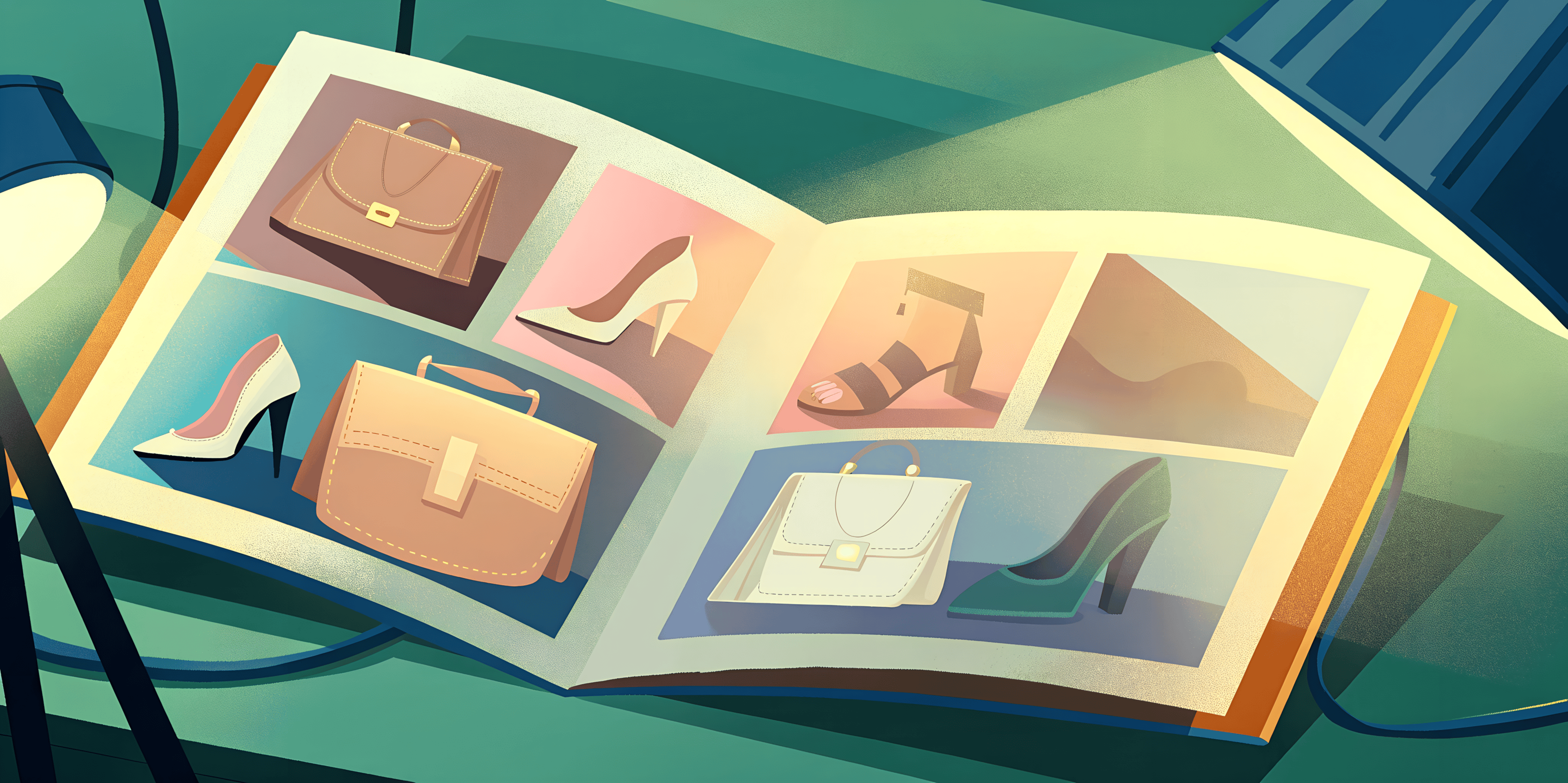
Imagery & Photography style
This is where many brands lose consistency, when every photo uses different lighting, backgrounds, or framing, the brand starts to feel scattered even if each image looks good on its own. That’s why choosing a clear photography style matters.
Some brands go clean and minimal. Others lean into lifestyle or editorial visuals. What matters isn’t the style itself, but sticking to it.
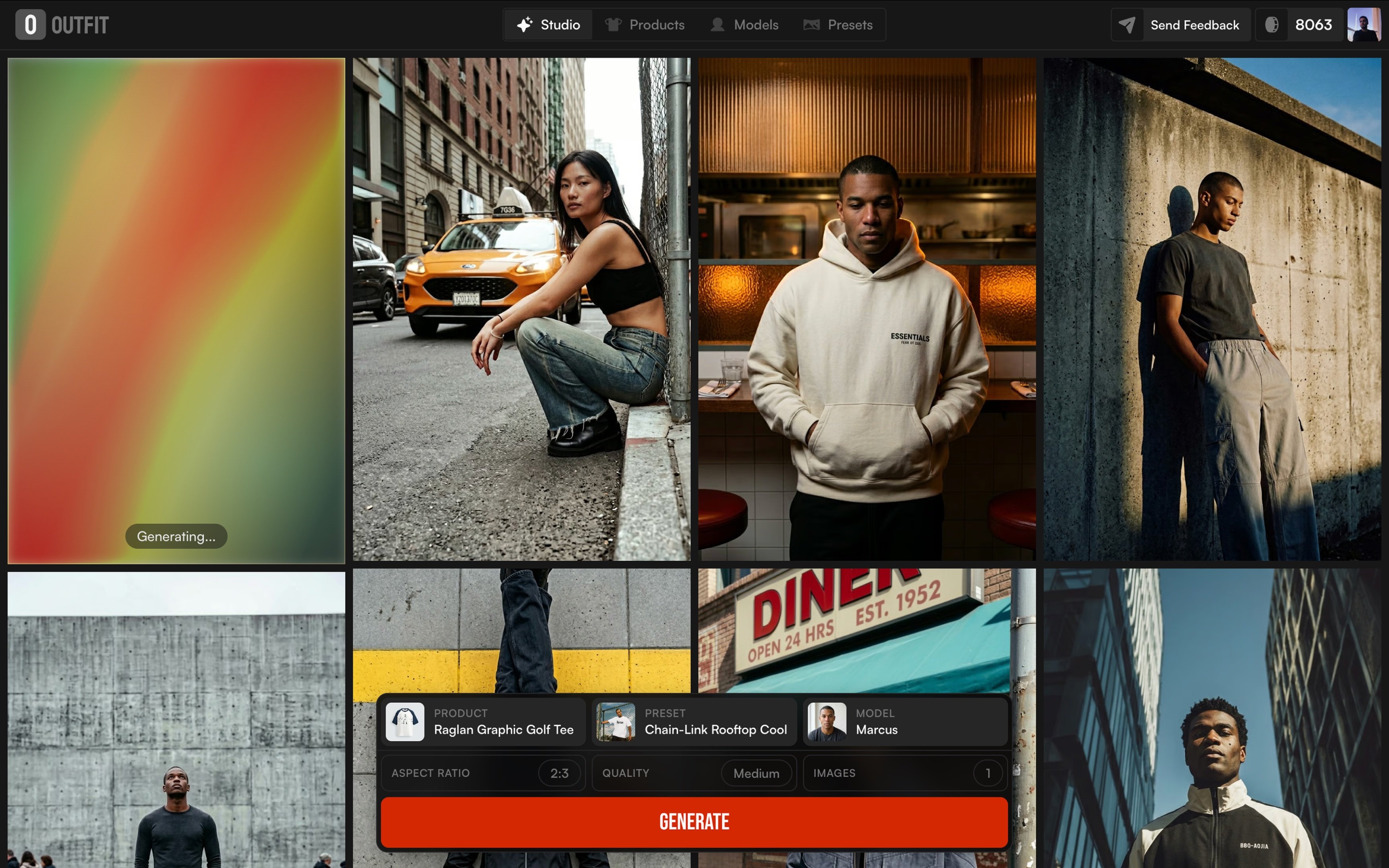
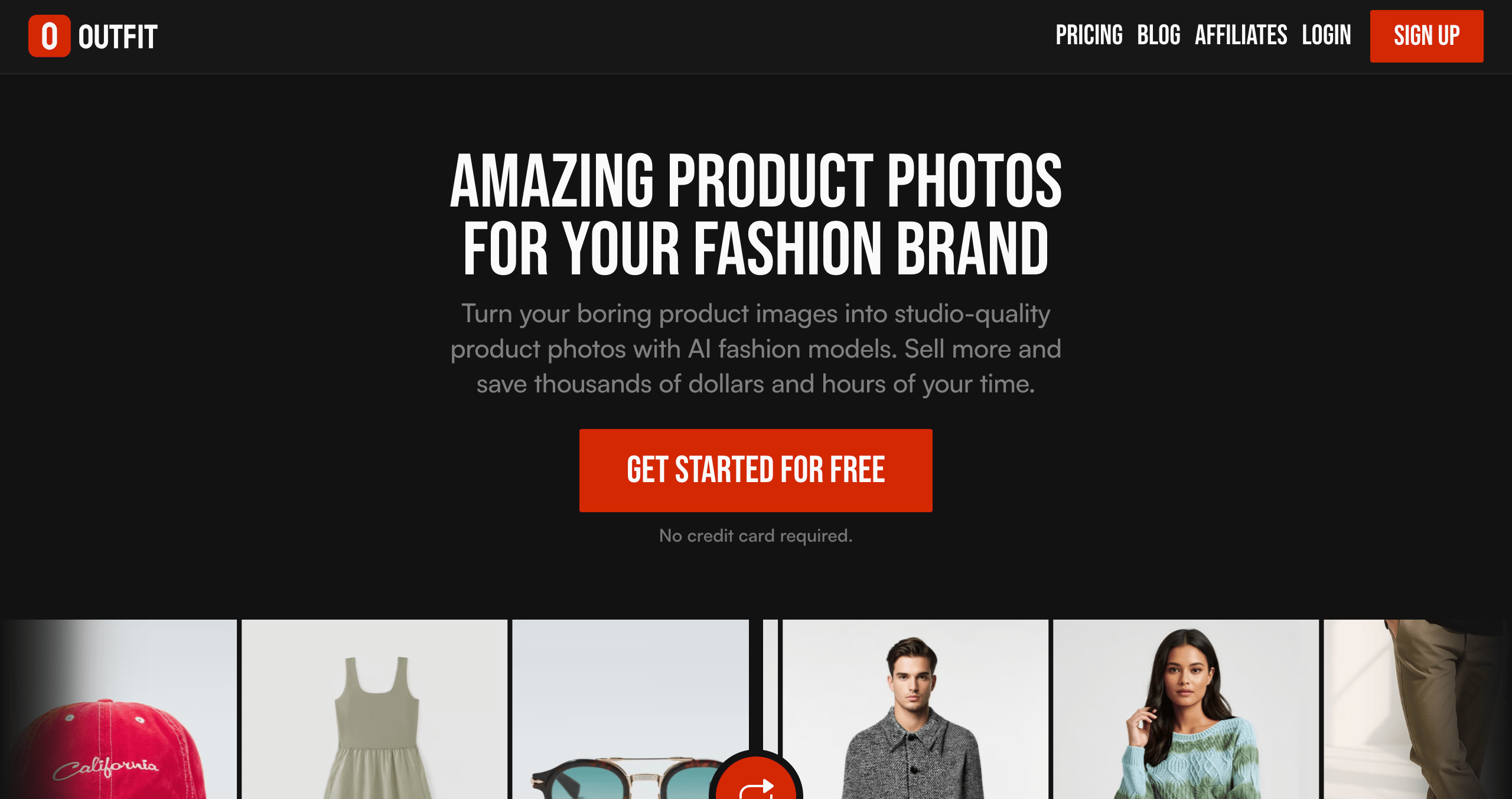
Tools like Outfit help brands keep that consistency. Instead of rethinking the look every time, the same visual style can be applied across different products and campaigns, using one clear direction.
Most teams still start with references and moodboards, often using platforms like Pinterest. But consistency comes from repeating the same visual choices not just collecting inspiration.
Layout & Spacing
Layout is the invisible structure behind your visuals. Spacing, alignment, and hierarchy affect how easy your content is to scan and understand.
When layouts stay consistent:
Content feels calmer
Messages land faster
The brand looks more intentional
Even simple rules like where text sits or how much space surrounds a product can make a big difference when repeated over time.
Why these elements work best together
Each element on its own is helpful, but the real strength comes from using them together as a system. Colors support typography, typography supports imagery, and layout ties everything together.
When brands treat these elements as a connected system, creating new content becomes faster and easier even as output increases. That’s also why having a visual system matters more than individual perfect designs.
How to create your brand’s visual language
Building a visual language doesn’t mean writing a long brand book or locking yourself into strict rules. It’s about making a few clear decisions then repeating them consistently.
Here’s a simple way to do it.
1. Define your brand identity
Before choosing colors or visuals, take a step back and define what your brand should feel like.
Is it calm or energetic? Premium or playful? Minimal or expressive?
This step sets the tone for everything that follows. When the brand’s feeling isn’t clear, visual decisions often become inconsistent and scattered. But when that foundation is defined early, every design choice from imagery to layout becomes easier, faster, and more aligned.
2. Choose your key visual elements
Once the identity is clear, pick a small set of elements you’ll keep coming back to:
A main color palette
One or two fonts
A clear photography style
You don’t need many options, fewer choices usually lead to stronger consistency.
This is where brands often realize that imagery needs the most control, especially when producing content at scale. Having a repeatable photography style makes everything easier later.
3. Create simple guidelines
Think of guidelines as guardrails, not restrictions.
You don’t need a 50-page document. A few clear examples can be enough:
Which colors to use most
How products are usually framed
What type of backgrounds feel “on brand”
These references help keep visuals aligned, even when different people are creating content.
4. Use templates and examples
Templates are what turn visual language into something usable, whether it’s social posts, product images, or campaigns, having examples speeds everything up and reduces guesswork. This is especially helpful when using tools like Outfit, where a single visual direction can be reused across multiple products without starting from scratch each time.
5. Share it with your team
A visual language only works if everyone understands it.
Designers, marketers, and content creators should all be aligned on what on brand looks like. Even a short shared reference goes a long way toward keeping things consistent.
Common mistakes brands make with visual language
Most brands don’t break their visual language on purpose, it usually happens slowly.
One of the most common mistakes is changing styles too often. New trends, new campaigns, new ideas and suddenly every piece of content looks like it belongs to a different brand. Even if each visual looks good on its own, the overall brand starts to feel unclear.
Another mistake is focusing on tools instead of systems. Using different designers, templates, or platforms without a shared visual direction often leads to inconsistency. The problem isn’t the tool, it’s the lack of a clear visual reference everyone can follow.
Many brands also confuse creativity with constant change. In reality, strong brands repeat the same visual decisions over time and only evolve them gradually. When everything changes at once, recognition resets instead of growing.
This is something we often see when brands create visuals without a clear photoshoot structure, as discussed in 5 AI photoshoot modes every brand should use with Outfit. Without choosing the right mode for the right purpose, visuals can quickly lose focus and consistency.
The good news? Most of these mistakes are easy to fix once the visual language is defined and shared. A few clear decisions go a long way.
Brands that nailed their visual language
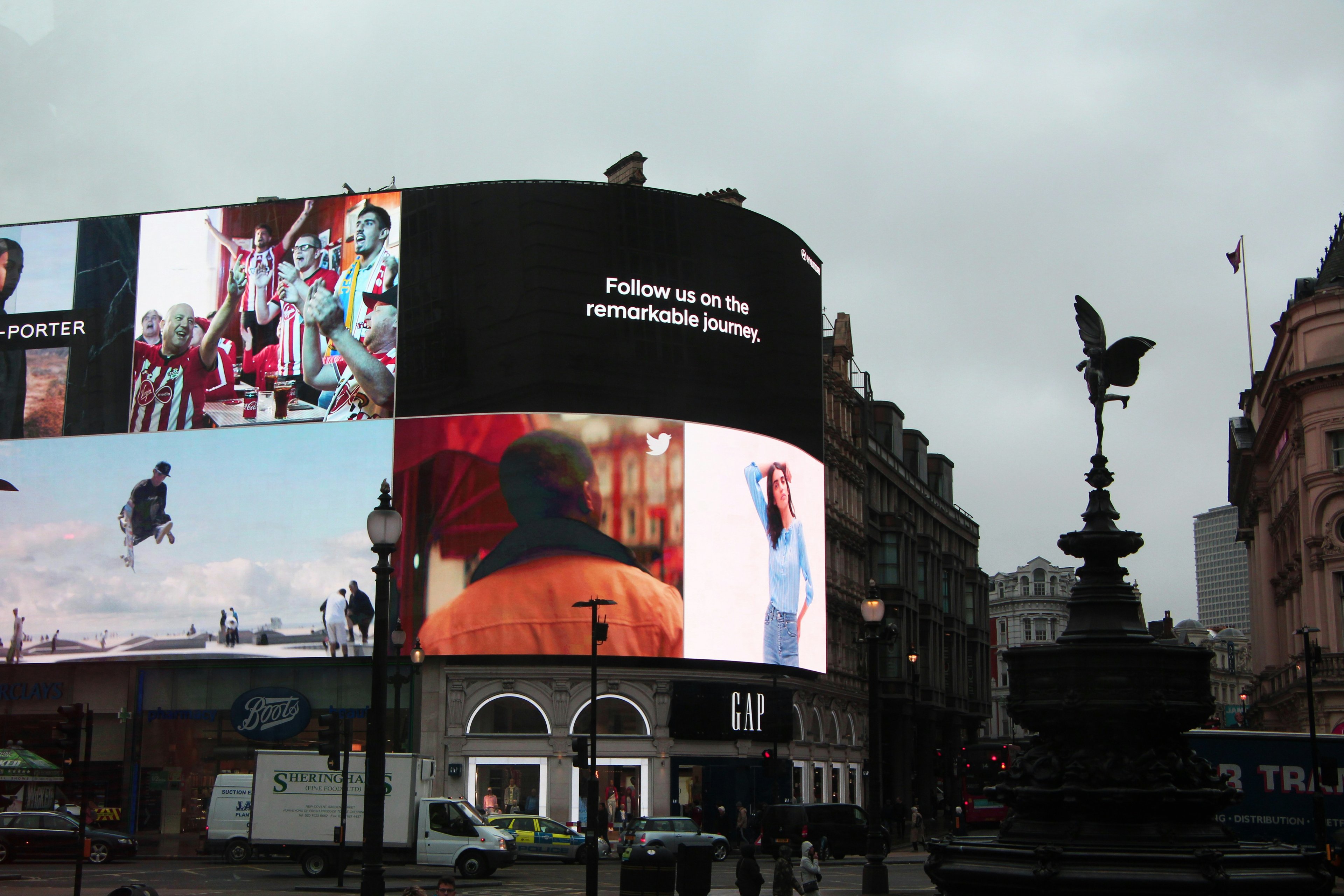
Some brands are instantly recognizable even without a logo. That’s usually a sign of a strong visual language that’s been applied consistently over time.
Take Starbucks as an example. Their visual language goes beyond the green logo. Warm tones, familiar layouts, and lifestyle-focused imagery all work together to communicate comfort and community. Whether you’re inside a store, scrolling past an ad, or holding a cup, the experience feels connected.

Then there’s Apple. Apple’s visual language is built on simplicity. Clean layouts, minimal colors, and carefully framed product visuals make their content feel premium and intentional. Even when the product changes, the visual language stays the same and that’s what makes it recognizable.
Another strong example is Red Bull. Their visuals are bold, dynamic, and full of movement. High-contrast imagery and action-driven scenes reflect energy and adventure, perfectly matching their brand personality. No matter where you see their content, it feels unmistakably Red Bull.

What all these brands have in common isn’t just good design it’s consistency. They chose a clear visual direction early on and stuck with it. Over time, that repetition turned their visuals into a language people instantly understand.
Final houghts
A consistent visual language isn’t about strict rules or perfect design. It’s about clarity.
When your brand looks and feels the same across different touchpoints, people start to recognize it faster and trust it more. Over time, that consistency turns into familiarity and familiarity is what makes brands memorable.
The strongest brands don’t change their visual direction every time they create something new. They build a clear system, repeat it, and let it evolve naturally as they grow. This makes creating content easier, faster, and more confident even when teams expand or tools change.
In the end, visual language is a long-term asset. When it’s clear and consistent, every new visual strengthens the brand instead of starting from scratch