The Biggest Product Image Mistakes New Brands Make
Most new brands lose sales because of product image mistakes they don't even know they're making. Here are the 7 biggest ones and how to fix them.
Your product image is your first impression and on the internet, first impressions happen in under 50 milliseconds.
Before a customer reads your description, checks your price, or looks at your reviews, they've already judged your brand. And that judgment? It came from your photos.
The problem is, most new brands don't realize they're making critical image mistakes until it's too late after the ad spend, after the launch, after the poor conversion rates start piling up.
Great product photography isn't just about having a good camera or a clean background. It's about understanding what makes a shopper stop scrolling, trust what they see, and actually buy.
In this guide, we're breaking down the 7 biggest product image mistakes new brands make and exactly how to fix them.
Mistake #1: the wrong background
Just use a white background. Sounds easy but most new brands get this wrong.
They shoot on an almost white background. Slightly grey. Slightly warm. Slightly off. And that small difference? It makes the whole brand look cheap.
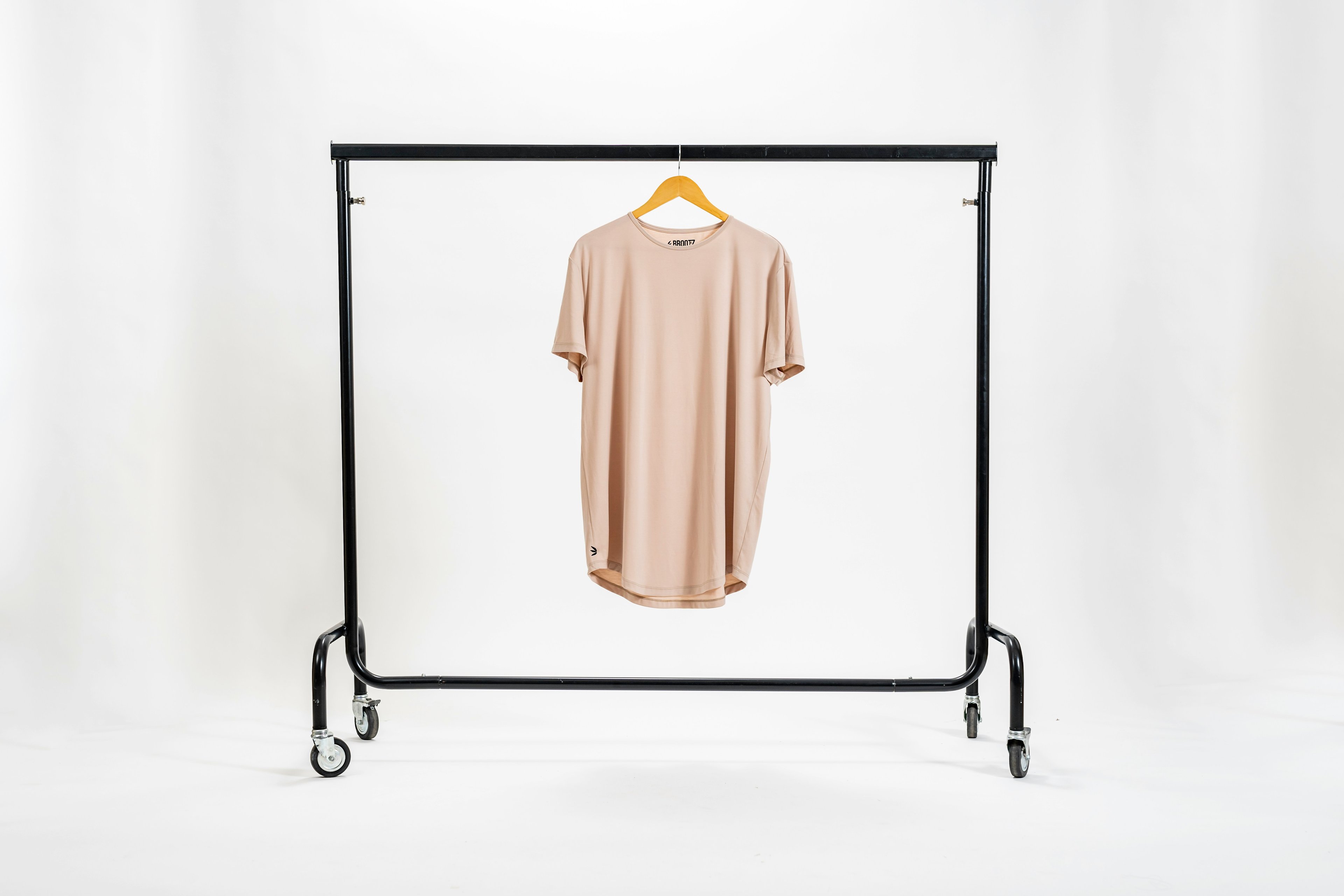
It goes beyond aesthetics too. Most major platforms require a pure white background RGB 255, 255, 255. Anything less and your listing looks off compared to every competitor who got it right.
Same thing with color. Wrong lighting = wrong colors in the photo = customers receiving something that looks nothing like what they ordered. That's a return. That's a bad review. That's a lost customer.
The fix: Pure white background for your main image, always. And make sure your lighting shows your product's true colors not a filtered version of them.
Mistake #2: low resolution images
Blurry photos don't sell. It's that simple.
A customer can't buy what they can't see clearly. If they can't zoom in on the fabric, the stitching, the details, they'll just move on to a brand that lets them.
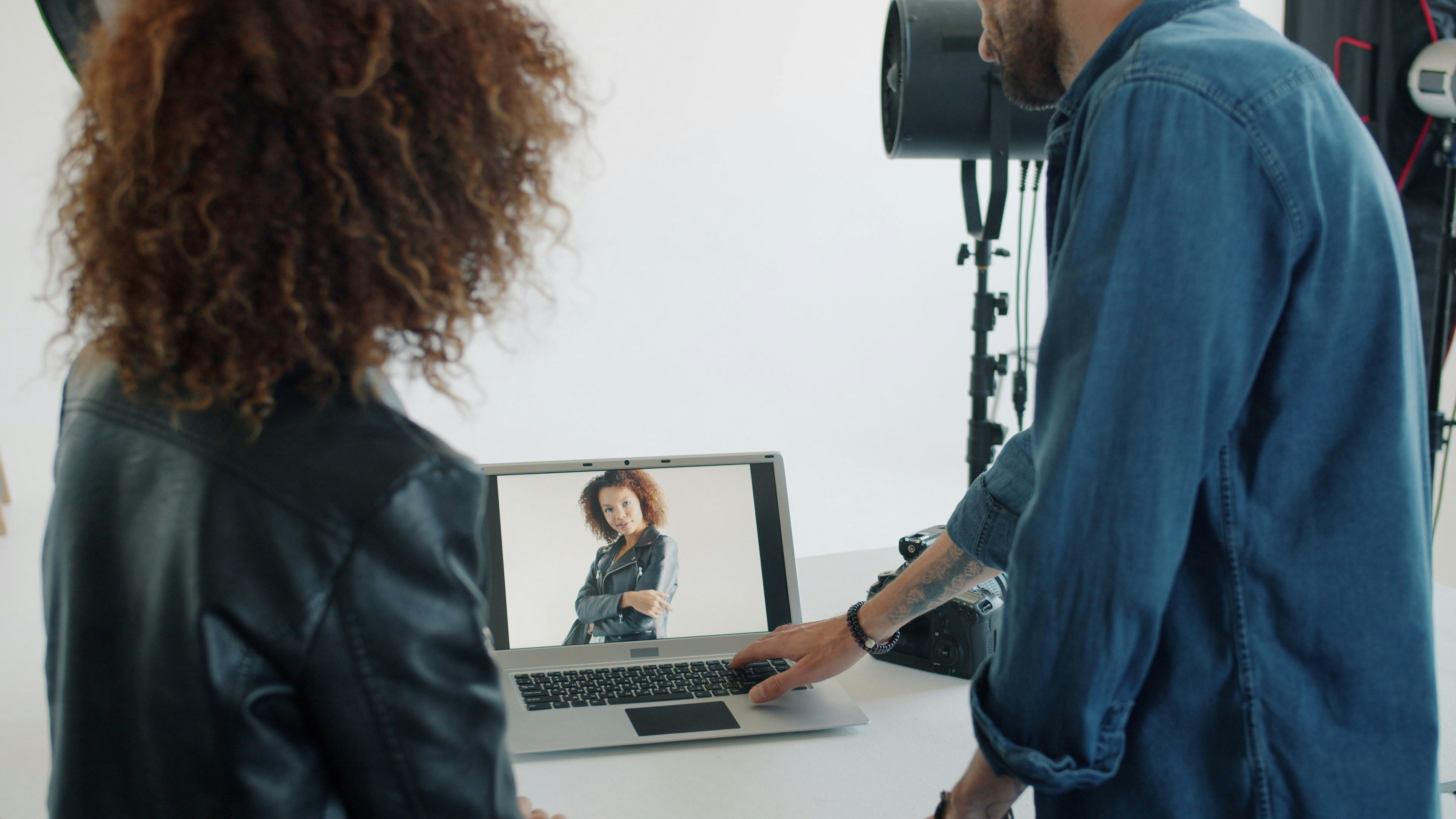
Products with high-resolution images see a 33% higher conversion rate than those with low-quality visuals. That's not a minor upgrade that's the difference between a brand that converts and one that doesn't.
The fix isn't complicated. Shoot at the highest resolution your camera allows. Don't over-compress when exporting. And always aim for at least 2000 x 2000 pixels before you upload anywhere.
The fix: High res in, high res out. If your images still look off, here are 7 simple ways to enhance them.
Mistake #3: bad angles & positioning
The angle you shoot from matters more than most brands think.
A shot from the wrong angle makes a great product look forgettable. Too far away and the product gets lost. Too close and you lose context. Slightly tilted for no reason and the whole thing looks rushed.
Your product should fill at least 85% of the frame especially on your main image. Anything less and it disappears on mobile screens.
The fix: Center your product. Fill the frame. Pick angles that show what makes your product worth buying. The best brands treat every shot as a deliberate decision not an afterthought.
Mistake #4: showing only one view
One photo is never enough, your customer can't touch the product. Can't feel the fabric. Can't flip it over. All they have is what you show them and if you only show them one angle, you're leaving way too much to their imagination.
60% of shoppers want to see 3 to 4 or more images before making a purchase decision.One photo doesn't build confidence. It builds doubt.
Show the front. The back. The details. The texture. How it looks on. How it fits in real life. Every extra image you add is another reason for your customer to stay on the page instead of leaving.
The fix: Aim for at least 5 images per product. Cover every angle that answers a question your customer might have before they decide to buy.
Mistake #5: too much visual clutter
Some brands think more props = more personality. It doesn't.
When you surround your product with too many objects, the customer's eye doesn't know where to go. They get distracted. They lose focus on the actual thing you're trying to sell.

Oversized props make your product look smaller than it is. Mismatched objects confuse the story. A busy background competes with the product instead of supporting it.
Your product should always be the loudest thing in the frame. Everything else is just supporting cast and supporting cast shouldn't steal the show.
The fix: Less is more. If a prop doesn't add context or help the customer understand the product better, remove it. Keep it clean. Keep it intentional.
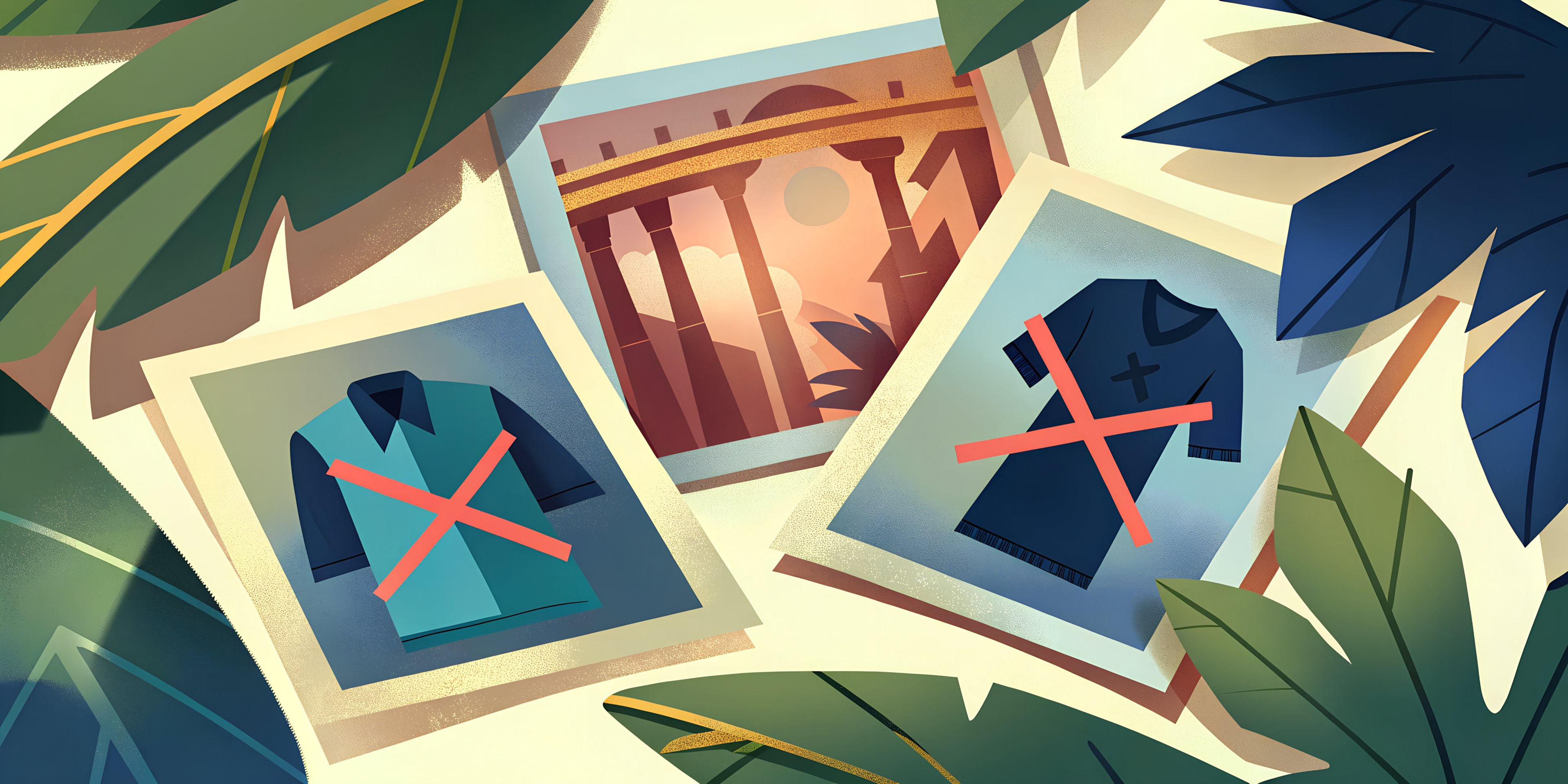
Mistake #6: not knowing your audience
You can have perfect lighting, clean background, and great angles and still get zero sales.
Because if your images aren't speaking to the right person, none of the technical stuff matters.

A brand targeting Gen Z needs a completely different visual language than one targeting women over 40. Different colors. Different settings. Different energy. What feels premium to one audience feels cold to another. What feels fun to one feels unprofessional to another.
Most new brands skip this step entirely. They focus on making the photo look good without asking: good to who?
The fix: Before you shoot a single photo, get clear on who you're selling to. Study what they respond to. Look at the brands they already buy from. Then build your visual identity around that not around what you personally think looks nice.
Mistake #7: no clear strategy
Most new brands treat product photography as a one-time task. Shoot the photos, upload them, move on.
But without a clear strategy, every photoshoot starts from zero. Different styles. Different lighting. Different energy. Nothing feels cohesive and inconsistency is one of the fastest ways to lose customer trust.
Inconsistent or low-quality images can make even the best products seem questionable. Your visuals are your brand's first impression across every platform, they need to tell the same story every time.
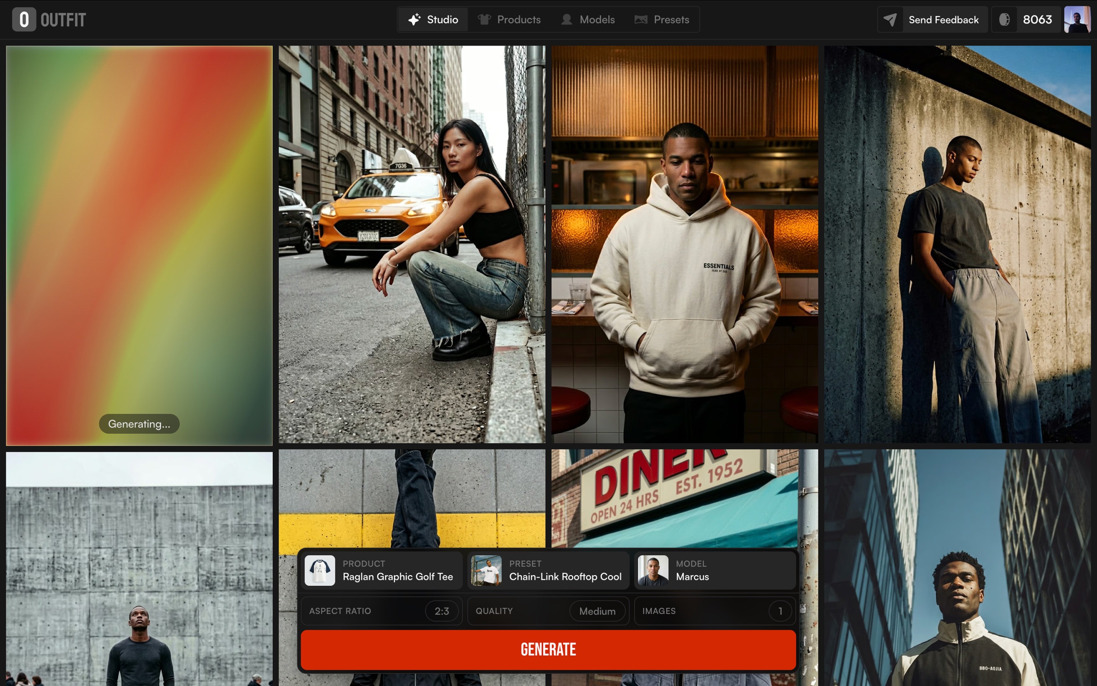
The brands that win aren't just taking better photos. They're building a repeatable system. Same style. Same tone. Same approach every single time.
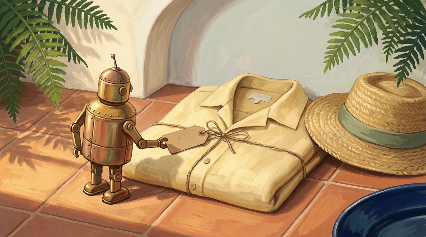
The fix: Treat your visuals like a system, not a task. Define your style early, stick to it, and build on it. AI tools can help you create consistent, professional images at scale without starting over every time.
Final thoughts
Product images aren't just photos. They're your storefront, your salesperson, and your brand's first impression all in one.
The brands that grow aren't always the ones with the best products. They're the ones that know how to show them.
Fixing these 7 mistakes won't just make your photos look better. It'll make your customers trust you faster, stay on your page longer, and buy with more confidence.
The good news? You don't need a big budget or a professional studio to get it right. You just need to be intentional and have the right tools to back you up.