Building a Fashion Brand Identity Without a Creative Director
Learn how to build a fashion brand identity without a creative director. Discover practical steps, visual direction tips, and tools to create a consistent, recognizable brand.
Not every fashion brand has a creative director, most founders are making visual decisions on their own. They choose colors, approve photos, and define the overall look without a design background. That’s why building a consistent visual language early becomes essential, especially when product images and brand content need to feel like they belong to the same world, not random posts.
Today, business owners rely more on AI tools and simple frameworks to build that consistency without hiring a full team. From automated mockups to AI-generated photoshoots, these tools help founders create cohesive visuals faster while keeping the brand recognizable, which is the same principle behind strong brand identity systems that focus on clarity, repetition, and visual direction instead of complex design processes.
Identity Before Product
Before customers understand your designs, they react to how your brand looks. The styling, color palette, and photography create an instant perception premium, street, minimal, or chaotic. This happens in seconds, which means your identity is doing the talking before your product ever does. When brands skip this step, their visuals feel random, and even strong pieces lose impact.
For founders without a creative director, this usually turns into guessing. One shoot looks clean, the next looks bold, then another follows a completely different trend. The result? A feed that looks like three different brands sharing one account one of the most common mistakes fashion brands make online. Defining a clear visual language early removes that confusion and helps every decision from backgrounds to model styling feel intentional and connected.
4 elements every fashion brand identity needs
A logo alone doesn't build recognition. What makes a brand feel coherent and worth remembering comes down to four elements.
1. The Feeling You Leave Behind
Every moment someone has with your brand adds up, the first post, the website, the packaging. Sandy Liang didn't just build a clothing brand. She built a world people wanted to belong to. That's what consistent brand experience looks like.
Start with three words that describe your brand personality. Make them specific. Then apply them to every touchpoint, every time.
2. A powerful online presence
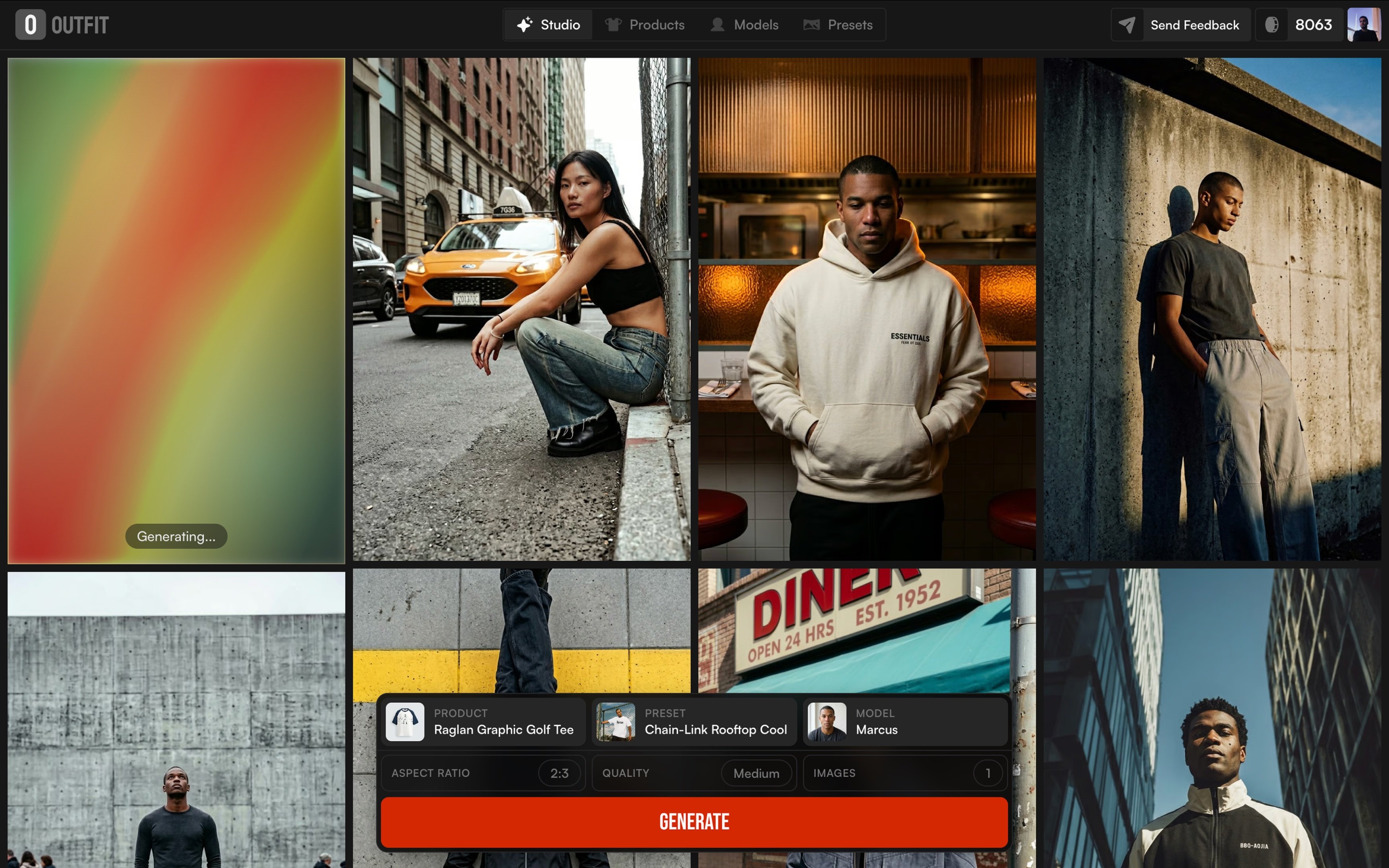
Your site should communicate who you are in under five seconds. Your product images are searchable assets, they get indexed and shared. Brands using AI fashion photography maintain visual consistency across every product page without repeated studio costs.
3. PR & Credibility
Five targeted pitches beat fifty generic ones. Have a media kit ready, brand story, aesthetic, and images editors can use. When it comes to influencers, micro consistently outperforms macro for new brands.
4. Follow Trends. Don't Become One.
Keep 70% of your content rooted in your core identity, 20% responding to what's relevant now, 10% experimental. Use Google Trends and Pinterest Predicts to spot what's building then speak to it in your own voice.
Why most fashion brands look forgettable
Scroll through any fashion discovery page and you'll notice something, most brands look like they could be the same brand. Same beige tones, same sans-serif logo, same flat-lay on a white surface.
It's not that any one of these choices is wrong. It's that they were made without intention copied from what looks like a brand rather than built from what this brand actually is.
Three patterns that make brands forgettable:
No clear visual direction
When your feed shifts from dark editorial to bright lifestyle to plain white product shots, customers can't build a mental picture of who you are. Inconsistent visuals don't just look messy, they signal that the brand doesn't have a point of view.
Weak product imagery
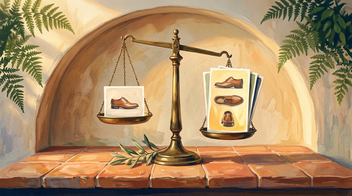
This is the one that kills credibility fastest. The most common product image mistakes aren't about quality, they're about consistency. Mixed lighting, mixed backgrounds, mixed styling all work against you.
Copying competitors
If your inspiration board looks exactly like your competitor's Instagram, you're building their brand recognition, not yours.
A brand identity formula for non-designers
You don't need a design degree. You need a framework.
STEP 1: identify your visual keywords.
Before opening Canva or talking to a designer, write down five words that describe how you want your brand to look. Not feel look. Washed, architectural, warm, sharp, raw. These words are your brief.
STEP 2: Create a simple logo.
The best fashion logos are often the most restrained. A well-chosen typeface, set cleanly, beats a complicated mark every time. Tools like Canva or Adobe Express let you test options quickly. Don't over-engineer it.
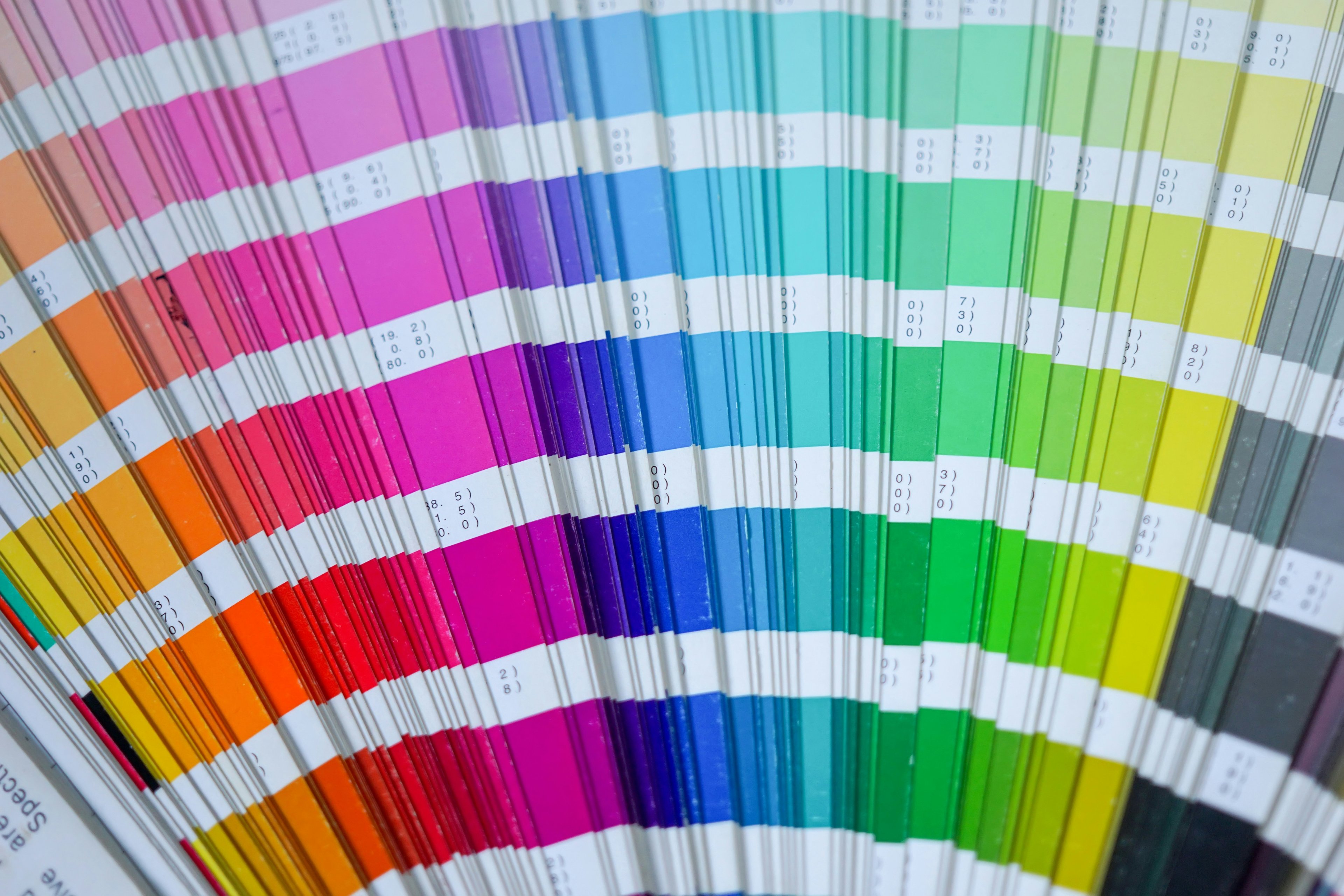
STEP 3: Choose brand colors
Pick two to three colors maximum. Know why you chose them not just that they look good together, but what they say. Earthy terracotta reads differently than icy sage. Your palette is a statement.
STEP 4: Pick brand fonts
One display font for headlines, one clean font for body text. That's it. Consistency in typography does more for brand recognition than almost any other single design decision.
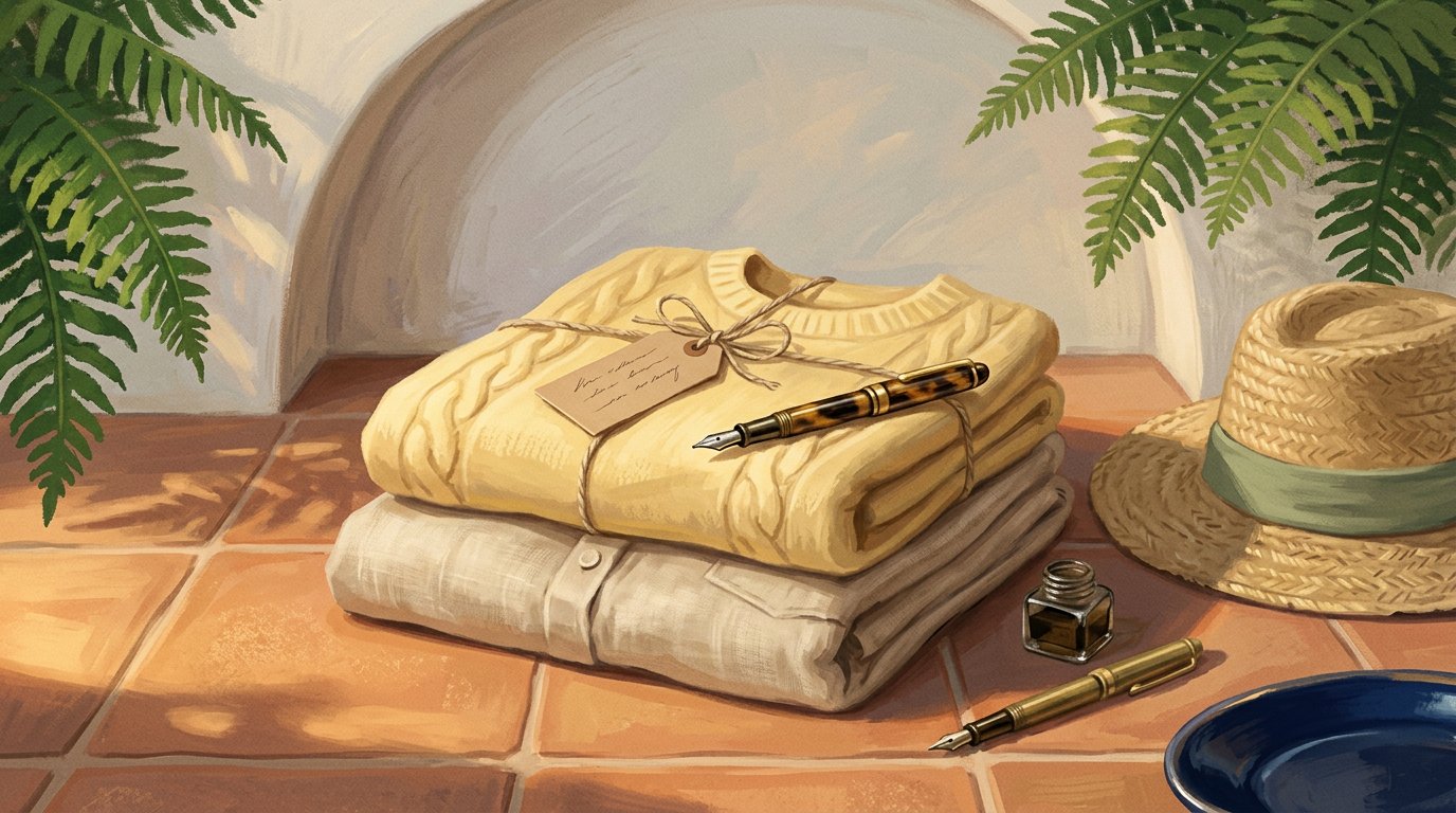
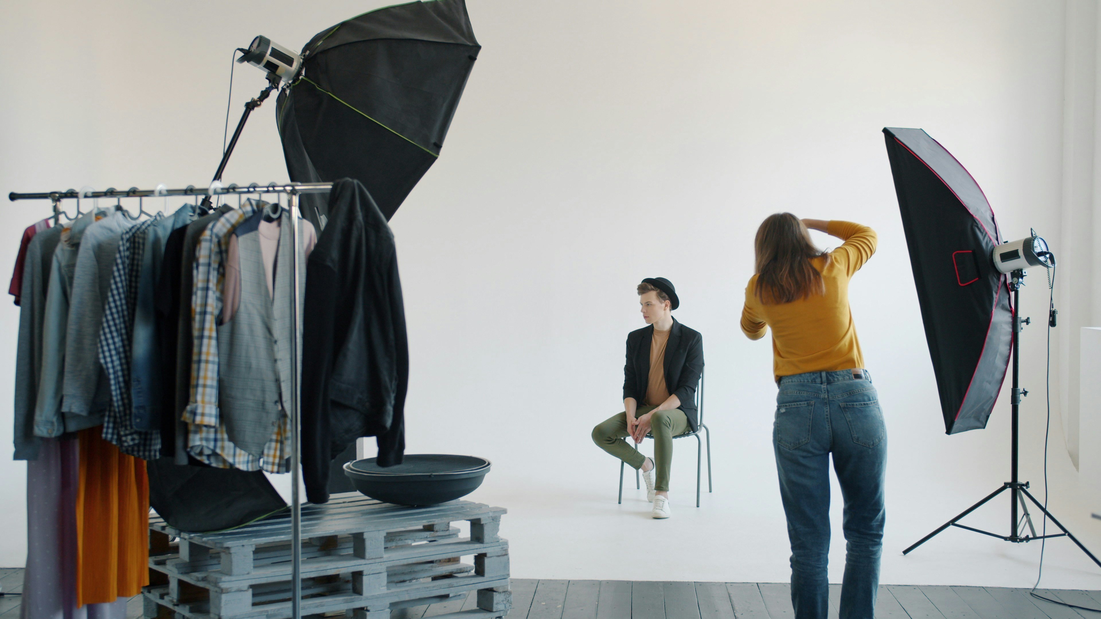
Your brand look starts with your photos
Your brand identity isn’t built by a logo alone, it’s shaped by how your products appear visually. The background, lighting, styling, and model choice all create a specific mood. A clean studio shot tells a different story than a street-style photo, even when the product is identical. When brands mix different styles, the result feels inconsistent and harder to recognize.
For founders without a creative director, sticking to one photography style makes branding decisions much easier. When every image follows the same mood, the brand starts to feel intentional and cohesive, helping customers quickly recognize it across platforms.
How to create your fashion brand identity
Most brands start with visuals. The smarter move is to start with strategy.

1. Structure the brand strategy first
Who are you, what do you stand for, and what do you want to be known for in three years? These questions come before any logo or color palette.
2. Understand how your brand is actually perceived
Show your current visuals to people outside your circle. What words do they use? Is that the brand you intended? There's often a gap and closing it is the real work.
3. Know exactly who you're selling to
Not women 25–35 who like fashion. Go narrower. The more specific your customer, the sharper your identity can be. The brands that stand out are never trying to speak to everyone.
4. Design your visuals from the strategy outward.
Logo, colors, fonts, photography style every decision should trace back to your brand personality and your customer. Design choices made in isolation create incoherence.
5. Create a brand identity style guide
Even a single page. Logo usage, color codes, font names, photography direction, tone of voice. This document means every piece of content whether made by you or a collaborator stays recognizably yours.
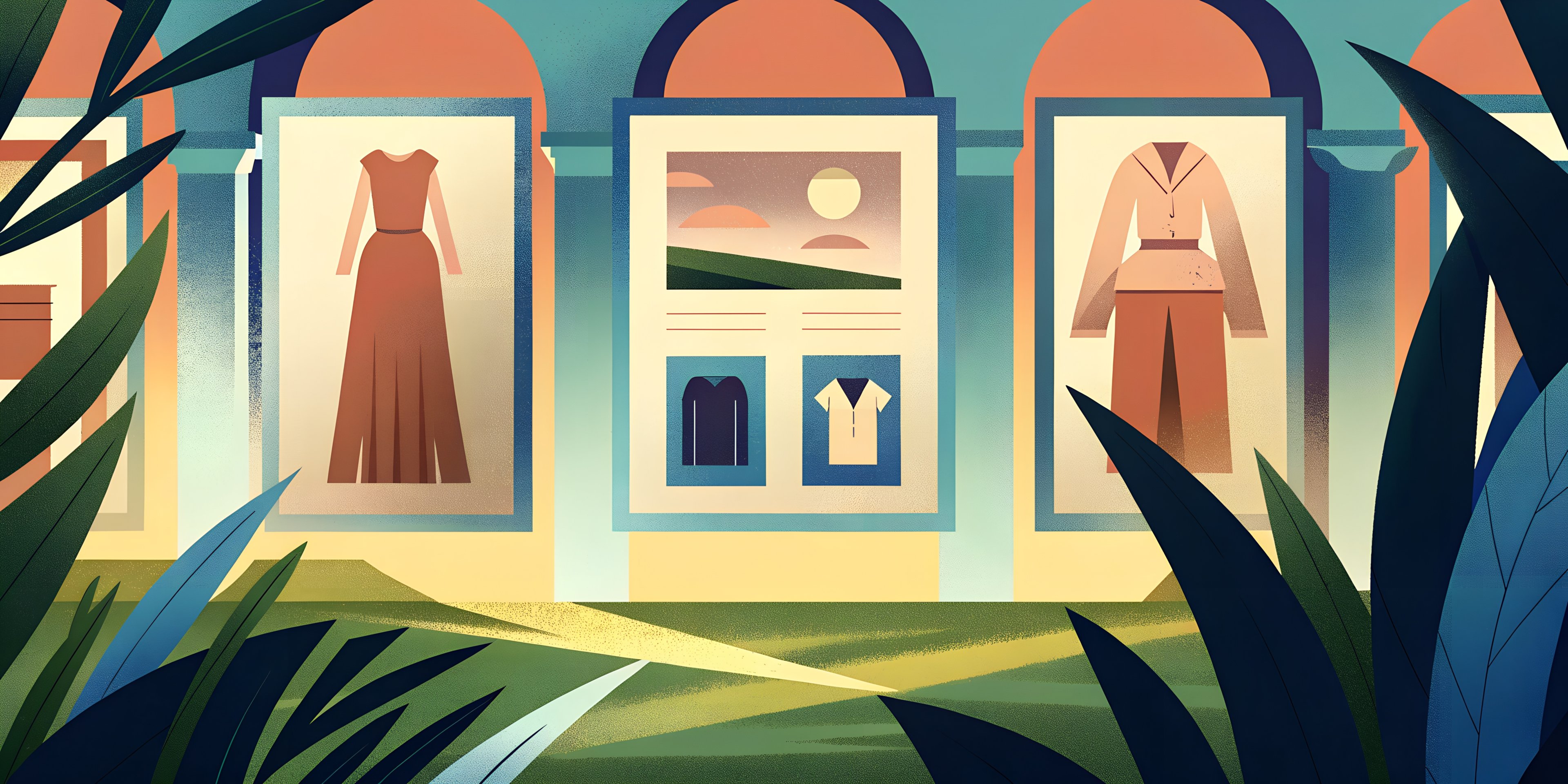
One product, multiple brand identities
Take one core piece, a white oversized shirt. Now imagine how four different brands would shoot it.
Brand A: minimalist studio, clean light, no styling.
Brand B: editorial, golden hour, layered and structured.
Brand C: lifestyle, morning light, casual and lived-in.
Brand D: high-fashion, dramatic shadow, black and white.
Same shirt. Four completely different worlds. Four completely different customers.
Your identity decides which world you live in. And once you choose, everything the photos, the captions, the platform, and the people you collaborate with should follow the same visual design direction. That's not a limitation. That's how a brand becomes recognizable.
Common brand identity mistakes to avoid
Most brand identity problems don't come from bad taste. They come from inconsistency.
Too many colors
A five-color palette doesn't feel rich, it feels unresolved. Pick two or three and stay there.
Random fonts
Every time you use a font outside your system, you're quietly eroding recognition. It's one of the most overlooked reasons a brand feels off even when the product is strong.
Mixed photo styles
Your feed is a first impression. If it looks like three different brands sharing one account, no one knows what you are and they won't stick around to figure it out.
Copying competitors
Inspiration is necessary. Imitation is a dead end. You'll always be the second version of someone else and customers can feel that, even when they can't explain why.
Conclusion
Building a fashion brand identity without a creative director is completely possible. What matters most is choosing a clear direction and sticking to it. When colors, styling, and product visuals follow the same approach, even small collections start to feel intentional and structured.
The strongest brands aren’t always the most complex، they’re the most consistent. Define your look, repeat it across every touchpoint, and let your visuals do the heavy lifting. Over time, that consistency turns simple products into a recognizable brand.