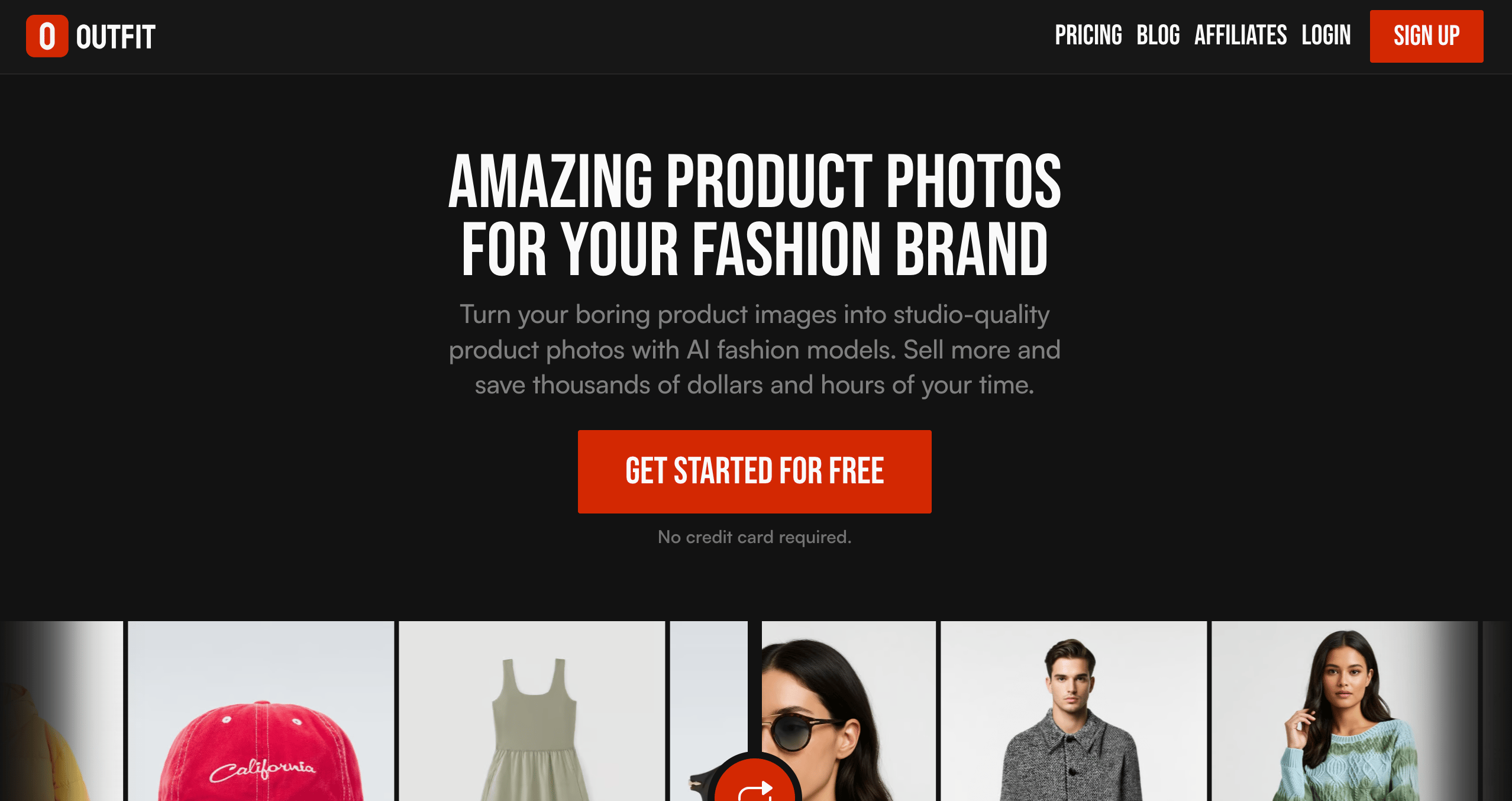
New in Outfit: Backgrounds That Feel Real
Discover how the right backgrounds help product photos feel more natural, consistent, and easier to trust, with Outfit’s curated background library.
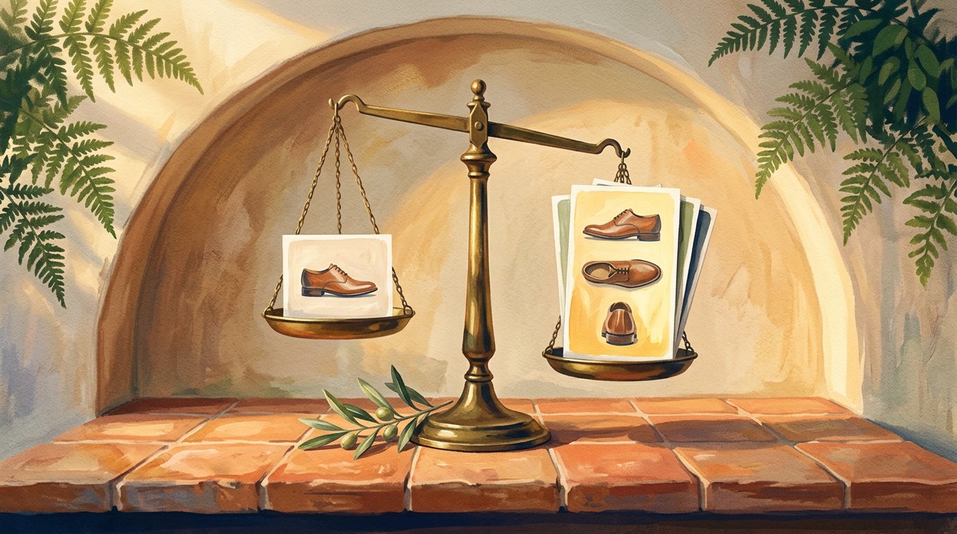
Most product photos don’t miss the mark because of lighting or quality.
They miss because the product feels out of place.
The background plays a bigger role than we usually admit. It quietly sets the mood, shapes first impressions, and helps people imagine how a product fits into their everyday life. That’s why outfit introduced a curated library of realistic backgrounds to help brands place products in settings that feel natural, familiar, and easy to trust.
Instead of guessing which background might work, brands can now choose from scenes that are designed around real use cases. It’s the same mindset behind maintaining a consistent visual language making sure every visual feels like it belongs to the same story, no matter where it shows up.
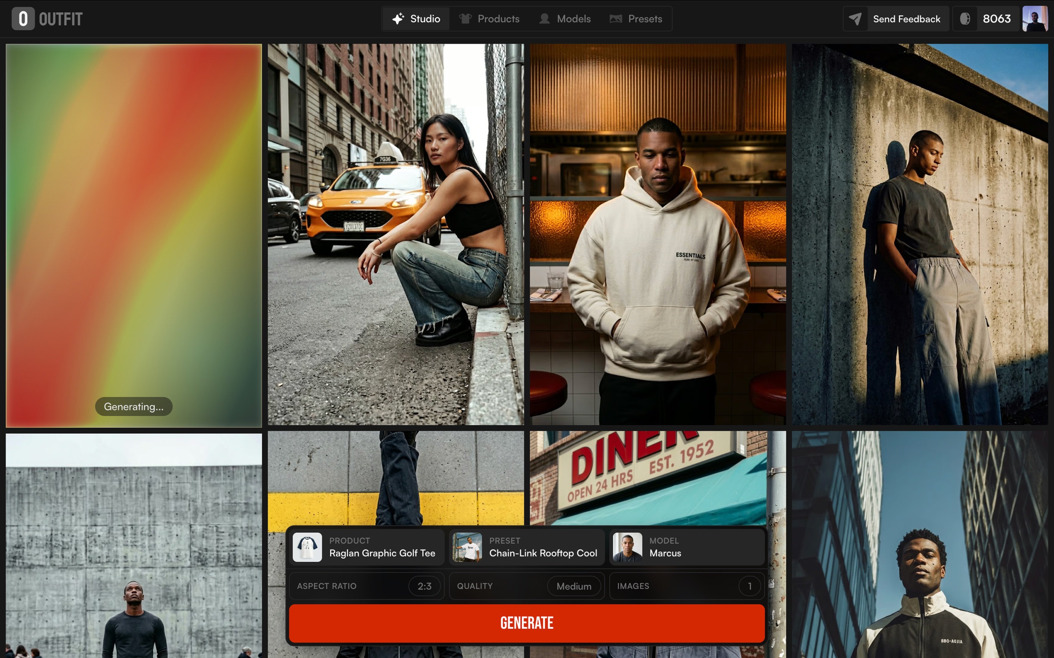
With this update, one product image can turn into multiple scene-ready visuals for product pages, ads, and social content, all within the same workflow brands already use when creating visuals with Outfit. The focus isn’t on creating more images, but on making it easier to choose the right ones.
Because at the end of the day, clear and believable product visuals are what help people feel confident clicking buy, a principle that’s been echoed across modern e-commerce best practices for years.
Why backgrounds matter more than people think
When someone looks at a product photo, they don’t consciously analyze the background but they feel it. A clean, well-chosen setting makes a product feel clear and trustworthy. A confusing or mismatched one does the opposite, even if the product itself is great.
That’s why backgrounds play a bigger role in buying decisions than we usually realize. In e-commerce, small visual cues often make the difference between scrolling past and stopping to look closer. Studies around product imagery and online shopping behavior consistently show that clear, realistic visuals help customers understand products faster and feel more confident about what they’re buying.
The challenge is that not every background works for every product. A white background might be perfect for clarity and comparison, while a textured surface or a real-life scene helps tell a story and add context. Using the wrong one doesn’t just look off, it can make a product feel cheaper, harder to understand, or out of place.
This is where many brands get stuck. They either overuse the same safe background everywhere or spend too much time experimenting with visuals that don’t scale. And over time, that inconsistency shows across product pages, ads, and social content.
If you’ve ever noticed how strong brands feel visually put together across platforms, it’s usually because they’ve thought carefully about these details. Backgrounds aren’t decoration; they’re part of the visual system that helps products feel familiar, reliable, and easy to choose.
Why the right background makes a product feel right?
Think about the product photos you instantly trust.
Most of the time, it’s not because they’re flashy, it’s because they make sense.
Big brands understand this really well. Apple almost always uses clean, simple backgrounds. Nothing competes with the product. It feels clear, calm, and confident. On the other hand, brands like Nike often place products in action-driven or lifestyle settings, helping you imagine movement, energy, and real use.
The background quietly tells you how to read the product.
A white surface says focus here.
A textured table says quality and detail.
A real-life scene says this belongs in your day.
When that background feels wrong, the product feels off, even if the product itself is great. And in online shopping, that small feeling matters. People scroll fast, and visuals do most of the explaining. That’s why brands that care about how their products are perceived put real thought into their settings, not just the product shot itself.
The problem is that choosing the right background usually takes time and experimentation. Many brands either reuse the same safe setup everywhere, or try random options that don’t always work across product pages, ads, and social.
That’s where an intentional approach makes the difference. Instead of asking Does this look okay?, the question becomes Does this feel right for this product?, a shift that helps visuals stay clear, consistent, and easier to trust.
Why random backgrounds rarely work
When brands rely on random backgrounds, the results are usually inconsistent. One image feels polished, the next feels off. Over time, that lack of cohesion becomes visible, especially when products appear across different pages and platforms.
You can see how intentional choices work with brands like IKEA, where products are always shown in settings that feel familiar and usable. Nothing looks accidental. The same applies to beauty brands like Glossier, where surfaces, lighting, and textures are repeated in a way that makes every product instantly recognizable.
For growing brands, achieving that level of consistency is often harder than it looks. Visuals need to work not just on one product page, but across ads, collections, and even different formats, something many teams struggle with when scaling content production. It’s a challenge we often see when brands start expanding their visual output across different product types and layouts.
That’s why narrowing visual choices can be so effective. Instead of starting from zero every time, brands benefit from working within a defined set of environments that already translate well across use cases similar to how mockups help teams preview products faster without rebuilding visuals from scratch, a concept explored across Outfit’s mockups experience.
This shift from experimenting endlessly to choosing from proven visual options helps brands move faster while keeping their visuals aligned, especially when content needs to scale week after week.
Meet the library: backgrounds you’ll actually use
Choosing a background shouldn’t interrupt your flow. You shouldn’t have to stop and overthink every visual decision just to move forward.
This library is built around simple, familiar settings. Clean backgrounds when you need clarity. Subtle textures when a product needs more presence. Softer scenes when visuals should feel warmer and more natural. Everything is there to support the product, not compete with it.
What really helps is knowing that these backgrounds are meant to keep working over time. As new options are added, they follow the same logic and quality so brands don’t have to adjust their process every time something changes, and can simply stay in sync with how Outfit evolves over time.
In the end, it’s less about choosing from endless options, and more about feeling confident that whatever you pick will still feel right.
Product in scene: when products feel real
Some product photos look clean, but still feel off.
That usually happens when the product feels like it’s floating.
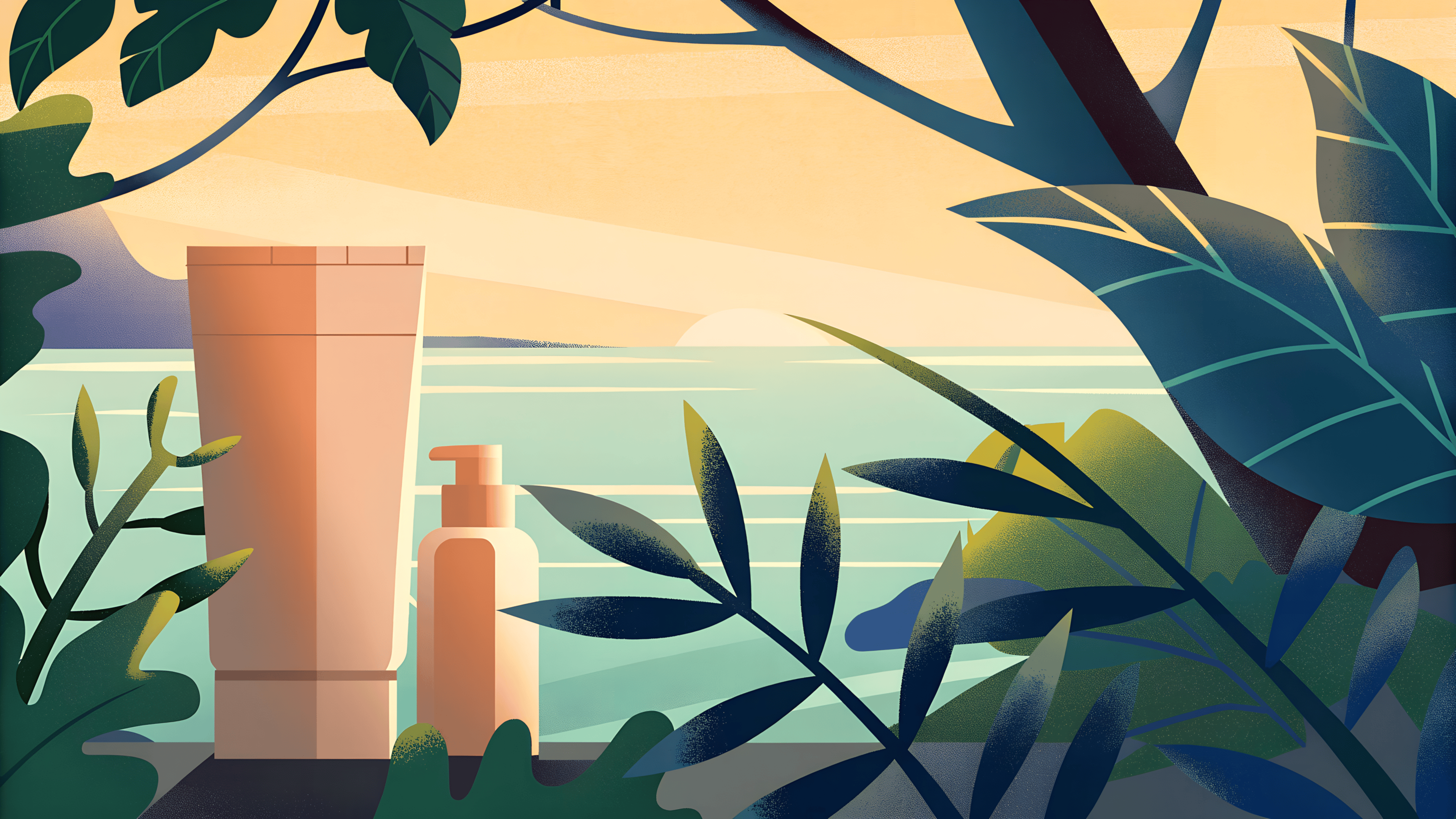
Placing a product in a simple scene fixes that. A bag on a chair. A candle on a table. A bottle next to a sink. Suddenly, the product feels real and easy to imagine in everyday life.
That’s why many brands show products in use or in place. The setting doesn’t need to be busy. It just needs to make sense. A little context helps people understand the product faster and feel more comfortable with it.
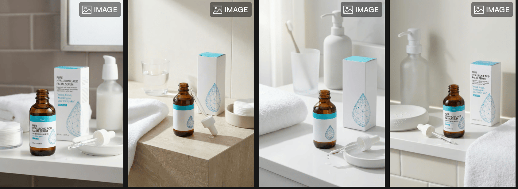
Product In Scene keeps things simple. The product stays the focus, while the scene quietly supports it. No heavy styling. No forced lifestyle shots. Just enough context to make the product feel grounded.
And because this works within the same flow brands already use to turn one upload into a complete photoshoot, it’s easy to move from clean shots to more contextual ones without extra effort.
When done right, the scene almost disappears and the product feels right where it is.
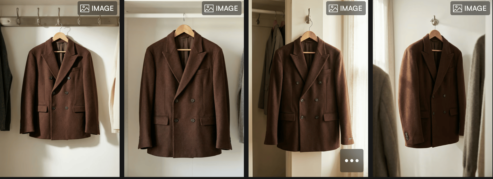
Put your product where it belongs
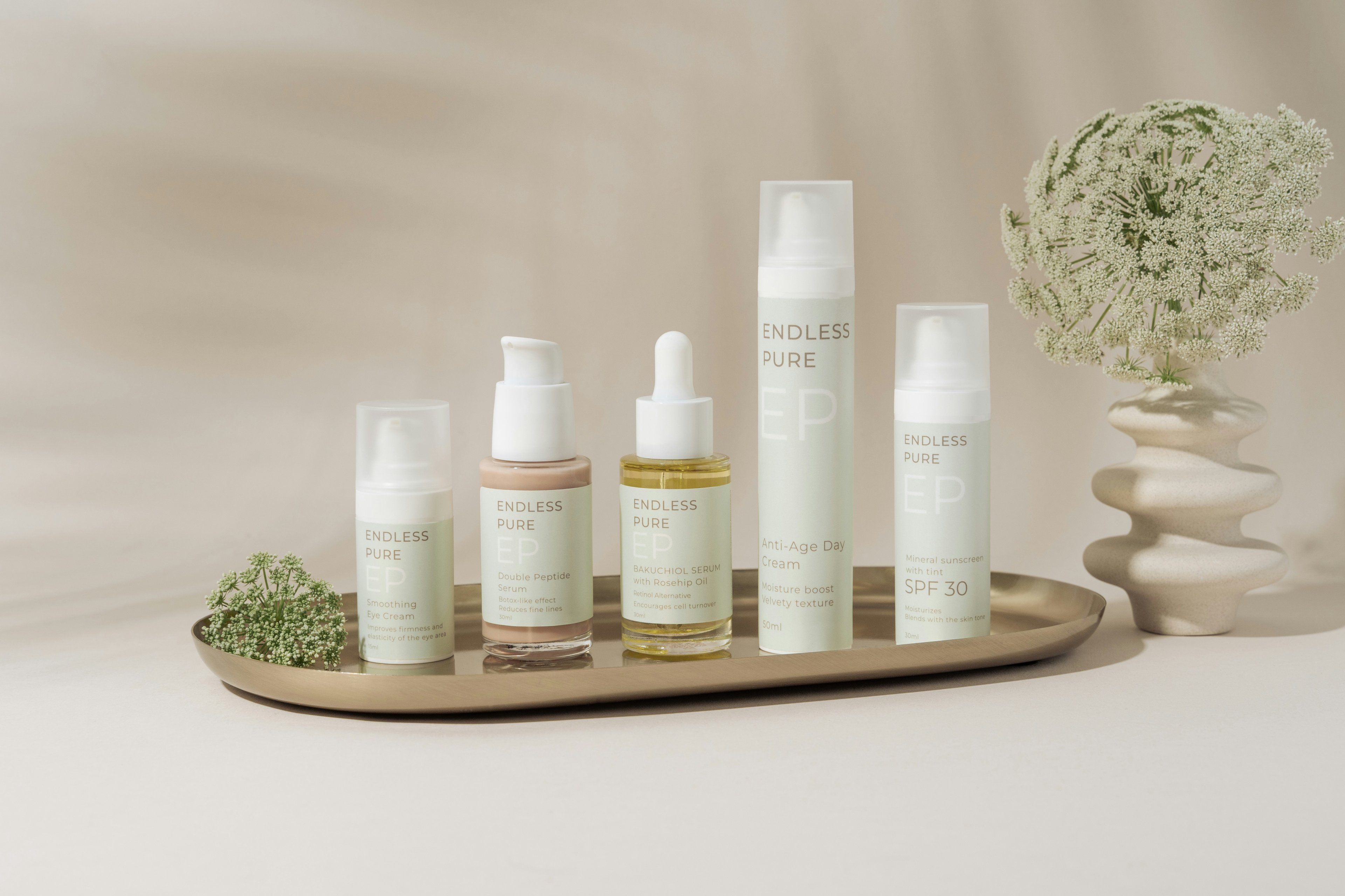
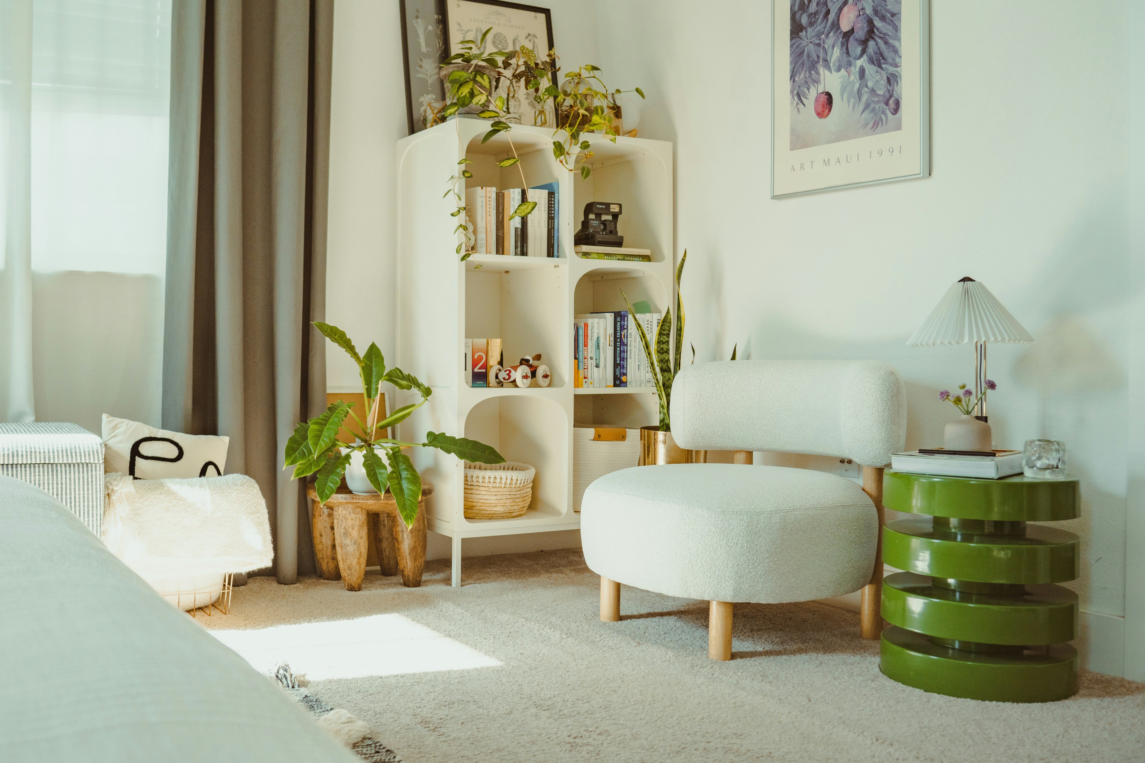
The same product can feel very different depending on where you place it.
A chair in an empty space feels generic.
The same chair next to a desk feels useful.
On its own, it’s just an object. In context, it becomes part of a routine.
That’s what this feature is about. It lets you place your product in settings that feel familiar and logical without turning the image into a busy lifestyle shot. A desk, a shelf, a table, a surface that makes sense. Nothing more than what’s needed.
This is especially helpful when you’re creating visuals for different moments. One version might work better for a product page. Another feels right for an ad. A third fits social content. The product stays the same, but the feeling changes slightly with the setting.
Instead of rebuilding visuals every time, you can adapt the same product image to different needs which is often how brands manage content efficiently when they’re planning campaigns or deciding what fits best within their available plans and usage needs.
At its best, this feature doesn’t add noise. It simply puts the product where it belongs so people understand it faster and trust it more.
Show what matters
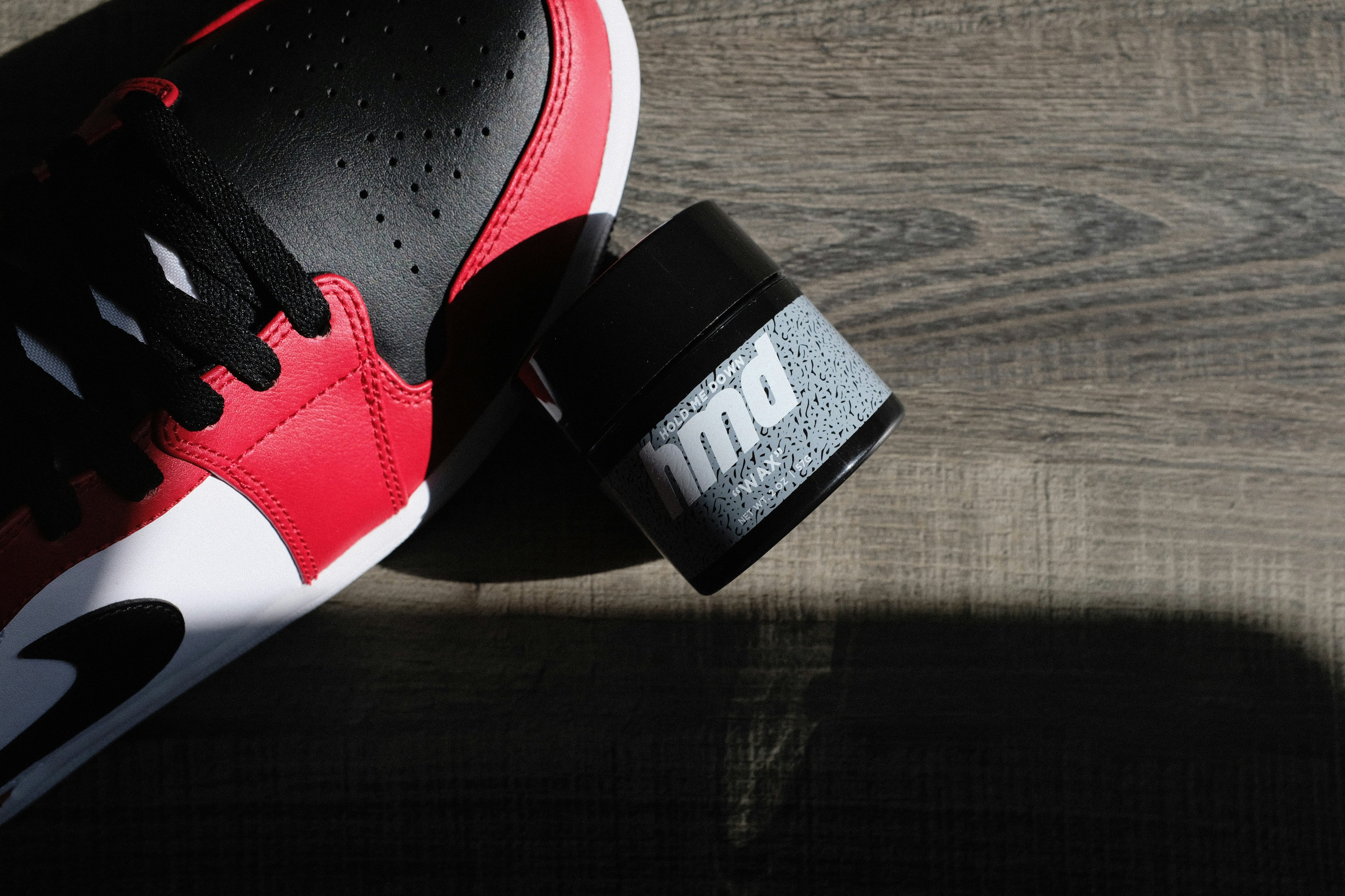
Sometimes, it’s the small details that make someone stop scrolling.
The texture of a fabric.
The finish on a surface.
The way light hits an edge or a label.
This feature is about giving those details space to show without over-styling the image. No dramatic setups. No heavy props. Just a clear focus on what actually matters in the product.
You’ll often see this approach used by brands like Apple, where close, simple shots help people understand quality and design without distraction. Beauty brands do the same when they show textures, packaging, or materials up close. The goal isn’t to impress, it’s to reassure.
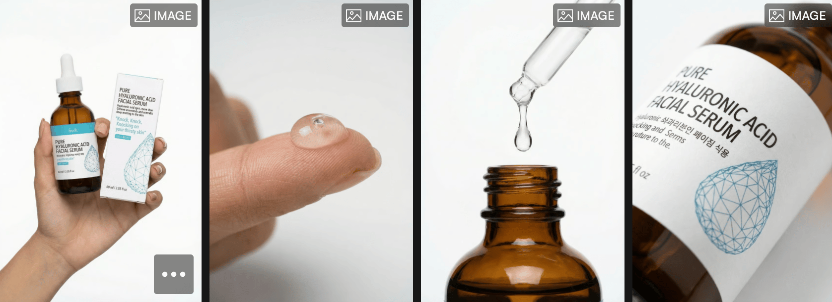
Show What Matters keeps visuals calm and intentional. The background stays quiet. The product stays clear. And the details speak for themselves.
This becomes especially useful when brands need visuals that work across different uses from product pages to ads without creating new assets every time, which is why many teams start thinking about what level of detail fits best within their pricing and usage plans as content production grows.
When details are clear, decisions feel easier. And when visuals feel easy, people are more likely to trust what they’re seeing.
A quick guide: choosing the right background
You don’t need to overthink backgrounds. A few simple rules usually do the job.
If the goal is clarity like product pages or marketplaces clean, simple backgrounds work best. They keep the focus where it should be and make products easy to scan and compare.
If you want the product to feel more premium, textured surfaces help. Wood, stone, fabric, or soft materials add depth without pulling attention away. This works well for fashion, accessories, beauty, and home products.
If the goal is connection especially for ads or social a light, real-life setting can help people imagine the product in their own space. A desk, a shelf, a table. Just enough context to make it feel familiar.
The key is matching the background to the moment, not using the same setup everywhere. That’s why having a small, well-chosen library makes decisions easier. Instead of asking What should I try?, the question becomes What fits this use? which is exactly how visuals are meant to work when creating content on Outfit.
When the background matches the purpose, the product doesn’t need to work as hard. It just feels right.
Why this changes how brands create product visuals?
Good product visuals aren’t about doing more work.
They’re about making better choices.
When the background feels right, the product feels easier to understand. When the scene makes sense, people don’t have to think twice. Everything just feels smoother for the brand and for the customer.
That’s what this update is really about. Making it easier to pick the right visual, faster. Letting one product image work across different needs without rebuilding everything from scratch.
With simple scenes, clear backgrounds, and familiar settings, Outfit helps brands create visuals that feel natural and consistent whether it’s for a product page, an ad, or a quick campaign.
As brands grow and create more content, having a setup like this becomes a practical choice especially when deciding what fits best within their pricing and usage needs.
In the end, when visuals are easy to choose, everything else becomes easier too.