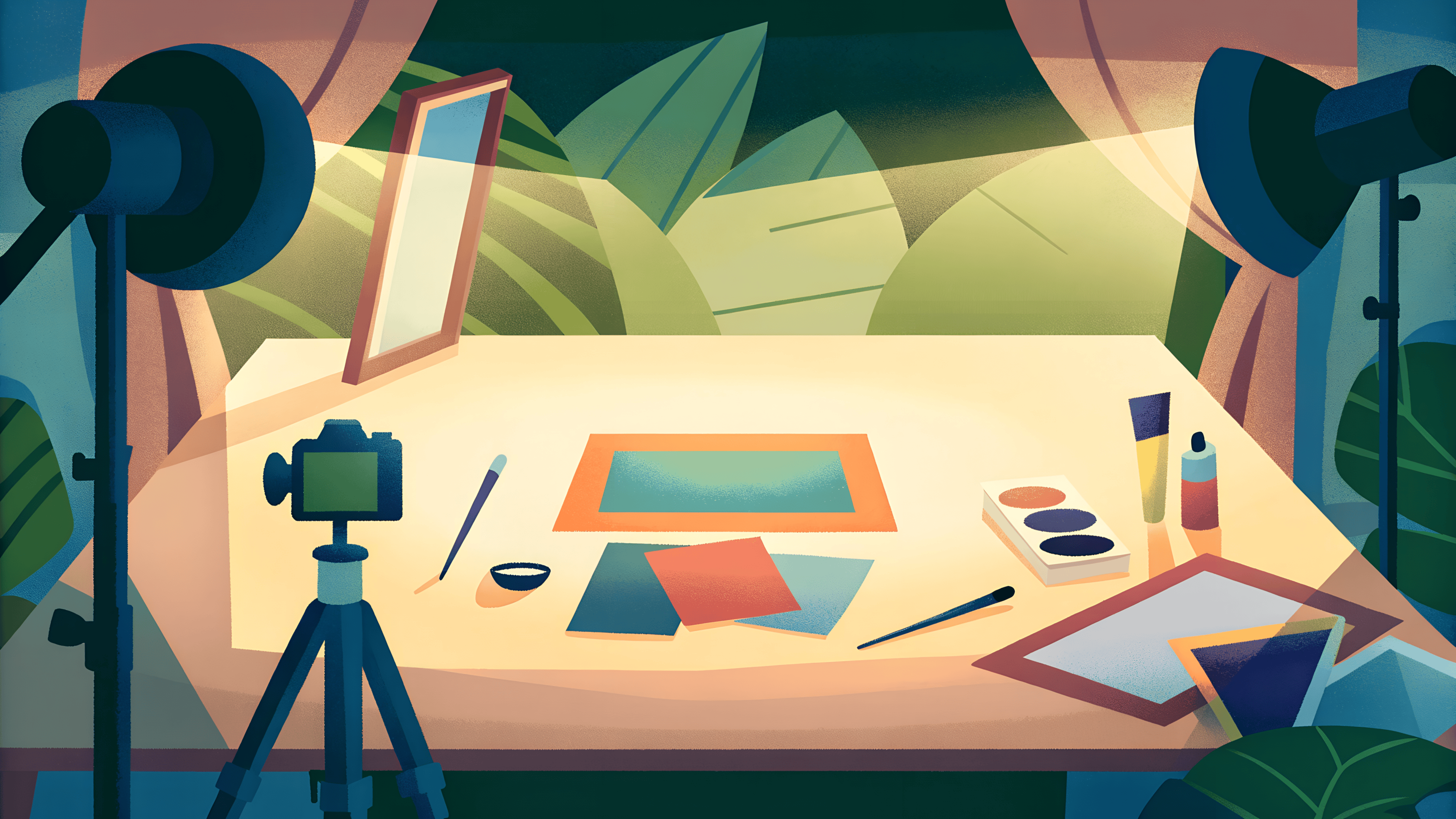
How to Do Product Photos the Wrong Way?
Bad product photos hurt sales more than you think. Learn the most common product photography mistakes and how poor presentation affects conversions.
Most bad product photos aren’t bad because of the camera, They’re bad because of how they’re used and presented.
A photo can be clear, well-shot, and still fail once it’s cropped poorly, shown from one angle, placed on a distracting background, or edited in a way that changes colors and proportions. These small presentation mistakes are often enough to make a product look cheaper, confusing, or untrustworthy.
In e-commerce, product photos do most of the talking. If they don’t clearly show what you’re selling or make shoppers feel confident, people simply scroll past.
In this article, we’ll look at the most common ways brands present product photos the wrong way. Not technical photography theory, just real mistakes that hurt visual quality, trust, and conversions after the photos are already taken.
Understanding what not to do is the first step toward creating product visuals that actually sell.
Low resolution product images
Low-resolution product images are one of the fastest ways to make a brand look unprofessional. Even if the product itself is high quality, blurry or pixelated photos signal low effort and low credibility. Shoppers can’t zoom in, can’t see details, and can’t feel confident about what they’re buying.
In e-commerce, clarity equals trust. When customers struggle to see fabric texture, edges, or finishes, they hesitate or leave. This is why bad product photos often fail not because of styling or lighting, but simply because image quality doesn’t meet online shopping expectations.
Instead of redoing entire shoots, many brands now rely on tools that improve image consistency and sharpness without reshooting. These tools like letsenhance help enhance resolution, clean up details, and standardize quality across large catalogs especially useful when working at scale or updating existing product libraries.

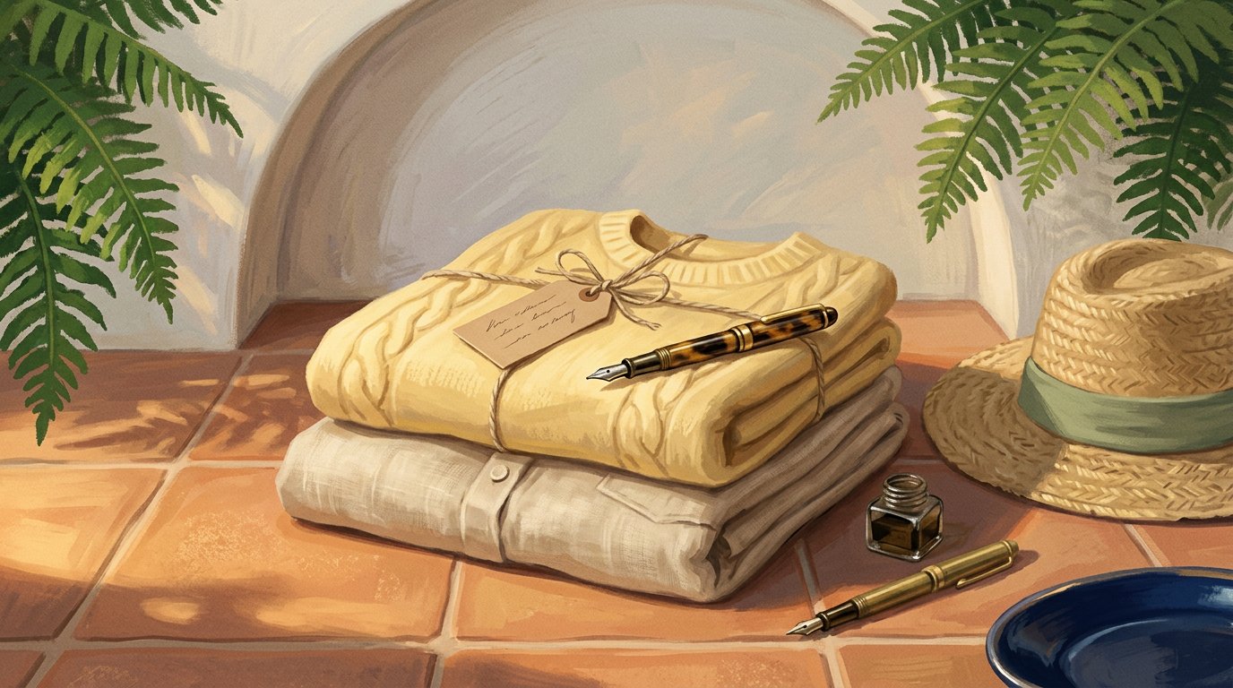
Too many props distract from the product
Props are meant to support the product, not compete with it. When there are too many objects around the product, shoppers don’t know where to look first. The focus shifts from what’s being sold to everything else in the frame.
In many bad product photos, props end up stealing attention instead of adding context. This is especially harmful in e-commerce, where customers scan images quickly. If the product isn’t immediately clear, they lose interest and move on.

Clean, simple compositions help shoppers understand the product faster and feel more confident about it. When visuals feel crowded or distracting, even a good product can look confusing or forgettable.
Why product angles matter?
When a product is shown from strange angles or placed in an unnatural position, shoppers struggle to understand what they’re looking at. Instead of highlighting the product’s shape or details, the image creates confusion and slows the buying decision.
This is a common issue in bad product photos, where creativity goes too far and clarity is lost. In e-commerce, customers don’t have time to decode an image. If they can’t quickly recognize the product and how it’s meant to be used, trust drops.
Clear, familiar angles help shoppers process images faster and feel more confident. Showing products the way people expect to see them often performs better than trying to look different or artistic.
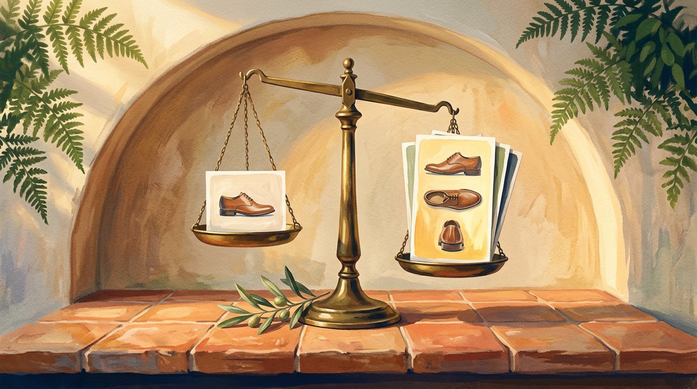
Only one view of the product isn’t enough
Showing a product from just one angle leaves too many unanswered questions. Customers want to understand size, shape, texture, and details and a single image rarely does that. When shoppers can’t fully visualize the product, hesitation increases.
Many bad product photos fail simply because they don’t provide enough visual information.
In e-commerce, multiple views help reduce uncertainty and build confidence. That’s why products shown from different angles, close-ups, and real-use views tend to perform better than listings with only one image.
Giving customers more than one view isn’t about adding noise. It’s about removing doubt.
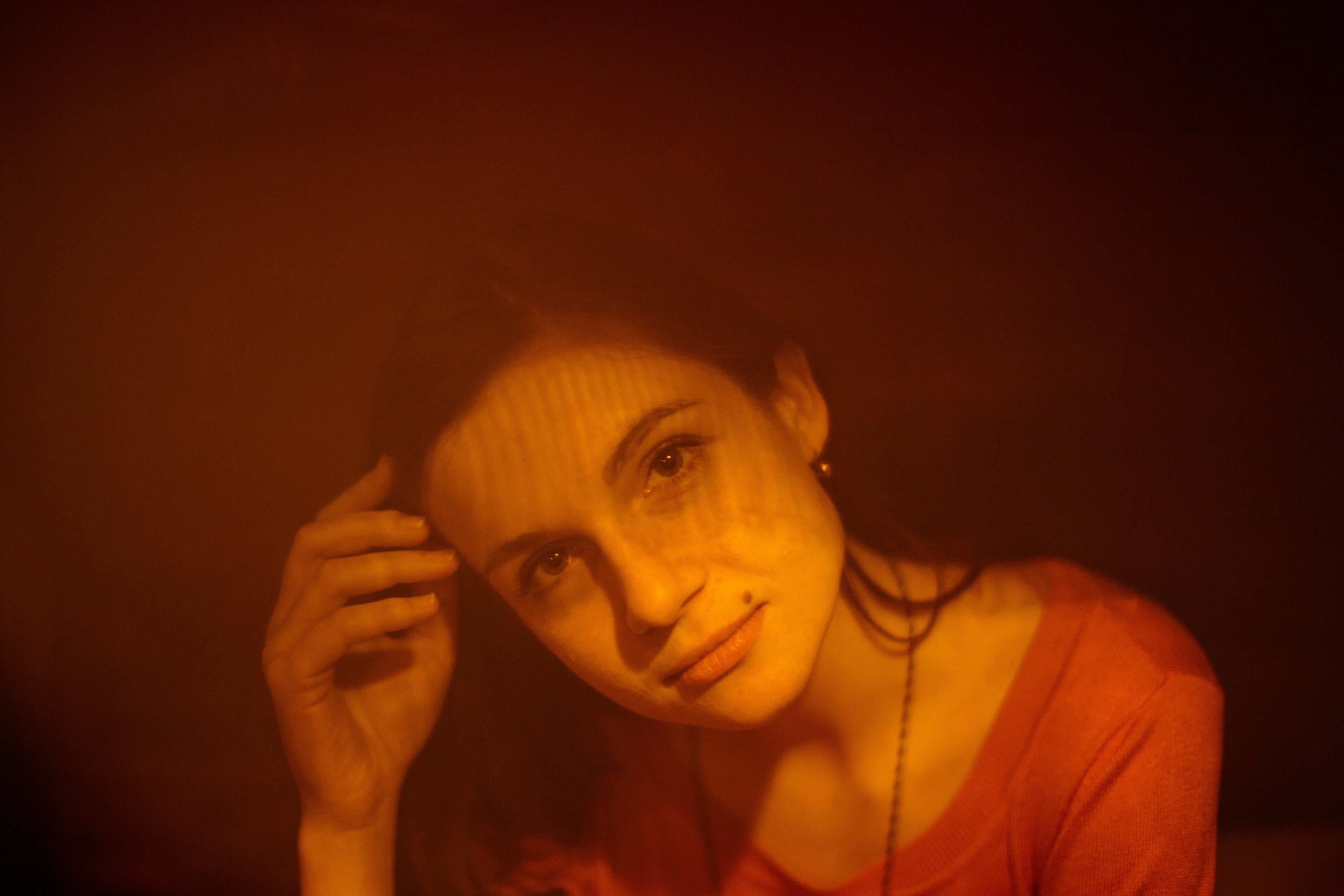
When colors don’t match reality
When product colors don’t match reality, trust breaks fast. A shirt that looks darker online, or a product that appears brighter than it actually is, sets the wrong expectation before the purchase even happens. This mismatch is one of the most common reasons customers hesitate or return items later.
In many bad product photos, color distortion comes from heavy editing, poor lighting, or inconsistent backgrounds. For online shoppers, color accuracy isn’t a detail; it’s part of the decision. If customers can’t trust what they see, they won’t feel confident clicking buy.
Clear, accurate colors help shoppers understand the product faster and reduce uncertainty. When colors feel off, even slightly, the entire listing feels unreliable.
Overexposed and underexposed product photos
When a product photo is too bright or too dark, important details disappear. Overexposed images wash out textures and edges, while underexposed ones hide shape and depth. In both cases, shoppers struggle to understand what they’re actually buying.
This issue shows up often in bad product photos, especially when lighting isn’t consistent across a product set. For e-commerce, exposure problems don’t just affect how a photo looks, hey affect clarity and confidence. If details aren’t visible, hesitation follows.
Balanced exposure helps show materials, finishes, and true product form. When light works against the product instead of supporting it, even a good item can look unreliable.
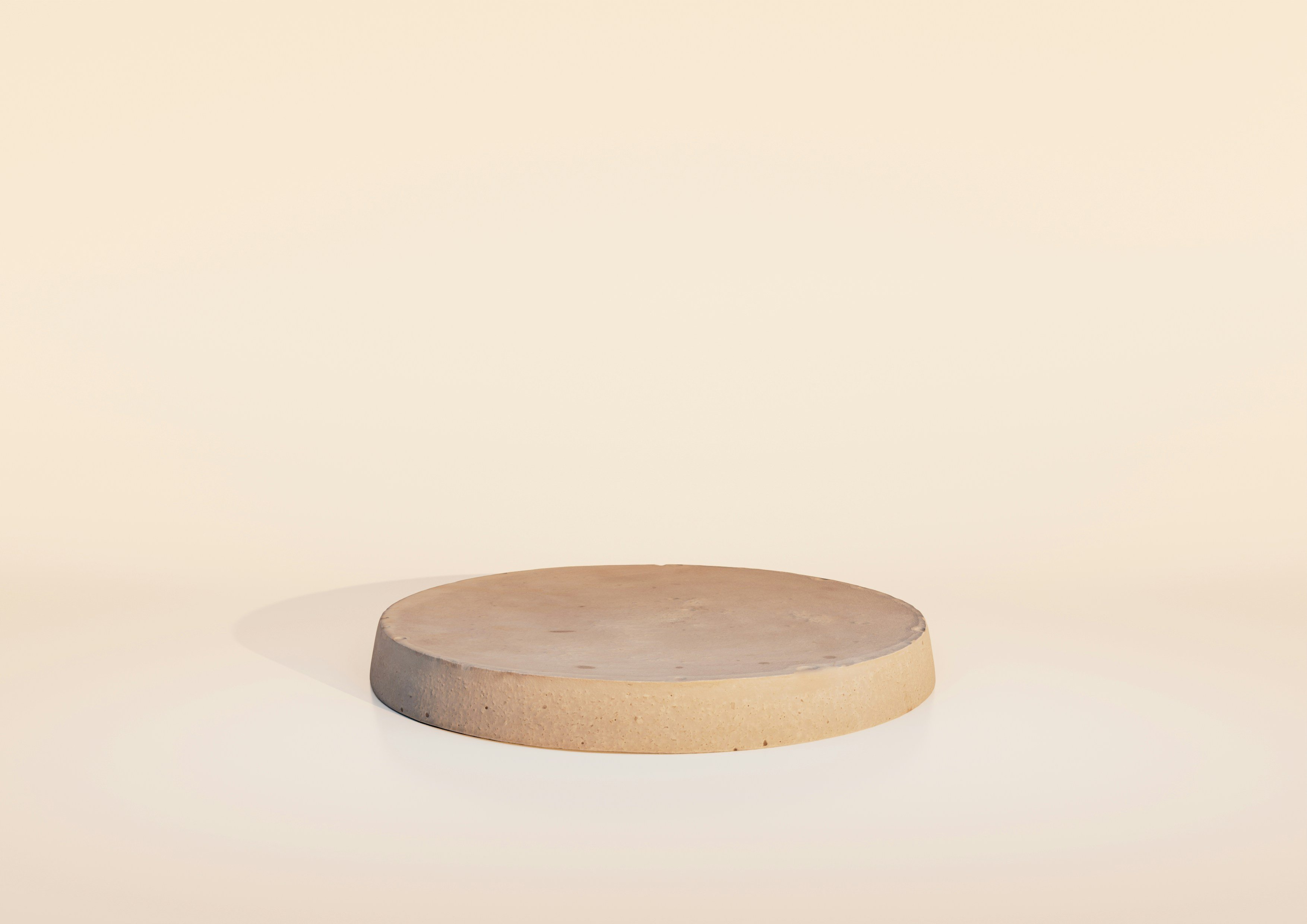
When scale feels off
When objects around the product are out of proportion, shoppers get the wrong idea about size and scale. A product can look much bigger or much smaller than it really is, simply because there’s no clear reference point or the surrounding items distort perception.
This problem shows up a lot in bad product photos, especially when props or environments are chosen without thinking about scale. In e-commerce, size uncertainty creates hesitation. If customers can’t quickly understand how big or small a product is, confidence drops and so do conversions.
Clear scale cues help shoppers make faster decisions. When proportions feel off, even a well-made product can feel risky to buy.
Retouching mistakes in product photography
Cutting corners on retouching often shows more than brands expect. Small issues, uneven lighting, rough edges, color inconsistencies, add up and make product photos look unfinished. Even when the product is good, weak retouching makes the whole listing feel low effort.
This mistake is common in bad product photos, where images look inconsistent across a catalog. In e-commerce, shoppers notice when photos don’t match in quality or style. That lack of consistency creates doubt and hurts trust.
Good retouching isn’t about over-editing. It’s about cleaning up distractions and presenting the product clearly and consistently.
Skipping that step usually costs more in lost confidence than it saves in budget.
Backgrounds can make or break a product photo
The background isn’t just decoration. When it’s messy, too busy, or inconsistent, it makes the product harder to read. Instead of helping the product stand out, the background competes with it and shoppers lose focus.
This mistake shows up a lot in bad product photos, where backgrounds change from one image to another or add unnecessary noise.
In e-commerce, a clean and consistent background helps customers understand the product faster and trust what they’re seeing. When the background feels off, the whole image feels unprofessional.
A simple background doesn’t mean boring. It means giving the product space to stand out and keeping attention where it belongs.
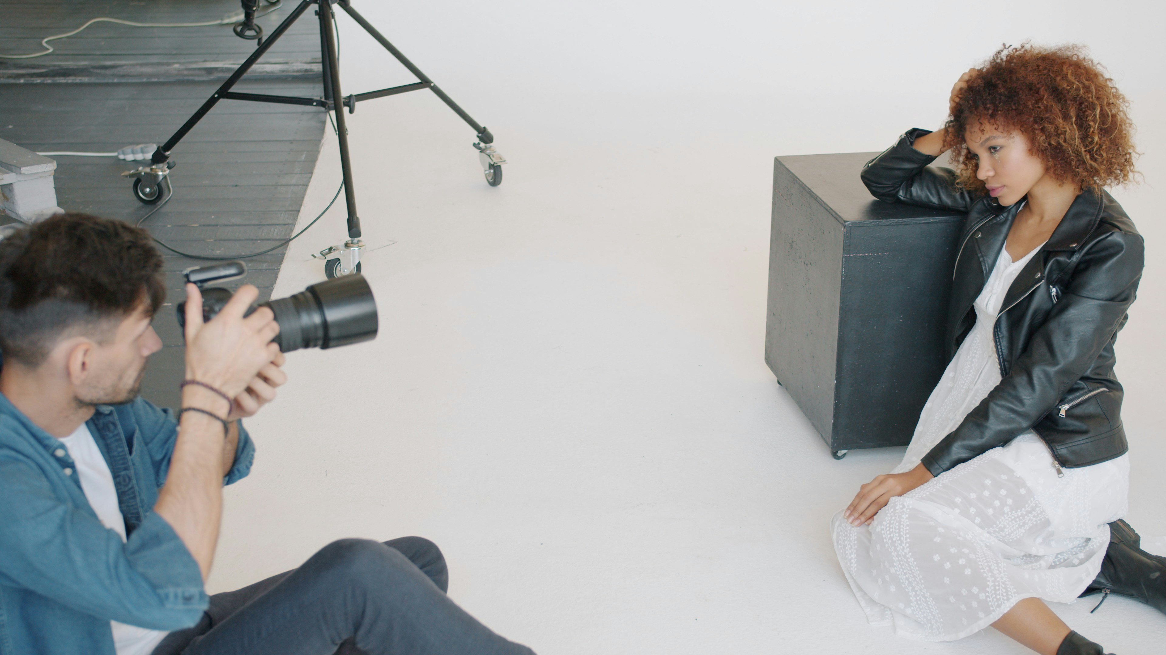
When the model becomes the main focus
Models should support the product, not overpower it. When the model grabs more attention than the item itself, shoppers remember the person not what’s being sold. The product becomes secondary, and the message gets lost.
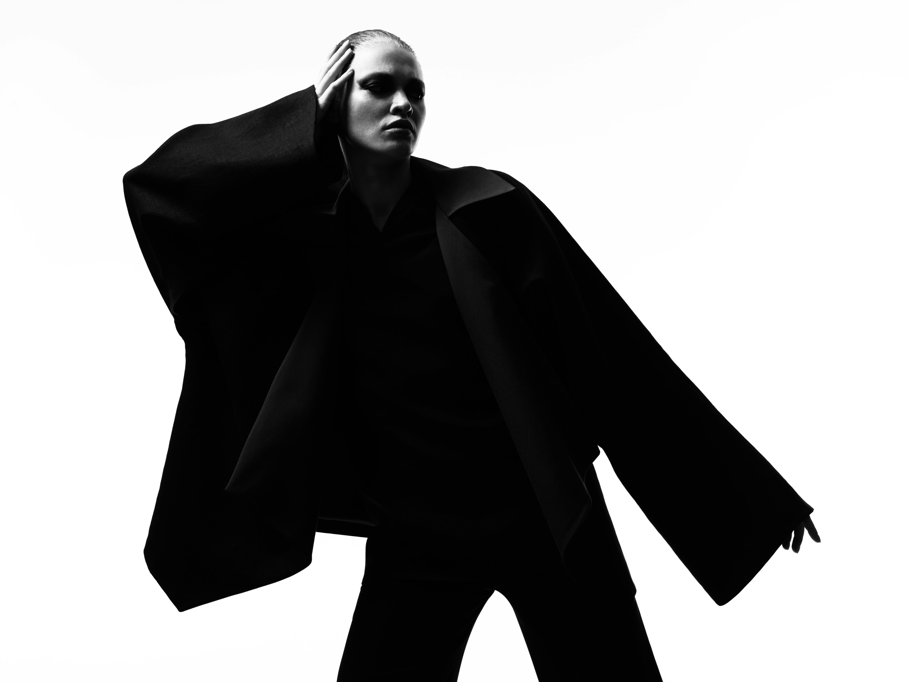
This happens a lot in bad product photos, especially in fashion and lifestyle shots. In e-commerce, customers want to clearly see fit, details, and features. If the model’s pose, expression, or styling steals the spotlight, the product feels unclear and harder to evaluate.
Good product photos keep the focus where it belongs. The model is there to add context, not to compete with the product.
Conclusion
Bad product photos aren’t usually the result of one big mistake.
They’re the outcome of small presentation issues that add up low clarity, confusing angles, distracting elements, weak consistency, or not showing the product well enough.
The good news is that most of these problems don’t require starting over. In many cases, improving how product photos are prepared, arranged, and presented makes a bigger difference than reshooting everything from scratch. When visuals are clear, consistent, and easy to understand, trust increases and so do conversions.
Before investing more time and budget into new shoots, it’s worth taking a closer look at how your current product photos are being shown. Fixing the wrong presentation choices is often the fastest way to make your products look more professional and sell better online.