The Color Codes of Winter 2026: What Brands Need to Know for Next Season
Discover the key color trends shaping Winter 2026 and how fashion brands can use this warm, modern palette to create stylish, seasonal visuals with ease.
Color plays a big part in how winter fashion looks and feels. When the season gets colder, the right shades can make clothes feel warmer, softer, and more inviting. For brands and business owners, choosing the right colors isn’t just about style, it can affect how customers see the products and whether the collection connects with the winter mood.
A good winter palette helps make pieces stand out, tells a clear story, and gives the whole collection a strong, cohesive look. That’s why understanding the season’s colors matters for anyone creating or promoting fashion during this time.
Why Winter 2026 Colors Look the Way They Do
Winter naturally changes the way people feel, and the colors of the season usually follow that mood. As the days get colder, people start gravitating toward shades that feel warm, calm, and easy to wear, colors that make outfits feel more comfortable and grounded. That’s why the Winter 2026 palette leans toward softer tones that match the slower, cozier vibe of the season.
But fashion always likes a little twist. Instead of keeping everything too quiet, designers add small, unexpected pops to bring personality into winter looks without making them overwhelming. It’s a simple balance, comfort with a touch of surprise and it’s what makes this season’s colors feel human, relatable, and stylish at the same time.
The Core Color Themes of Winter 2026
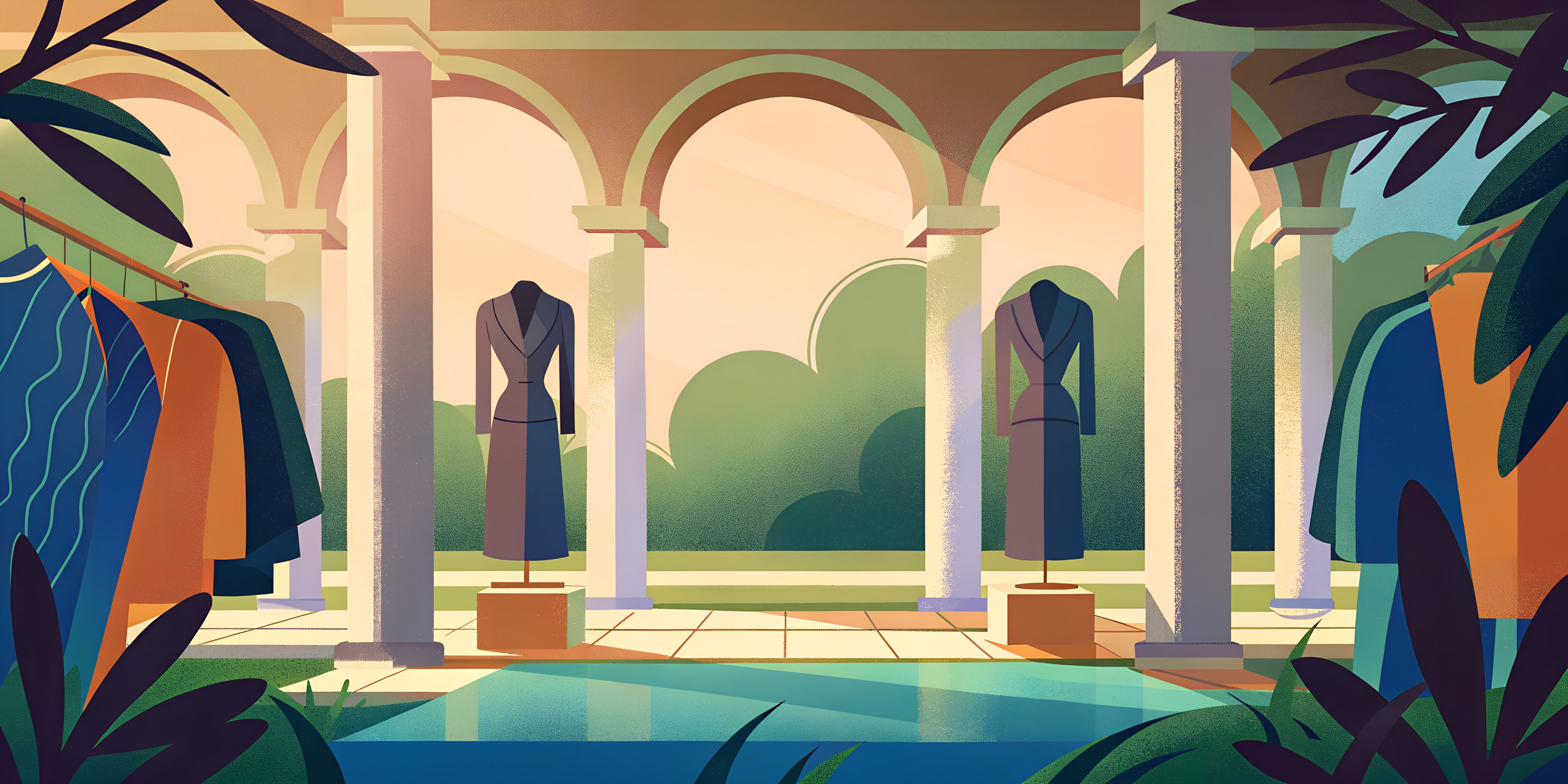
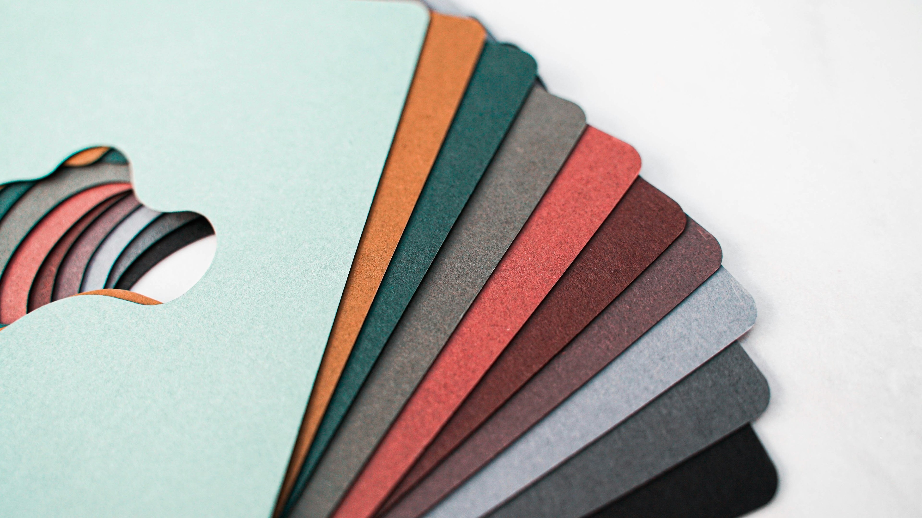
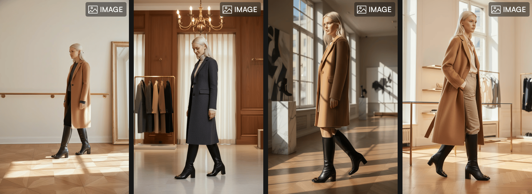
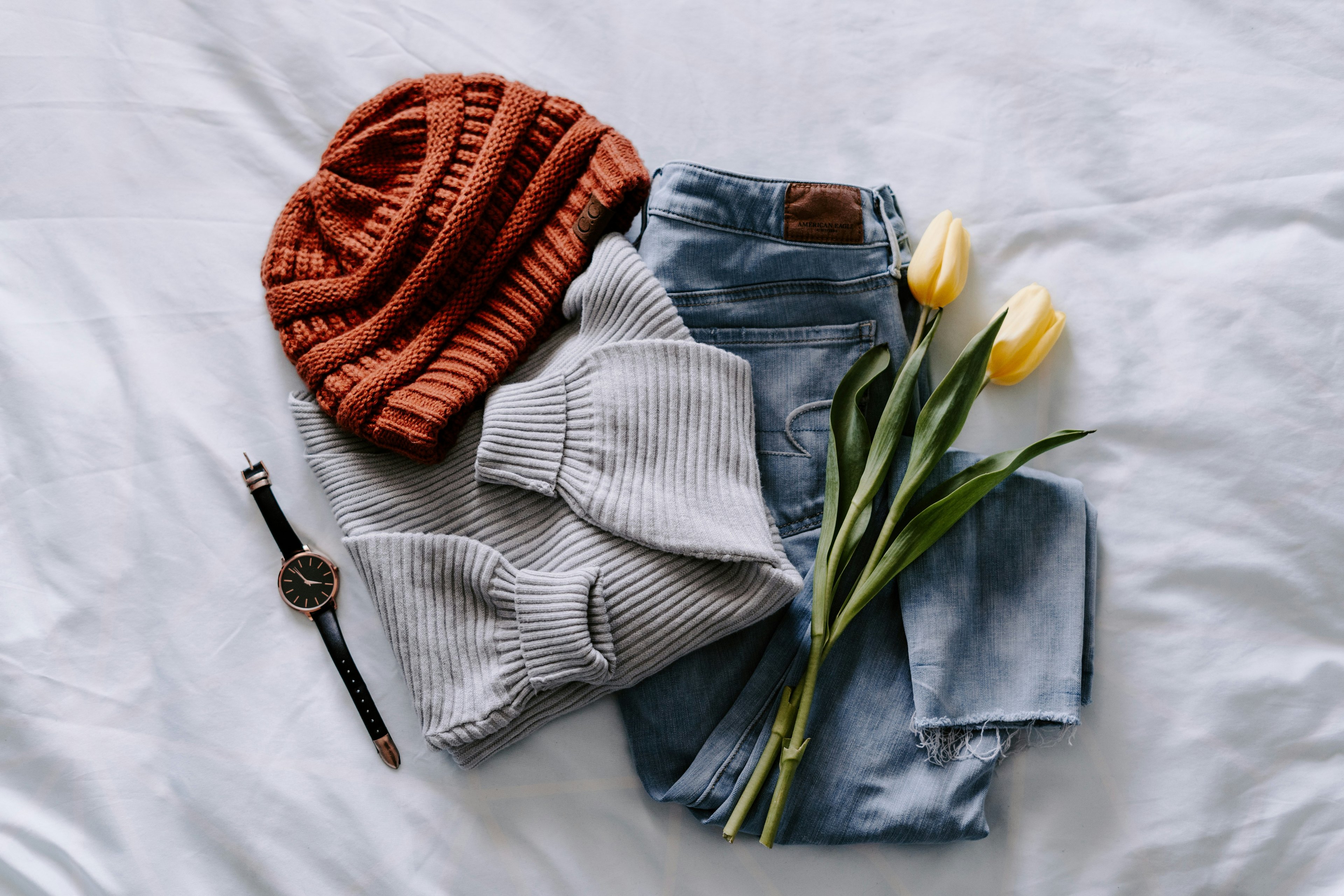
The Winter 2026 palette mixes warmth with clean modern tones, giving fashion a cozy feel with just the right amount of freshness. Here are the key shades shaping the season:
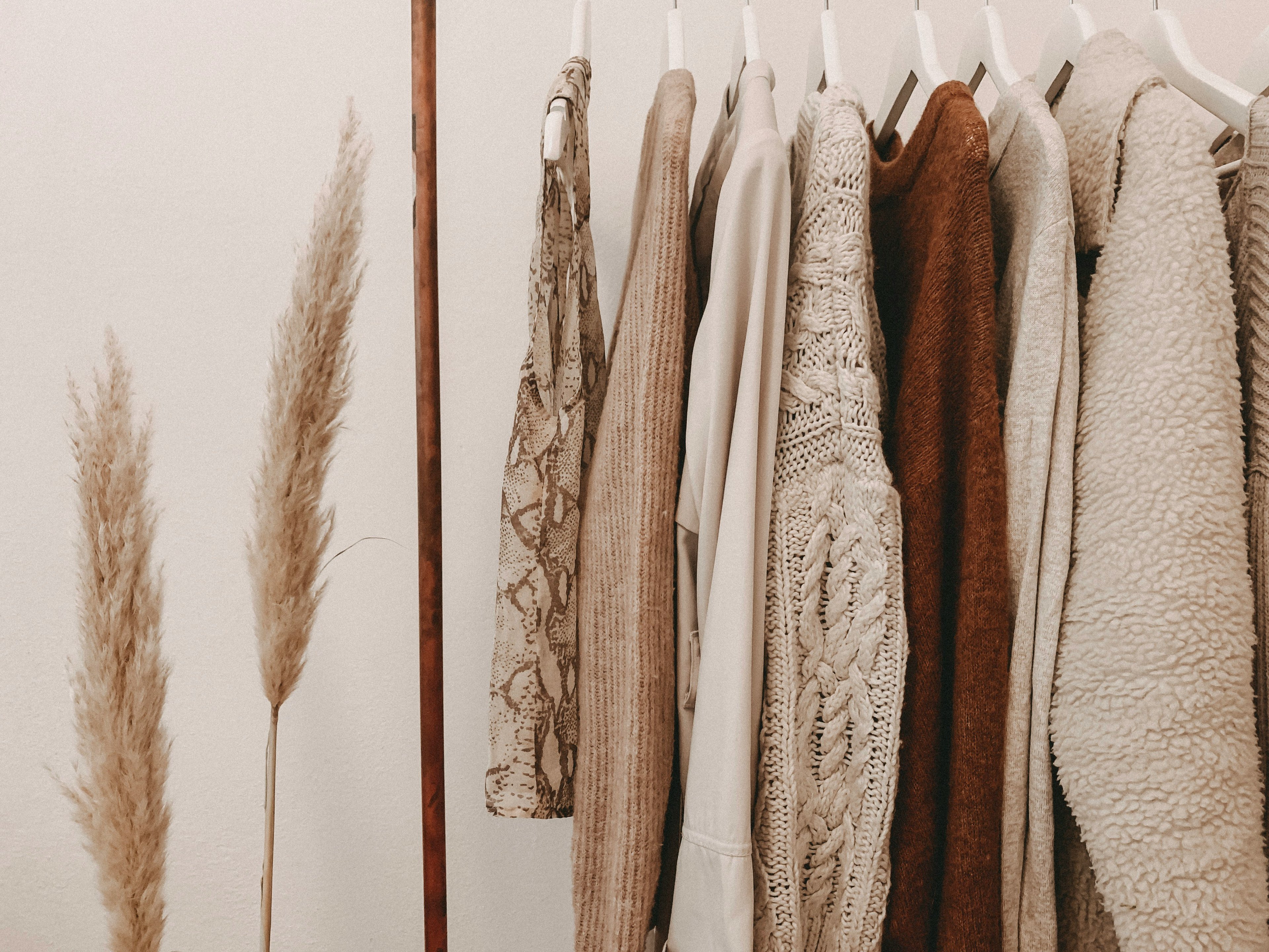
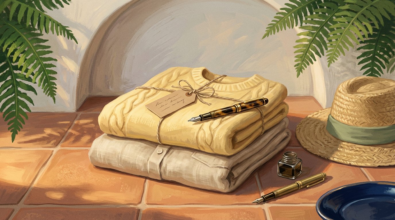
Chocolate Fondant brings a rich, cozy brown that adds depth and comfort to winter looks.
Caramelized introduces a soft caramel warmth perfect for knits, coats, and everyday pieces.
Aqua Gray offers a clean blue-gray blend that gives outfits a modern, minimal edge.
Moonlight Haze adds a dreamy light blue-violet tone that works beautifully with softer silhouettes.
Golden Acacia stands out as the season’s bright pop, adding a golden touch that lifts accessories and details.
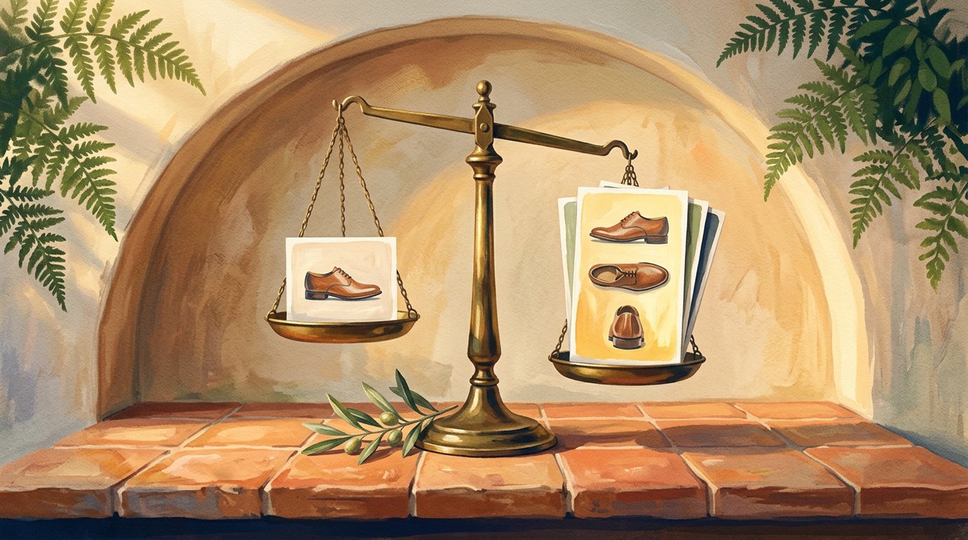
The Challenges Brands Face When Updating Seasonal Visuals
Even with a clear winter palette, updating fashion visuals isn’t always easy for brands. Seasonal colors change fast, and creating new shoots every time can be expensive and time-consuming. Many business owners also struggle with keeping their visuals consistent, especially when combining warm tones with cooler shades or adding pops like Golden Acacia without losing the overall mood. Sometimes products don’t photograph in the exact color they’re meant to be, which can make the collection feel less cohesive.
On top of that, planning fresh campaigns, styling new looks, and producing enough content to stay relevant can feel overwhelming during a busy season. Finding the right balance between the new color trends and the brand’s own identity is another challenge. All of this makes winter visuals harder to update, even when the color direction is clear.
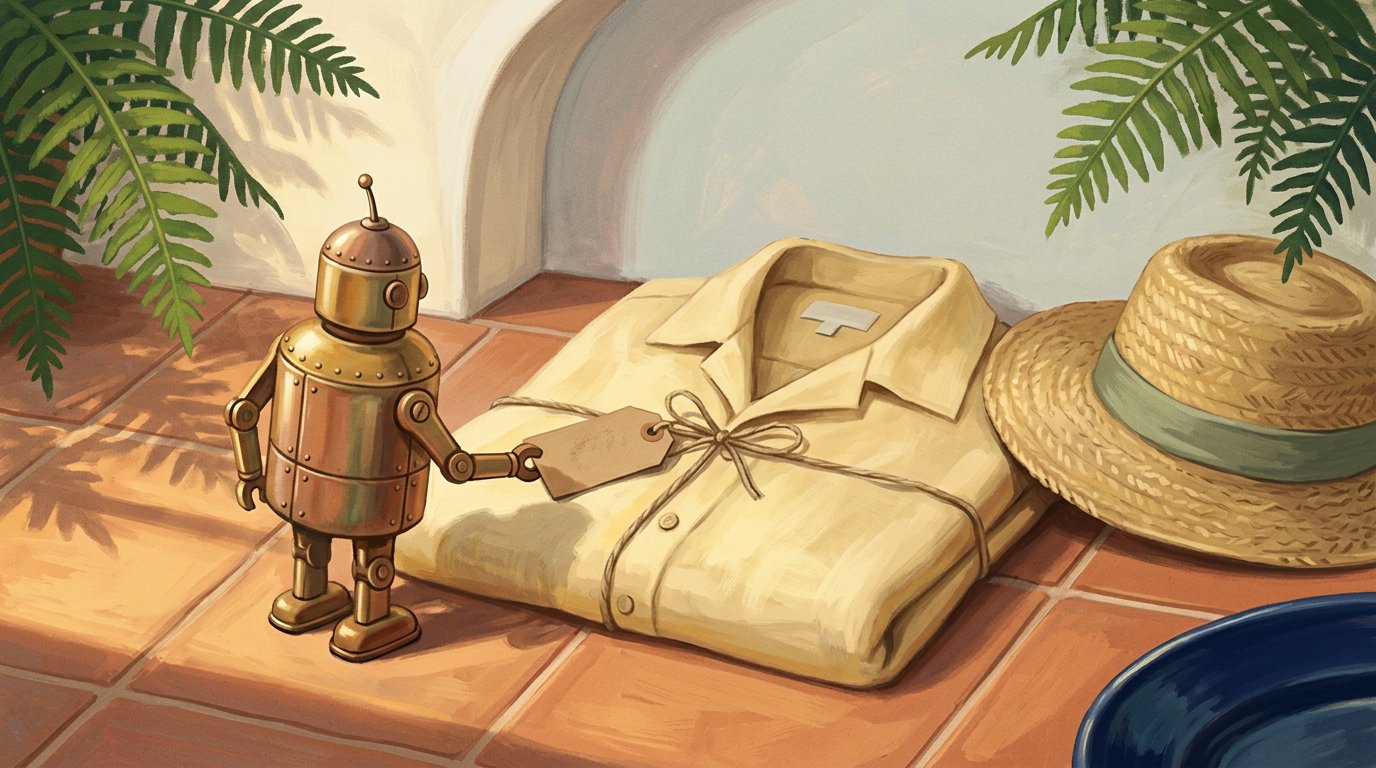
How AI Helps Brands Work With These Colors More Easily
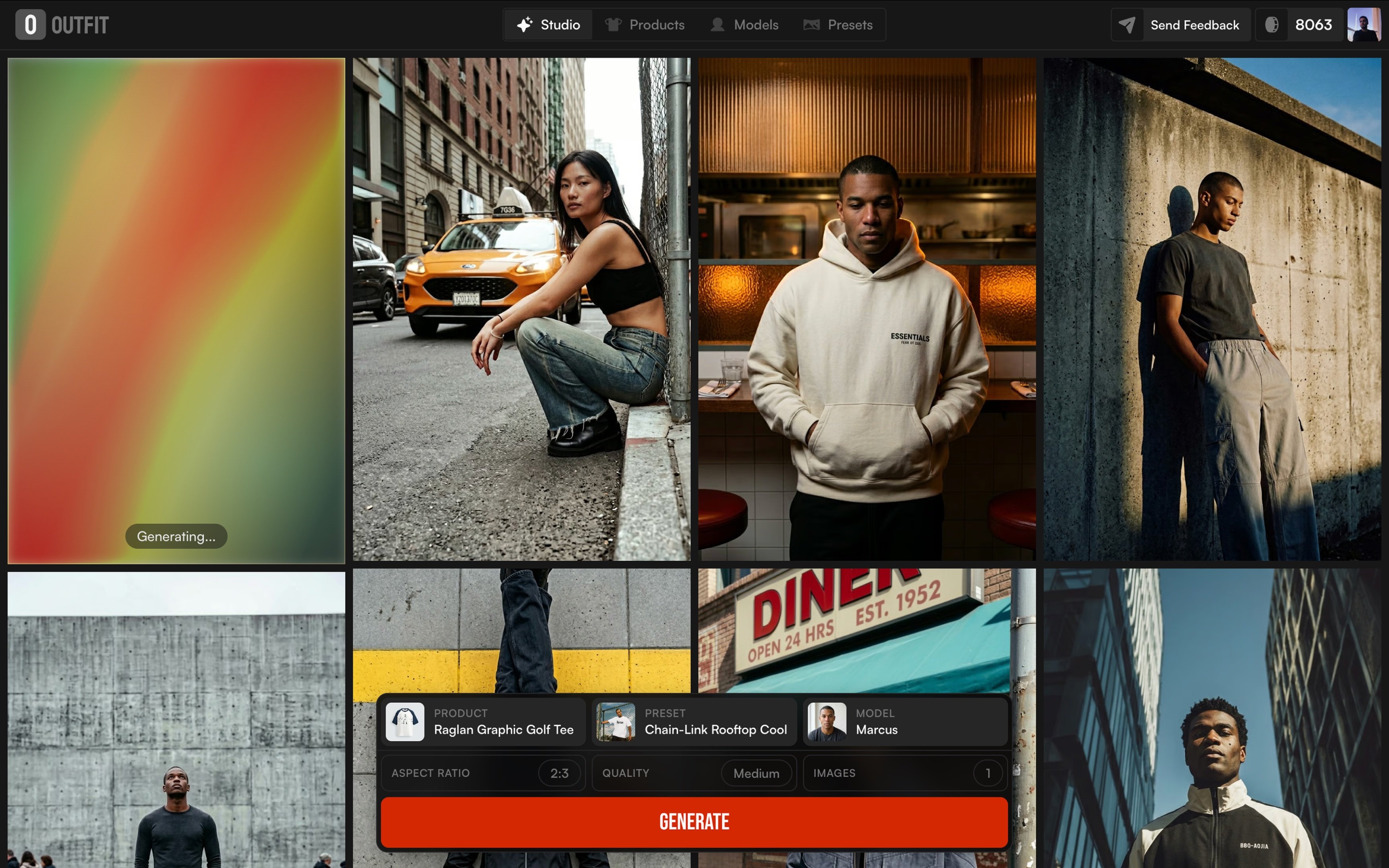
Keeping up with seasonal colors can be challenging, but AI is making the process a lot smoother for fashion brands. Instead of planning full photoshoots every time a new palette appears or when a brand is preparing a new collection, AI tools now allow teams to create updated visuals faster and with far less effort. By simply using existing product images, brands can experiment with different settings, moods, and styling ideas that match the Winter 2026 colors without having to reshoot everything from scratch.
This makes it easier to test which tones work best for each item, whether it’s the warmth of Chocolate Fondant, the softness of Moonlight Haze, or the bright pop of Golden Acacia. AI also helps maintain consistency across lookbooks and campaigns, making the whole collection feel more polished and intentional. And platforms like outfit take this even further by turning simple product images into fashion-forward visuals that align with the season’s palette, giving brands a quick and flexible way to stay on trend.
How Brands Can Use These Colors in Their Fashion Visuals
Fashion brands can bring the Winter 2026 palette to life in simple, creative ways. Warm tones like Chocolate Fondant and Caramelized work beautifully in knitwear, outerwear, and everyday winter essentials, they instantly make pieces feel cozy and approachable. Cooler shades like Aqua Gray and Moonlight Haze help create a cleaner, more modern mood, especially in tailored silhouettes or minimal styling. And for brands that want a small spark of personality, Golden Acacia is perfect for accessories or subtle details that brighten the whole look without overpowering it.
These colors don’t have to be used only in the clothes themselves. Brands can also integrate them into backgrounds, lighting styles, props, or overall art direction. Even small shifts in tone can make a campaign feel more aligned with the season and more attractive to customers. When used intentionally, the Winter 2026 palette helps create visuals that feel connected, stylish, and ready for the colder months.
A Last Look at the Season’s Color Mood
Winter 2026 proves how powerful the right colors can be in shaping the look and feel of a collection. When brands work with warm browns, soft violets, clean blue-grays, and small golden pops, their visuals instantly feel more in tune with the season. These shades make outfits look more relatable, more wearable, and more connected to what people naturally gravitate toward in colder months. For fashion creators and business owners, the goal isn’t to follow every trend, it’s simply to choose colors that support the story they want to tell. And with this winter’s palette being so calm, warm, and easy to style, it gives brands plenty of room to create visuals that feel fresh without complicating things. Sometimes, all a winter collection needs is the right mood and the right colors to bring that mood to life.